
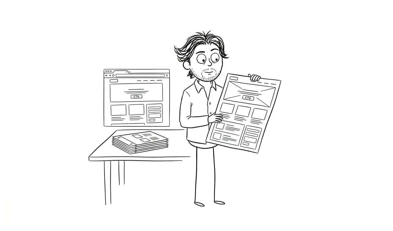
Landing Page Visual Hierarchy Checklist
Use this landing page visual hierarchy checklist to prioritize your offer, proof, CTA, pricing, forms, and mobile reading order before build.
A landing page visual hierarchy checklist helps you decide what visitors should notice first, what they need next, and which action should remain obvious throughout the page. Start with the offer and primary CTA, then arrange supporting context, proof, pricing, objections, and form details in a deliberate reading order. Use size, spacing, contrast, position, and repetition to express that order without hiding essential information.
What is visual hierarchy on a landing page?
Visual hierarchy is the order in which a page presents information to the eye. It helps a visitor identify the offer, understand why it matters, evaluate whether it fits, and find the next step without reading every line with equal attention.
Hierarchy is not decoration. A larger headline, stronger contrast, tighter grouping, or more generous spacing tells the reader which elements belong together and which deserve priority. When every heading, card, badge, and button competes for attention, the page may look energetic but feel difficult to understand.
A useful hierarchy answers four questions quickly:
- What is this page offering?
- Who is it for?
- Why should the visitor consider it?
- What should the visitor do next?
The sequence should also hold up when the page is scanned, viewed on a small screen, or read without its images. If the content itself is unsettled, prepare a landing page copy checklist and a wireframe checklist before polishing the interface.
Good visual hierarchy makes the page’s argument easier to follow. It cannot replace a clear offer or credible evidence.
Landing page visual hierarchy checklist
Use this checklist during wireframing and again before development. Review the page at normal size, zoomed out, and on a narrow viewport. Each view reveals different problems.
1. Define one primary page goal
Write the intended action at the top of the design brief. Examples include requesting a consultation, purchasing a defined service, joining a waitlist, or downloading a resource.
Then identify the primary CTA that supports that goal. The page can include secondary links, but they should not look equally important. If two actions need the same visual weight, the page may be serving two different intents that deserve separate routes.
Check that:
- one action is visibly primary
- the CTA label describes the next step
- secondary links use quieter styling
- navigation does not overpower the page goal
- repeated CTAs lead to the same destination
The landing page CTA checklist covers button copy, placement, forms, and mobile behavior in more detail.
2. Make the offer the first clear message
The hero should identify the offer before introducing supporting ideas. A visitor should not need to decode a slogan, inspect the navigation, or scroll to learn what can be bought.
Use the largest text for the page’s main promise or offer. Follow it with a subheading that adds useful context: audience, scope, differentiator, or price. Keep badges, eyebrow labels, and decorative words subordinate.
A practical order is:
- category or audience label, if genuinely useful
- offer-focused headline
- specific supporting sentence
- primary CTA
- concise qualification or process detail
Do not make five items look like headlines. One dominant heading and one supporting level usually create a clearer entry point. Review the above-the-fold checklist if the opening section is carrying too many messages.
3. Match emphasis to decision importance
Visual prominence should reflect how important a detail is to the buying decision. Offer scope, price, proof, fit, and next steps usually deserve more attention than process labels or ornamental features.
For every visually prominent element, ask:
- Does this help someone understand or evaluate the offer?
- Is it more important than the content around it?
- Would the page still make sense if this element disappeared?
- Is its emphasis supported by content, or only by styling?
A large abstract statement can push useful scope below the fold. A bright badge can distract from the CTA. A decorative number can resemble a metric even when it is only a section marker. Reduce emphasis when the styling implies more importance or evidence than the content deserves.

4. Group related information with spacing
Spacing communicates relationships. Elements placed close together appear connected; larger gaps signal a new topic or section. Use that principle consistently instead of relying on boxes around everything.
Keep each heading close to the paragraph, list, table, or cards it introduces. Give separate ideas enough room to remain distinct. Avoid equal vertical gaps between every element, because uniform spacing makes all relationships look the same.
Review these groups:
- headline, subheadline, and primary CTA
- price, billing terms, and inclusions
- testimonial and attribution
- form field and help text
- objection and answer
- section heading and introductory sentence
Cards are useful when items are parallel and independently scannable. Do not turn continuous reasoning into a wall of cards. A sequence often reads better as headings, short paragraphs, and lists.
5. Use typography as a limited system
Choose a small set of text roles and apply them predictably. A typical landing page needs a page title, section heading, subsection heading, body copy, label, and supporting note. Creating a unique style for every component weakens the system.
Check that:
- heading levels are visibly distinct
- body text remains comfortable to read
- labels do not look like buttons
- links remain recognizable
- bold text highlights only key phrases
- all-caps text is short and used sparingly
- line lengths do not become excessively wide
Do not use font size alone to create hierarchy. Weight, color, line height, width, and surrounding space all contribute. A restrained type scale can still create a strong structure when spacing and grouping are clear.
6. Reserve strong contrast for priority and clarity
High contrast attracts attention, so spend it deliberately. The primary CTA can use a stronger fill or border than secondary actions. Essential headings should be easier to notice than captions. Body text must remain readable against its background.
Contrast should not be used to hide important caveats. Pricing terms, scope boundaries, form requirements, and accessibility information need readable treatment even when they are visually secondary.
Test the page without relying on color alone. Selected states, errors, links, and status messages should also use text, icons, underlines, or structural changes. Check keyboard focus and hover states during implementation rather than treating them as later polish.
7. Give proof a clear but honest position
Proof should appear near the claim it supports. A relevant case study, attributed testimonial, process artifact, or concrete deliverable is easier to evaluate when its relationship to the offer is obvious.
Do not promote weak proof through oversized presentation. A generic quote does not become more credible because it occupies the full viewport. Never add placeholder logos, invented testimonials, unsupported metrics, or implied awards to balance a layout.
When strong social proof is unavailable, emphasize evidence the business can verify:
- clear deliverables
- transparent scope
- examples of the work product
- documented process
- practical answers to buyer questions
- relevant, approved case studies
The visual hierarchy should distinguish the quote from its attribution and keep any outcome claims tied to their source.
8. Present price and scope together
Pricing is easier to understand when it is connected to what the buyer receives. Avoid placing a large price in one section and essential exclusions far away in low-contrast text.
For a fixed-price offer, group:
- service name
- price
- primary deliverables
- major boundaries
- payment or booking note
- next action
Dee Agency’s Landing Page Design & Build is $3,000. That price should sit within a clear offer hierarchy rather than appearing as a detached promotional badge. If the page problem needs diagnosis before implementation, the $500 Audit + Spec examines one focused lens, not the whole business; its fee is credited 100% toward follow-on work booked within 30 days.
9. Make objections easy to find in context
Visitors should not have to search a long FAQ for every important qualification detail. Put scope boundaries near scope, pricing questions near price, and form expectations near the form. Reserve the FAQ for useful questions that do not fit naturally elsewhere.
Use question-based headings or concise labels so objections are scannable. Keep answers visually quieter than the offer but readable enough to support a decision. Accordions can reduce page length, but they also hide information; avoid hiding details that many qualified visitors need.
The page should acknowledge uncertainty without making every sentence defensive. Clear boundaries often build more confidence than a row of vague reassurance badges.
10. Protect the primary CTA across the page
Repeat the primary CTA where a visitor has enough context to act: often near the hero, after the offer or proof, and at the end. Repetition should create a consistent path, not a series of competing prompts.
Check that every primary CTA uses consistent:
- wording
- visual style
- destination
- expected next step
Avoid making inline links, social icons, chat widgets, and secondary buttons brighter than the primary action. On mobile, persistent UI should not cover content or compete with form controls.
11. Design the form as part of the hierarchy
The form is not a separate utility pasted below the sales page. Its heading, context, fields, help text, errors, and submit action form the final decision sequence.
Start with a short explanation of what the form is for and what happens after submission. Make labels easier to notice than placeholders. Group related fields, identify optional inputs, and keep validation messages beside the relevant control.
A clear form hierarchy is:
- form purpose
- expectation or fit note
- field label
- field control
- help or error text
- submit action
- confirmation and next step
Do not style every input with the same prominence as the submit button. The path through the fields should be calm; the final action should be unmistakable.
12. Rebuild the order for mobile, not just the width
Desktop layouts can place related content side by side. Mobile turns those columns into a sequence, and the default code order may not match the intended reading order.
Inspect each stacked section. A screenshot, caption, heading, and CTA that work in two columns can become confusing if the image appears before the text that explains it. Pricing cards may place the recommended option after less relevant choices. A sticky CTA may cover the final form field.
On a narrow viewport, verify that:
- the offer remains visible early
- headline lines break naturally
- section order still tells a coherent story
- proof remains attached to the supported claim
- comparison tables are usable without losing labels
- CTA buttons fit and remain descriptive
- forms, errors, and confirmations are readable
- sticky elements do not obscure content
The landing page mobile checklist provides a broader QA pass for small screens.
How do you test visual hierarchy before launch?
Start with a blur or squint test: step back or blur the page and note which shapes and contrast blocks attract attention. The offer, major section changes, proof, price, and primary CTA should create a sensible path. If decoration dominates, reduce it.
Then run four practical reviews:
The five-second identification test
Show the page briefly, then ask what it offers, who it appears to serve, and what action was available. This is a comprehension check, not a conversion prediction.
The heading-only test
Read only the H1, H2s, and H3s. They should summarize the page’s argument in a logical sequence. Replace vague headings such as “Unlock more” or “Why us” with labels that carry information.
The grayscale test
Review the page without color. The hierarchy should still work through type, spacing, position, borders, and labels. This can reveal places where color is doing all the organizational work.
The keyboard and screen-reader order test
Tab through interactive elements and inspect the document outline. Visual order and source order should agree. A layout that looks correct but reads in a confusing sequence is not finished.
Common visual hierarchy mistakes
Making everything prominent
Multiple accent colors, oversized headings, badges, animations, and filled cards create noise when they all demand attention. Choose one dominant message per section and let supporting details look supportive.
Using layout to compensate for unclear copy
A dramatic composition cannot clarify an undefined audience or vague offer. Return to the copy and wireframe when the team keeps changing emphasis without resolving what the page should say.
Hiding essential details in fine print
Scope, price conditions, form requirements, and meaningful limitations should be readable. Secondary does not mean concealed.
Copying desktop order directly to mobile
Responsive design needs an intentional sequence. Verify the stacked order rather than assuming the browser’s column collapse produces the right story.
Treating whitespace as empty inventory
Whitespace separates ideas and reduces competition. Filling every gap with a badge, icon, quote, or feature weakens the relationships the spacing was meant to show.
A compact review template
Use this short template during design review:
Primary page goal:
Primary CTA and destination:
First visible offer statement:
Most prominent proof:
Price and scope location:
Main objection addressed:
Desktop reading order:
Mobile reading order:
Secondary actions:
Elements competing with the CTA:
Accessibility checks completed:
Final decision owner:
Record issues by decision impact rather than personal taste. “The chat widget has more contrast than the project CTA” is actionable. “Make it pop” is not.
What should happen after the hierarchy review?
Turn each finding into a specific change: rewrite a heading, reduce a card’s emphasis, move proof beside its claim, group price with scope, reorder a mobile section, or quiet a secondary action. Recheck the full page after each meaningful change because improving one section can shift the balance elsewhere.
If the offer and content are ready, Dee Agency’s $3,000 Landing Page Design & Build service can turn the hierarchy into a production page. If the underlying issue is still unclear, the $500 focused Audit + Spec can inspect one lens and produce a practical specification, with the fee credited toward follow-on work booked within 30 days. Review all Dee Agency services, or share the project details to choose the appropriate next step.

Got a project worth shipping? Send the brief.
Quote and kickoff date back in a day, usually faster. If it's not a good fit I'll say so.