Landing Page CTA Checklist for Service Businesses
A practical landing page CTA checklist for service businesses: button copy, placement, contrast, friction, and mobile behavior.
A landing page CTA checklist for service businesses covers five core areas: button copy, placement, visual contrast, friction reduction, and mobile behavior. Get all five right and your CTA stops being something visitors scroll past and starts being something they actually click. This applies whether you’re running a single-service page or a multi-step funnel. The checklist below is practical and specific, not a list of vague best practices.
Why most service page CTAs don’t convert
The CTA is the most important element on your landing page. Everything else, the headline, the benefits section, the social proof, exists to build enough trust and clarity that someone clicks that button. And yet most service page CTAs are generic, buried, or both.
“Contact us” tells a visitor nothing. “Get started” is vague. A button that looks like body text doesn’t register as clickable. A form with eight fields before someone even knows if you’re a fit creates friction before value has been established.
These aren’t small issues. They’re the last mile between a page that informs and a page that converts. The good news is that fixing CTAs is usually faster than fixing anything else on the page.
A weak CTA wastes every dollar you spend driving traffic to the page. Fix this before you optimize anything else.
If you want a deeper read on what makes the surrounding page work, the article on what makes a landing page convert covers the full picture. This checklist focuses specifically on the CTA layer.
The landing page CTA checklist for service businesses
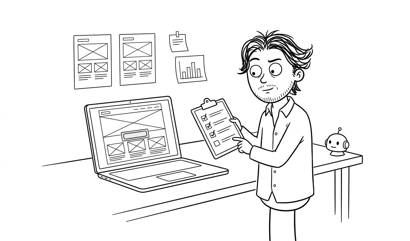
Use this checklist before you publish or when diagnosing a page that isn’t converting. Go through each item. If you can’t check it off, it’s a fix worth making.
Button copy
- The button says what happens next, not what the visitor is doing. “Book a free call” instead of “Submit.”
- No filler verbs. Not “Click here,” “Get started,” or “Learn more” as standalone phrases.
- The copy matches the offer. If the offer is a free audit, the button says “Get your free audit,” not “Contact us.”
- The copy makes the next step feel concrete. “Start the project” is clearer than a vague “Get started,” though exact wording is worth testing.
- The copy is under six words. Longer than that and it stops reading like a button.
Visual contrast and placement
- The button is visually distinct from every other element on the page. It shouldn’t compete with navigation, text links, or secondary buttons.
- Button color has enough contrast against the background to pass basic accessibility checks. WebAIM’s contrast checker is free and takes 30 seconds.
- The primary CTA appears above the fold on desktop and mobile. A visitor should not need to scroll to find it.
- There’s a second CTA placement at the bottom of the page for visitors who read all the way through.
- If the page is long (more than three scrolls), there’s a CTA in the middle section, too.
- Secondary CTAs (like “See how it works” or “View pricing”) are visually subordinate to the primary CTA. One hierarchy, not a competition.
Friction and form design
- The form attached to the CTA asks only for what’s needed to qualify the lead. Full name, email, and one qualifying question is usually enough at this stage.
- No required fields that feel intrusive before any relationship exists. Company size, job title, annual revenue: save those for later.
- There’s a privacy line near the form. Something like “Your info stays private. No spam.” reduces hesitation.
- Error messages are specific. “Invalid email” is more useful than “There was an error.”
- Success state is clear. After someone submits, they know what happens next and when to expect it.
- If you use a multi-step form or a scheduler embed (like Calendly), the transition is smooth. Don’t drop someone into a third-party interface with no context.
For a full treatment of form-specific decisions, the landing page form checklist covers field count, qualification logic, and what to show on the confirmation screen.
CTA copy clarity checklist
- The offer behind the CTA is clear before the button appears. A visitor shouldn’t click and then find out what they’re getting.
- The CTA copy is consistent with the headline. If the headline promises a free strategy session, the button delivers a free strategy session.
- Urgency is real or absent. Fake countdown timers and “limited spots” claims that never change destroy trust.
- The CTA doesn’t create anxiety. “Buy now” on a high-consideration service feels pushy. “Book a 30-minute call” is lower commitment.
- The CTA is specific about the commitment level. Is it a call? A proposal? An email? Free or paid? Say so.
Mobile behavior
- The button is large enough to tap comfortably. Google’s mobile-friendly guidelines recommend touch targets of at least 48x48px.
- The CTA doesn’t get hidden behind a sticky nav or a cookie banner on small screens.
- Forms are thumb-friendly. Single-column layout, large input fields, native keyboard types for email and phone.
- The CTA loads fast. A button that appears half a second after the page paint feels broken on mobile.
- Click-to-call is enabled if phone is a conversion path. Don’t make someone copy and paste a number.
How many CTAs should a service page have?
This comes up constantly. The short answer: one primary action, consistently repeated.
That doesn’t mean one button. It means one offer, surfaced multiple times. Every CTA on the page points to the same next step. You’re not giving visitors a menu of options; you’re making it easy to say yes to the one thing you want them to do.
The exception is dual-track CTAs, where some visitors are ready to buy and others need more information first. In that case, you can have a primary CTA (“Book a call”) and a secondary CTA (“See examples”). The key is visual hierarchy. Primary is prominent, secondary is subtle. Not two equal buttons side by side.
One primary action, repeated. Not one button. One offer.
What CTA copy actually works for service businesses
Generic service industries have the same CTA problem: “Get in touch” and “Request a quote” are everywhere, and they say nothing about the experience of working with you.
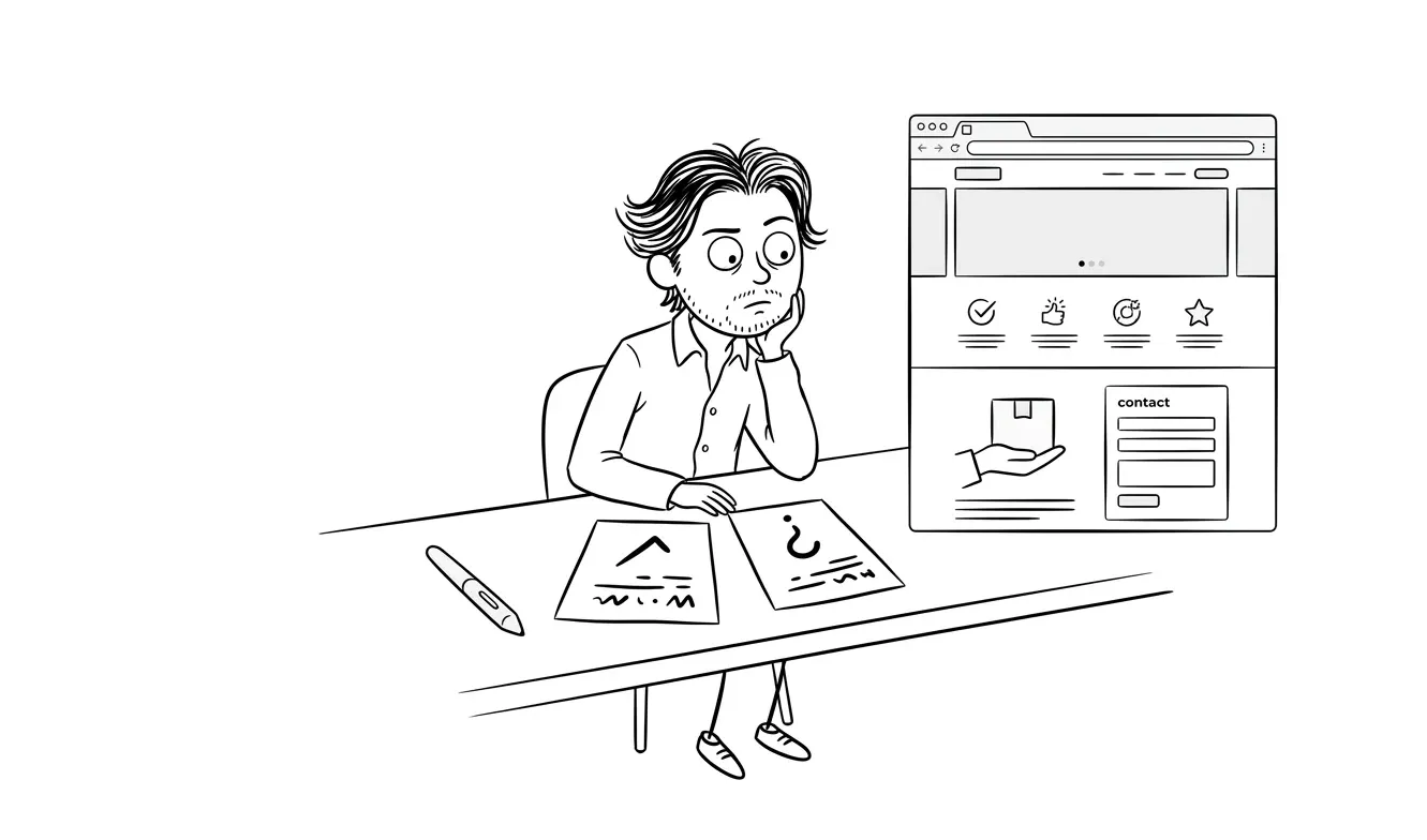
Here’s a simple swap pattern for common service types:
| Generic CTA | Better version | Why it works |
|---|---|---|
| Contact us | Book a free 30-minute call | Specific commitment, low friction |
| Get a quote | Share your project details | Conversational, reduces formality |
| Get started | Start the website redesign | Names the specific outcome |
| Learn more | See how the audit works | Action + specificity |
| Submit | Send project details | Describes what they’re doing |
| Sign up | Claim your free trial | Outcome-first framing |
The pattern is: specificity over vagueness, outcome over action, low commitment over high commitment.
The secondary CTA problem
Most service pages only think about the primary CTA. But a significant portion of visitors aren’t ready to book a call on their first visit. They need a softer on-ramp.
A secondary CTA gives them one. That could be:
- A link to a case study or relevant example
- A “How it works” section anchor
- A PDF download or short guide
- An email list opt-in (“Get the checklist”)
The goal isn’t to distract from the primary CTA. It’s to capture intent from visitors who aren’t ready yet, so you have a way to reach them when they are.
Place secondary CTAs lower on the page. Keep them visually soft. And make sure they serve a real purpose, not just filling space.
Common CTA mistakes on service landing pages
Using “we” language on the button. “Request our services” is about you, not the visitor. Reframe around what they get.
Burying the CTA below a wall of copy. If a visitor has to read 800 words before they find a button, most won’t make it. Put the CTA early and repeat it.
Making the form the hero. A form above the fold before any value has been established creates friction. Earn the click first, then ask for information.
Mismatching the CTA to the traffic temperature. Cold paid traffic needs a softer CTA (free consultation, free audit) than warm referral traffic, who might be ready to book immediately. Consider the source when you pick your offer.
Forgetting the mobile tap target. A button that looks fine on desktop can be nearly un-tappable on a phone. Test on a real device, not just a browser resize.
Using animations that delay the button. Fade-in animations on CTAs might look nice in a design tool. In practice, if a visitor reaches the CTA before the animation completes, they miss it. Keep CTAs static or use instant-on animations.
How to test your landing page CTA checklist for service businesses
Running through the checklist once is a good start. But the real value comes from treating it as a repeatable diagnostic rather than a one-time task.
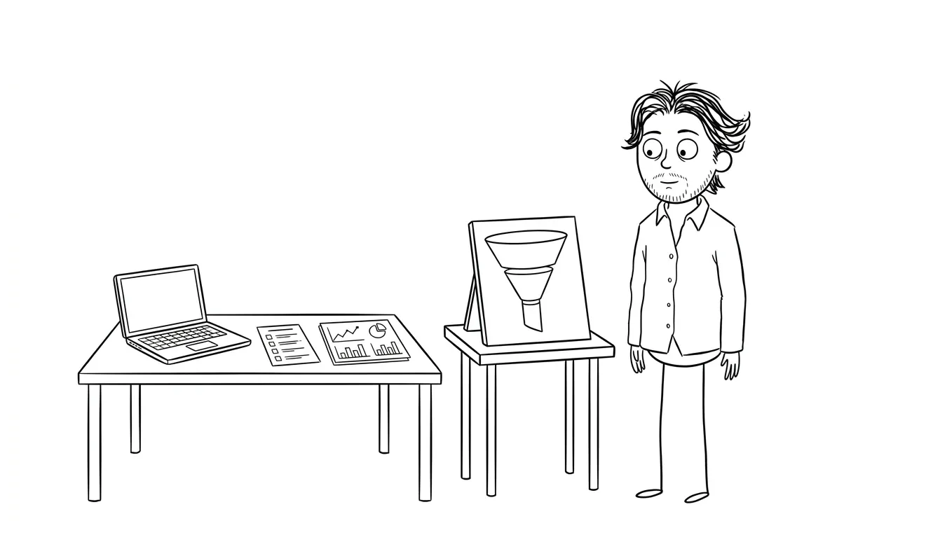
Here’s a practical testing sequence:
- Read the button copy out loud. If it sounds robotic or vague, rewrite it. You’re testing for natural language, not just word count.
- Load the page on your phone. Not a browser preview. Your actual phone. Can you tap the button without pinching? Does the form work without horizontal scrolling?
- Check the fold on three screen sizes. Desktop wide, laptop, and mobile. The primary CTA should be visible on all three without scrolling.
- Fill out the form yourself. Every field. Submit it. Check the success state. Read the confirmation email if there is one. Fix anything that feels off.
- Ask someone unfamiliar with your business to find the CTA. Watch where they look. Watch where they hesitate. That hesitation is a data point.
- Check your analytics for drop-off. If visitors are reaching the CTA section but not converting, the problem is in the CTA itself. Copy, contrast, or friction. If they’re leaving before reaching it, the problem is earlier on the page.
The landing page conversion audit checklist goes deeper on the full page diagnostic. But if CTA conversion is your specific problem, this six-step sequence narrows it down fast.
What to do after you find a problem
Don’t fix everything at once. Pick the single highest-impact change, make it, and give it enough traffic to read clearly before touching anything else. Two changes at once means you don’t know which one worked.
If the copy is vague, fix the copy first. Copy changes are free and fast. If placement is the issue, move the button before changing anything else. If the form is causing drop-off, reduce fields before adding a privacy note.
Small, isolated changes tell you more than a full page overhaul.
When to audit your existing CTA instead of rebuilding the page
If your page has reasonable traffic and a low conversion rate, the CTA is often the highest-leverage fix. Not a rebrand, not new photography, not a full redesign.
A focused audit can tell you exactly where the CTA is failing. Is it the copy? Placement? Friction in the form? Misalignment with the offer? These are distinct problems with distinct fixes.
Want a focused look at your landing page CTA? A conversion-focused audit covers exactly this kind of friction. It’s $500, audits one lens at a time, and the fee credits 100% toward the full landing page build if you move forward within 30 days. Start with the audit.
The landing page design and build service at dee.agency is a flat $3,000 for a complete, conversion-optimized page, CTA strategy included. But if you’re not sure what’s wrong, the audit is the right starting point.
Frequently asked questions
What should a CTA button say on a service landing page?
It should describe what happens next in specific terms. “Book a free 30-minute call” works better than “Contact us” because it sets expectations and reduces the perceived commitment. Keep it under six words and make it outcome-focused.
How many CTAs should a landing page have?
One primary CTA, repeated at least twice: once above the fold and once at the bottom. On long pages, add a third in the middle. All primary CTAs should point to the same action. A secondary CTA for visitors not ready to convert yet is fine, but it should be visually subordinate.
Where should the CTA be placed on a landing page?
Above the fold is non-negotiable for the first placement. A visitor should see a clear next step without scrolling. Repeat it at the end of the page for visitors who read through. On pages longer than three screen-lengths, a mid-page placement helps too.
What’s the difference between a primary and secondary CTA?
A primary CTA drives the main conversion action, typically booking a call or submitting an inquiry. A secondary CTA captures visitors who aren’t ready yet, through a softer offer like a guide download or a “how it works” link. The key is visual hierarchy: primary is prominent, secondary is subtle.
How do I reduce friction on a landing page CTA?
Ask for as little information as possible before value is established. A name and email is usually enough for an initial inquiry. Add a privacy note near the form. Make the success state clear so people know what happens after they submit. And on mobile, make sure fields and buttons are large enough to tap comfortably.
What is the best CTA for a freelancer or solo studio service page?
“Book a free call” or “Share your project details” both work well. They’re low commitment, specific, and conversational. Avoid “Submit” or “Get started” as standalone phrases since they don’t communicate what the visitor is agreeing to. Match the CTA copy to the offer you’re describing in the paragraph just above it.
Ready to fix your landing page CTA?
If your page has traffic but not enough conversions, a focused audit will find where it’s breaking down. Or if you’re starting from scratch, the landing page design and build service at dee.agency includes full CTA strategy at a flat $3,000.

Got a project worth shipping? Send the brief.
Quote and kickoff date back in a day, usually faster. If it's not a good fit I'll say so.