Landing page hero section checklist before you build
A practical landing page hero section checklist for founders: headline clarity, CTA, social proof, mobile layout, and load speed before you build.
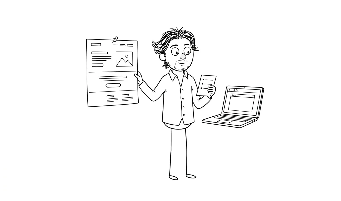
A landing page hero section checklist helps you verify the most important screen on your page before a single pixel gets designed. The hero, roughly the first thing visitors see before scrolling, either earns the click or loses it. This checklist covers the eight things founders and small teams need to confirm: a clear headline, a specific subhead, one primary CTA, relevant visual, social proof, mobile layout, load speed, and audience-to-message fit. Get these right first, and everything downstream gets easier.
Why the hero section deserves its own checklist
Most landing page advice treats the page as one long document. The hero is just another section. That’s the wrong frame.
The hero is doing something no other section has to do: it’s convincing a stranger to stay. If it doesn’t work, nothing below it gets read. No testimonials, no feature list, no pricing, none of it.
That’s why the landing page hero section checklist matters as its own artifact, separate from a full wireframe review. You can have a mediocre bottom section and still convert. You can’t have a weak hero and expect the rest of the page to save you.
Founders usually focus on the wrong things here. They spend time on color palettes, hero images, and button shadows. The harder problem, and the one that actually affects conversion, is whether a first-time visitor can answer three questions in under five seconds:
- What is this?
- Who is it for?
- What do I do next?
If they can’t, the page is broken. Not visually. Functionally.
Let’s go through the checklist item by item.
The landing page hero section checklist: eight things to verify
1. Headline clarity
Your headline should answer “what is this?” in plain language. Not clever language. Not brand language. Plain language.
A good test: read it to someone who’s never heard of your product. Ask them what they think it does. If they get it right, you have a working headline. If they look confused or ask a follow-up question, you have a clarity problem.
Common failure modes:
- Too much jargon (“AI-powered workflow orchestration for modern teams”)
- Too abstract (“The future of how you work”)
- Trying to be clever before being clear (“Work less. Do more.”)
Clear beats clever every time, especially for early-stage products where brand recognition is zero.
Visitors decide in seconds whether to keep reading. If your headline requires context they don’t have yet, they’re gone.
2. Subheadline specificity
The subheadline is where you add the detail the headline omitted. It’s not a second headline. It’s a clarifier.
A good subheadline tells the reader: who this is for, what problem it solves, and what makes it different, without trying to do all three in one sentence. Pick the one or two that matter most for your audience.
If your headline is “Hire designers who ship,” a subheadline like “Flat-fee design and development for founders who need to move fast” adds specificity: audience (founders), need (speed), format (flat-fee). That’s doing real work.
If your subheadline is essentially a rephrasing of the headline, cut it and write a new one.
3. Single primary CTA
One button. One action. That’s it.
The hero is not the place for “Get started” and “Watch the demo” and “See pricing” sitting next to each other. Multiple CTAs in the hero split attention and reduce conversion. Pick the one action you most want a first-time visitor to take.
What that action is depends on your sales model. If you’re trying to collect emails, the CTA is the signup. If you’re running demos, it’s “Book a demo.” If you’re selling direct, it’s “Buy now” or “Start free.”
The button label also matters. “Get started” is vague. “Start your free trial” is specific. Specific outperforms vague almost every time because the reader knows exactly what happens when they click.
Check:
- Is there exactly one primary CTA in the hero?
- Does the label describe what the reader gets, not just what they do?
- Is it visually dominant? Can you find it in two seconds?
4. Audience match
This one gets skipped constantly. Your hero might be clear and specific and have a great CTA, and still fail because it’s talking to the wrong person.
Ask: who is actually landing on this page? Where are they coming from? What do they already know? What do they need to see to feel like this is for them?
A founder landing from a LinkedIn ad is in a different mental state than someone finding you via Google. The hero should reflect who you’re expecting. If you’re running paid traffic, your hero needs to match the promise of the ad that brought them there. If you’re relying on SEO, your hero needs to match the intent behind the search.
This is called message-to-market match, and it’s one of the most common places landing pages quietly fail. The product is real. The copy is fine. But it’s written for a slightly different person than the one actually showing up.
Audience match matters as much as copy quality. The clearest headline in the world won’t convert if it’s speaking to the wrong visitor.
5. Social proof placement
Social proof in the hero isn’t mandatory. But if you have it, it needs to be in the right place and the right format.
What works in the hero: logos of recognizable customers, a short specific testimonial (one sentence, with a real name), a stat with clear context (“trusted by 4,000 product teams”), or a recognizable media mention.
What doesn’t work: long testimonials, generic statements (“customers love us”), or proof that requires the visitor to already know what your product does.
Place proof right below or beside the CTA, or directly below the headline. It should reinforce the claim the headline just made, not introduce a new one.
If you don’t have proof yet, that’s fine. Don’t fabricate it and don’t use placeholder text. Just skip it for now and come back when you have something real.
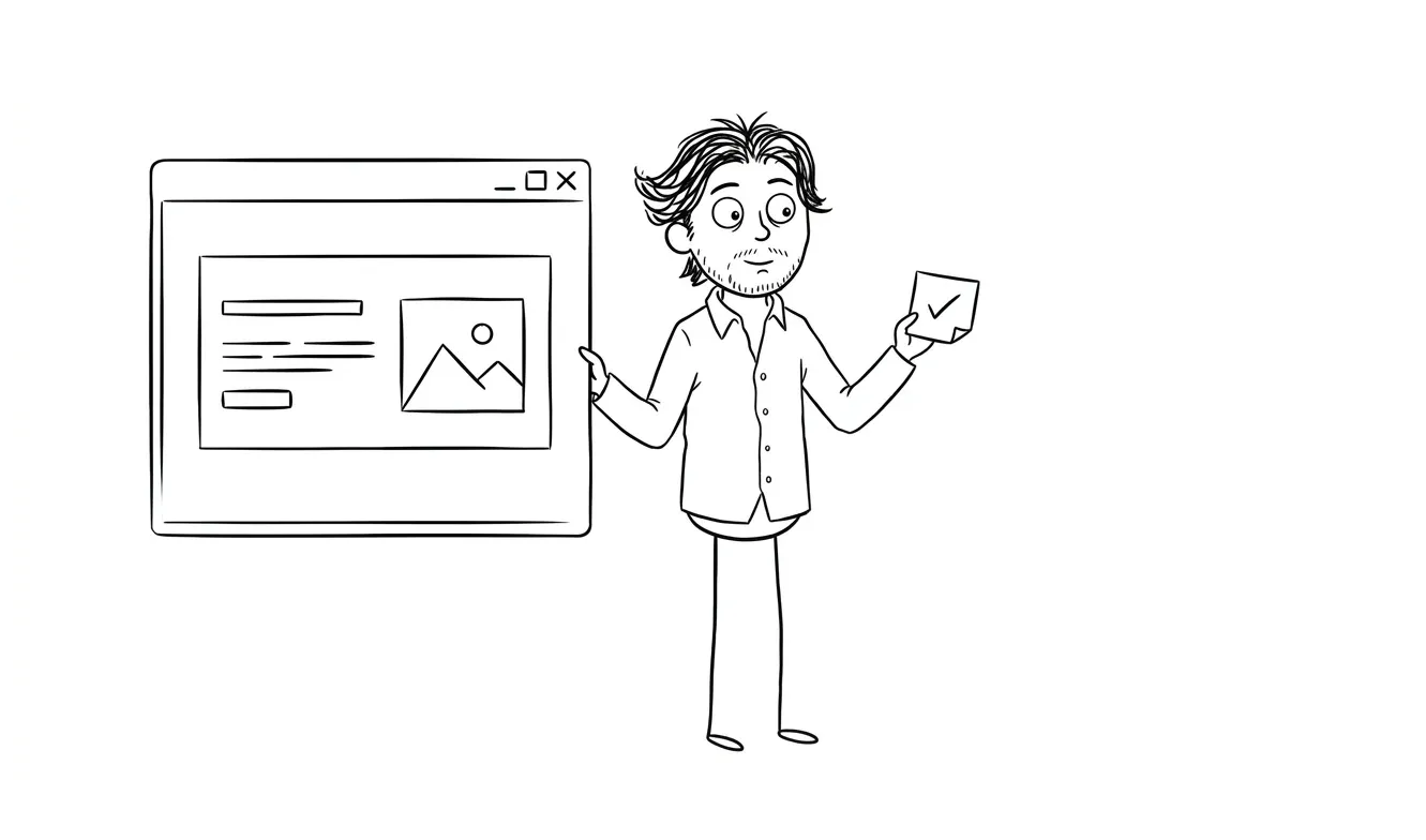
6. Visual relevance
Hero visuals serve one job: reinforce what the words just said.
A product screenshot is usually better than a stock illustration. A screenshot of the key feature, properly labeled, helps the reader understand what they’re getting. A vague abstract graphic does almost nothing.
Before you pick a visual, answer this: what does this image add that the headline and subheadline don’t already communicate? If the answer is “nothing,” find a different image.
Also check whether the visual causes layout problems. A full-width hero image that buries the headline on mobile is a real problem. The visual should support the message, not compete with it.
7. Mobile layout
Pull up your hero on a phone. Not in a browser emulator. On an actual phone.
Check:
- Is the headline fully visible without scrolling?
- Is the CTA button tappable? (Apple recommends a minimum tap target of 44x44 points)
- Does the visual make the text harder to read?
- Does the layout still make sense without the desktop side-by-side arrangement?
Mobile isn’t a nice-to-have. Many visitors will land on your page from a phone, especially from ads, social, email, and search. If the hero breaks on mobile, you’re losing those visitors before they read a word.
This step gets skipped in the wireframe phase and caught late in development, which is more expensive to fix. Check it early.
8. Load speed on first screen
The hero needs to load fast. Not “pretty fast.” Noticeably fast.
The biggest culprit is usually the hero image. A 4MB hero image loaded at full resolution is killing your conversion before the headline even renders. Use a modern format (WebP or AVIF), size images appropriately for the viewport, and use lazy loading for everything below the fold.
Run your page through Google PageSpeed Insights and look at the Largest Contentful Paint score. That metric specifically measures how fast your main hero content becomes visible. A score above 2.5 seconds is a problem you need to fix before launch.
You can also check web.dev/lcp for a deeper explanation of what the LCP metric measures and how to improve it.
When to run this checklist
Run it before design, not after. This checklist is most useful as a pre-design sanity check, when you’re deciding what the hero should say and show, before you hand anything to a designer or open Figma yourself.

If you’re redesigning an existing page, run it against the current version first. That tells you what’s actually broken versus what just looks outdated. Those are different problems and they have different solutions.
I’ve written a more detailed landing page wireframe checklist that goes into structure across the full page. The hero checklist here is the focused version for the one section that matters most.
And if you want a broader look at what actually drives landing page performance, the article on what makes a landing page convert covers the conversion fundamentals beyond just the hero.
What to do when you find a problem
If you run through this checklist and find issues, the path forward depends on how many you found and how severe they are.
One or two issues, like a weak headline or a vague CTA label, are copywriting fixes. You don’t need a redesign. Rewrite the headline, test the new version, see if metrics improve.
Three or more issues, especially if they involve structure (layout, mobile, load speed, audience match), usually mean the hero needs to be rebuilt rather than patched. Small edits on top of a broken structure tend to produce marginal improvements at best.
If you’re not sure which category you’re in, a focused audit is a useful middle step. Dee Agency’s Audit + Spec service is designed exactly for this: one focused lens on your page, delivered as a clear diagnosis with prioritized recommendations. It’s $500 and the full amount applies toward a landing page build if you book within 30 days.
That service is worth doing before you commit to a redesign, because a redesign that doesn’t fix the actual problem is expensive and frustrating.
The hero section as a forcing function
There’s a useful way to think about the hero checklist that goes beyond conversion optimization. Forcing yourself to answer these eight questions clearly is also forcing yourself to get clear on your product positioning.
What does this actually do? Who is it actually for? Why would someone choose it over alternatives?
If you can’t answer those questions clearly enough to write a good hero, the problem isn’t the hero. The problem is the positioning. That’s harder to fix and more important to fix, because no amount of design work will patch unclear positioning.
The checklist is the fast version of that conversation. If every item checks out, you have a solid hero and probably solid positioning behind it. If the checklist surfaces confusion, you’ve found something worth resolving before you build anything.
Need a second pair of eyes on your hero section? A focused landing page audit at dee.agency costs $500 and gives you a clear picture of what’s working and what to fix. Share a note about your page.
Frequently asked questions
What should a landing page hero section include?
A landing page hero section should include a clear headline, a specific subheadline, one primary CTA, a relevant visual, and optionally a single line of social proof. All of these need to work together to answer three questions in under five seconds: what is this, who is it for, and what do I do next.
How long should a landing page headline be?
Aim for six to twelve words. Longer headlines can work, but they need more scanning time that many visitors won’t give. The goal is immediate clarity, and shorter usually gets there faster. Test against the “explain to a stranger” rule: read it aloud and see if someone unfamiliar with your product understands what you’re selling.
Should I have two CTAs in my hero section?
Generally, no. One primary CTA performs better because it focuses attention. If you have a strong secondary action, like a demo video, consider placing it below the fold or using a less prominent design treatment so the primary button stays dominant.
How do I know if my hero section is working?
The simplest signal is bounce rate combined with scroll depth. If visitors land and leave immediately without scrolling, the hero is failing. You can also run user tests using tools like Maze or UsabilityHub to see whether people can answer the three core questions after seeing the hero for five seconds.
What image works best in a landing page hero?
Product screenshots tend to outperform abstract illustrations because they show the visitor what they’re getting. If your product is physical, use a real product photo. If it’s a service, a supporting image that matches the tone of your headline works. Avoid stock photos that feel generic or unrelated to the product.
When should I hire someone to rebuild my landing page hero instead of fixing it myself?
If you’ve iterated on the copy and structure multiple times and conversion isn’t improving, it’s worth getting outside help. A landing page design and build from someone with conversion experience will usually surface issues that are hard to see when you’re too close to the product. A focused audit first is a good way to know exactly what needs fixing before committing to a full build.
Ready to fix your hero section?
If you’ve run through this checklist and know your hero needs work, two options make sense depending on where you are.
If you want clarity before committing to a full build, the Audit + Spec service at dee.agency gives you a focused diagnosis for $500, credited 100% toward a follow-on build within 30 days.
If you already know what needs fixing and want it done, the landing page design and build is a flat-fee service that covers design, copy structure, and development.
Either way, start with a quick note about your page and we’ll figure out the right next step.

Got a project worth shipping? Send the brief.
Quote and kickoff date back in a day, usually faster. If it's not a good fit I'll say so.