

Landing page mobile checklist
A practical mobile checklist for service businesses to run before landing page design starts: CTAs, tap targets, forms, load speed, and more.
A landing page mobile checklist for service businesses covers everything you need to lock down before design starts: tap targets, load speed, above-the-fold clarity, form fields, trust signals, and CTA placement. Running this checklist before you brief a designer saves you revision cycles and means the build doesn’t need to be re-done once real users start reviewing it on small screens. Dee Agency’s Landing Page Design & Build service handles all of this, but if you want to audit first, a $500 focused audit is the right starting point.
Why mobile comes first in the checklist, not last
Most service businesses build their landing pages on desktop. They review on desktop. They approve on desktop. Then they launch and realize the form is impossible to fill out with a thumb and the hero CTA is buried below two paragraphs of copy.
Mobile isn’t an edge case for service businesses. Your prospective clients are reading your page on their phones while waiting in line, during a commute, or right after someone mentions you in a conversation. The moment they land on a broken or frustrating mobile experience, they’re gone.
The point of a pre-build checklist isn’t to design twice. It’s to make one set of decisions that works at every screen size, from the start.
Before you brief a designer or open Figma, run through this checklist. It’ll save you from the most common mobile problems that don’t get caught until the page is already built.
The landing page mobile checklist for service businesses: what to check before design
This checklist is organized by the order things get designed. Start with structure and content, then move into layout decisions, then interaction details.
1. Define your primary CTA before layout
On mobile, you get one prominent call to action. Two competing CTAs on desktop often becomes a cluttered, scrollable mess on a small screen.
Before design starts, answer this:
- What is the single action you want someone to take from this page?
- Is it a form submission, a phone call, a booking link, or an email?
- Can that action be completed on a phone in under 60 seconds?
If your CTA requires someone to fill out a 10-field form, that’s a problem to solve before the designer touches it. Reduce the fields. A landing page contact form should ask for name, email, and one qualifying question at most. Read through the landing page form checklist before you finalize what you’re asking for.
2. Audit your copy length at every section
On mobile, every extra sentence scrolls. Long paragraphs that look fine on a 27-inch monitor become walls of text on a phone.
Check each content section:
- Hero headline: Can it fit in two lines on a 375px screen?
- Subheadline: Is it one sentence or two, max?
- Body copy blocks: Are any of them longer than three sentences?
- Feature/benefit list: Can each item be expressed in under 10 words?
If the answer to any of those is no, cut before design starts. The designer can’t fix a copy problem with visual design.
3. Confirm your trust signals are mobile-ready
Trust signals on landing pages include logos, testimonials, credentials, and social proof. On mobile, they need to work in a single-column stack.
Check your trust signal content before design:
- Do you have testimonials? Are they short enough to read without scrolling for 30 seconds?
- Do you have logos? Are they vector files that render cleanly at small sizes?
- Are credentials or certifications visually simple or do they rely on complex badge designs?
A row of six client logos that looks sharp on desktop becomes a jumbled, illegible row on mobile if they aren’t prepared as clean SVGs. Sort this out before the designer has to improvise.
4. Check that your imagery works in portrait orientation
Hero images, service illustration photos, and headshots all behave differently on mobile. A landscape image that frames a subject beautifully on desktop often crops to a torso or background on mobile.
Before briefing:
- Do you have a mobile-ready version of your hero image, or is the subject centered so cropping works?
- If using a headshot for a personal brand service page, does it work as a square or portrait crop?
- Are any images decorative enough to be hidden on mobile without losing meaning?
This is one of the decisions that costs the most revision time if it gets skipped. Sorting the image assets before design starts means you won’t be hunting for a re-cropped photo three days into the project.
Load speed decisions that belong in the pre-build checklist
5. Decide on video before design
Autoplay background video is a desktop pattern. On mobile, it drains battery, slows load time, and often gets paused automatically by the browser anyway.
If your current brief includes a video hero:
- Is it serving a real purpose or is it aesthetic?
- Can a well-chosen static image do the same job?
- If video is essential, is there a static fallback for mobile explicitly planned?
Google’s PageSpeed documentation is clear that render-blocking resources are a primary cause of poor load scores. Autoplay video almost always contributes to this. Make the call before design, not after someone runs a Lighthouse audit on the finished page.
6. Plan your font load strategy
Custom fonts add HTTP requests and increase time-to-first-content. On mobile networks, that delay is more noticeable.
Ask before the designer picks a font stack:
- Does the brand require a specific font, or is system font acceptable?
- If a custom font is required, is it available via Google Fonts (fast CDN) or does it require a self-hosted file?
- Are you loading more than two font weights? If so, can you get to two?
These are design system decisions that look small but affect real-world mobile performance. They’re much easier to make before a visual design exists than after.
7. Confirm image format requirements with your developer
If you’re working with a developer on the build (or using a builder like Framer or Webflow), confirm ahead of time that images will be served as WebP with JPEG fallbacks, and that there’s a plan for responsive image sizes.
If you’re using a platform that doesn’t handle this automatically, you’ll need to prepare multiple image sizes. That’s a production task that belongs in the brief, not in a post-launch fix.
Interaction and touch decisions for the mobile checklist
8. Tap target sizing
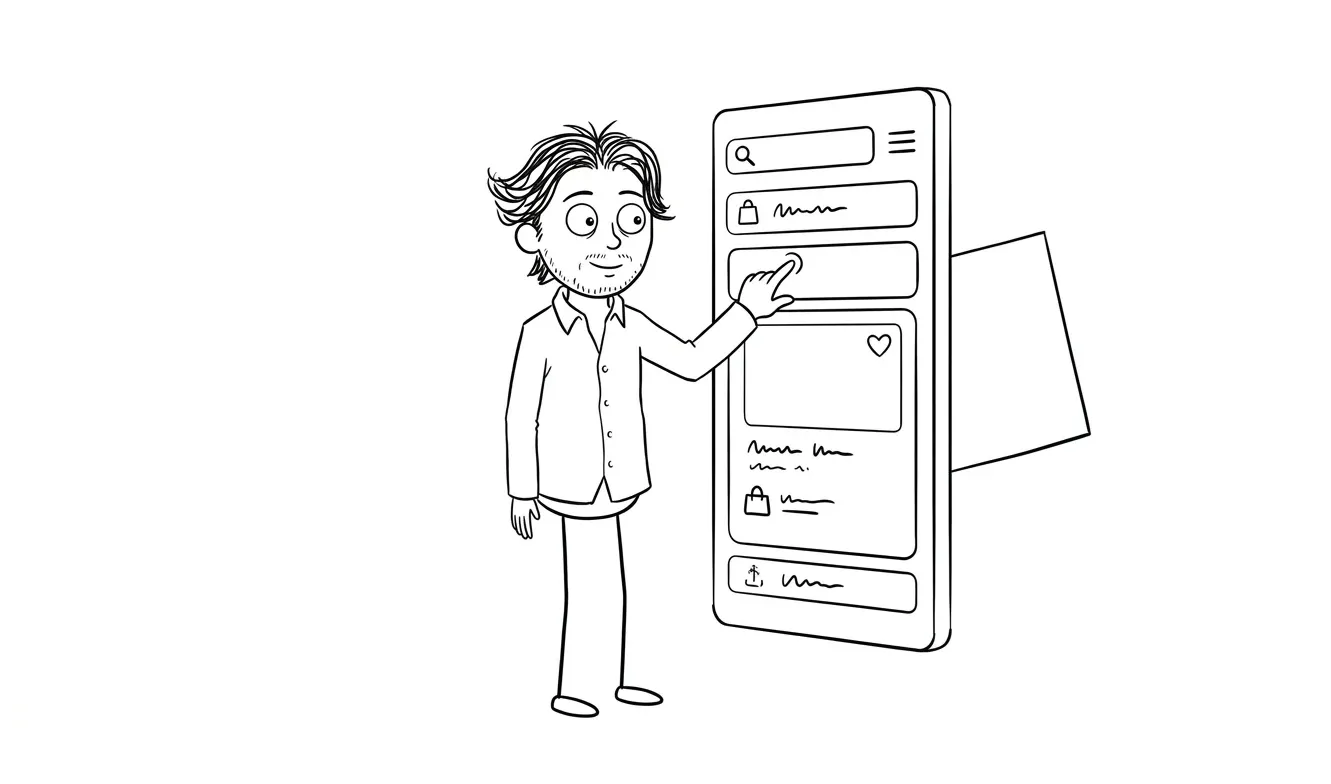
Buttons, links, and form inputs need to meet minimum tap target requirements. Google recommends tap targets of at least 48x48px with 8px of spacing between them.
Before design starts, flag any elements that might be problems:
- Inline text links in body copy (they’re almost always too small to tap reliably)
- Multiple CTAs close together
- Small print links like “privacy policy” or “terms” that sit near the main CTA
The designer needs to know tap sizing is a constraint, not an afterthought.
9. Form input types
On mobile, the keyboard that appears depends on the input type set in the HTML. If a phone number field is typed as text rather than tel, users get a full QWERTY keyboard instead of a number pad. That’s friction that costs conversions.
Before briefing your form requirements, specify:
- Phone number fields:
type="tel" - Email fields:
type="email" - Number fields:
type="number" - Date fields: either
type="date"or a purpose-built mobile date picker
This is a build concern, but it belongs in the brief because it affects how the form gets designed and specced. If you’re building on Webflow or a similar platform, some of these are handled automatically. On custom builds, they’re not.
10. Sticky CTA or scroll behavior
On long-form service pages, a sticky CTA bar at the bottom of the screen can significantly improve mobile conversion. But it requires a layout decision upfront.
Before design:
- Is your page long enough that a sticky CTA makes sense (more than three screen-lengths)?
- Does the sticky bar conflict with any browser UI (bottom navigation on Safari, for example)?
- What copy goes in the sticky bar? Is it the same CTA as the hero or a softer prompt?
If you want a sticky CTA, put it in the brief. If the designer doesn’t know about it, they’ll design a layout that doesn’t account for it.
Content hierarchy decisions for mobile
11. Check your above-the-fold hierarchy
On mobile, “above the fold” means what’s visible without scrolling on a 667px screen (roughly an older iPhone size). That’s not much space.
Run through the landing page above-the-fold checklist for a thorough review, but the core questions are:
- Is your headline immediately clear about what you offer?
- Is there a visible CTA without scrolling?
- Is there at least one trust signal (a credential, a logo, or a brief proof point) visible without scrolling?
If any of those are missing, the layout needs to be restructured before design starts, not after.
12. Navigation decisions
Most high-converting service landing pages have no navigation at all, or a stripped-down header with just the logo and one CTA button. Full site nav on a landing page gives people an exit route before they’ve converted.
On mobile, nav adds even more friction. A hamburger menu that opens a slide-out with seven links is the last thing someone who landed from an ad needs to see.
Decide before design:
- Does this page have navigation or not?
- If yes, what’s in it?
- On mobile, is it hidden, simplified, or converted to a sticky CTA?
13. Footer content
Footers on service landing pages can be minimal. But they need to include legal links on mobile the same as desktop.
Check:
- Are the footer links large enough to tap reliably?
- Does the footer contain anything that competes with the CTA?
- Is any footer content critical enough that removing it on mobile would be a problem?
Technical requirements to confirm before build
14. Confirm your build platform handles mobile by default
Webflow, Framer, and Astro all handle responsive design, but they do it differently. Some platforms require you to explicitly design a mobile breakpoint. Others auto-reflow content.
Before briefing:
- What platform is the page being built on?
- Does it require manual mobile design or does it handle reflow automatically?
- Who is responsible for QA on mobile: the designer, the developer, or you?
15. Define your testing devices
“Looks good on mobile” means different things to different people. Before build starts, agree on what devices you’re testing on.
Practical minimum:
- iPhone SE (small screen, common)
- iPhone 14 Pro (current standard)
- Android mid-range (Chrome browser behavior differs from Safari)
If you’re using a builder with a mobile preview mode, that preview is not a substitute for testing on a real device. Specify that real device testing is part of QA.
Pulling the checklist together before you brief a designer
This checklist isn’t about making your designer’s job harder. It’s about making the brief specific enough that the first design pass is close to right.

The most expensive mobile problems are the ones that get caught after the page is already built. A CTA that can’t be tapped, a form that loads the wrong keyboard, a hero image that crops to nothing on a small screen. All of them are avoidable if you run through this before anything gets designed.
If you’re not sure what your specific page needs, that’s what the Audit + Spec service is for. It’s a $500 focused diagnostic that identifies the real problem before work starts. The fee is credited in full toward the follow-on build if you move forward within 30 days.
And if you’re ready to build, the Landing Page Design & Build service at $3,000 covers everything in this checklist from brief to launch, responsive across all breakpoints.
Need a mobile-ready landing page for your service business? Dee Agency’s Landing Page Design & Build is a flat-fee $3,000 service that handles design, copy structure, and responsive build. Start the conversation.
Frequently asked questions
What should a mobile landing page checklist cover for service businesses?
A mobile landing page checklist should cover CTA clarity, copy length, tap target sizing, form input types, image cropping, load speed decisions (video, fonts, image formats), above-the-fold hierarchy, navigation, and build platform requirements. Running through these before design starts prevents the most common revision cycles.
How many form fields should a mobile landing page have?
Three fields or fewer is the practical target for mobile: name, email, and one qualifying question. Every additional field increases friction, and that friction costs more on mobile than desktop because typing on a phone is slower and more error-prone.
Does navigation hurt mobile landing page conversions?
Generally, yes. Full site navigation on a landing page gives visitors an exit route before they’ve converted. On mobile, a hamburger menu opening a full nav is especially disruptive. Most high-converting service landing pages use a simplified header with a logo and one CTA button, or no navigation at all.
What tap target size does Google recommend for mobile?
Google recommends tap targets of at least 48x48 pixels with 8 pixels of spacing between them. Buttons, links, and form inputs smaller than this are statistically harder to tap accurately and lead to user errors and frustration. This applies to inline text links and footer links as well as main CTAs.
When should I run a mobile audit before building a landing page?
Before you brief a designer. If you’re not confident about what your page needs, a focused audit helps define the problem first. Dee Agency’s Audit + Spec is a $500 service that audits one focused lens and is credited toward follow-on work if you proceed within 30 days.
What’s the difference between mobile-friendly and mobile-first design?
Mobile-friendly means the desktop design was adapted to work on mobile. Mobile-first means the mobile layout was designed first and then expanded for larger screens. For service landing pages, the practical difference is in hierarchy: mobile-first design forces you to decide what’s most important because you have the least space to work with.
Ready to build a landing page that works on every screen?
The Landing Page Design & Build service at dee.agency is a flat-fee $3,000 service covering everything from copy structure to responsive build. If you want a diagnostic first, the $500 Audit + Spec finds the real problem before any design work starts.
Tell us about your project and we’ll figure out the right starting point.

Got a project worth shipping? Send the brief.
Quote and kickoff date back in a day, usually faster. If it's not a good fit I'll say so.