
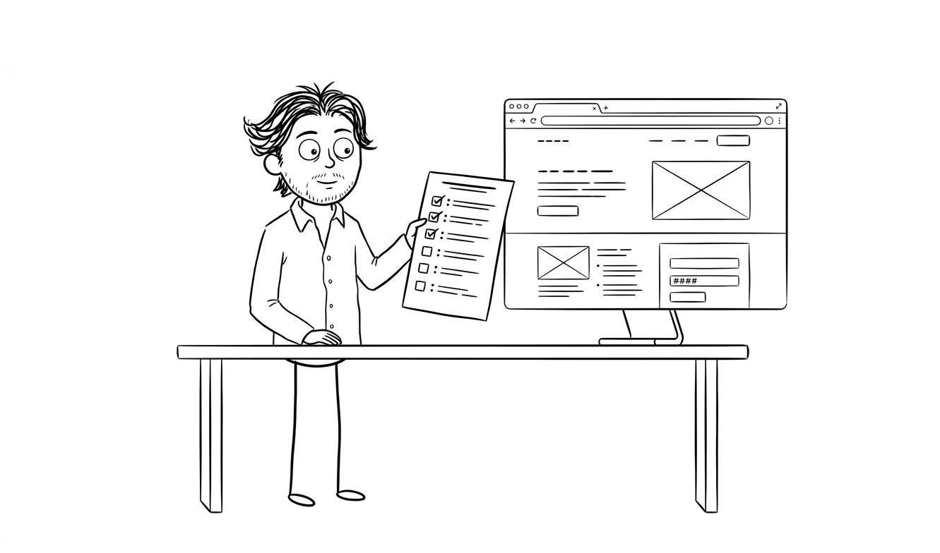
Above-the-Fold Landing Page Checklist
A practical above-the-fold landing page checklist for service businesses: headline, CTA, trust signals, mobile, and visual hierarchy covered.
The above-the-fold section of your landing page is the most important real estate on your site. For service businesses and founders, a practical above-the-fold landing page checklist covers five things: a clear headline that names who you help and what they get, a supporting subheadline with one concrete detail, a single visible CTA, a trust signal, and a hero image or visual that reinforces the offer. Get those five right and the rest of the page has a real chance of converting.
Why the fold still matters
Visitors decide within seconds whether to keep reading or leave. That’s not a guess, that’s observable behavior across any analytics tool with scroll tracking. If your headline doesn’t answer “what is this and why should I care,” people don’t scroll down to find out.
This is especially true for service businesses. You’re asking someone to trust a person or team with real work. The above-the-fold section has to earn that scroll.
The fold is your first impression and your last chance if it fails. Every element above it should do one job: make the right visitor want to stay.
The checklist below is structured in the order things visually appear and in the order they matter for conversion. Work through it before you design, before you write copy, and before you ship.
The above-the-fold landing page checklist for service businesses
Navigation (or lack of it)
- Is navigation minimal or removed? Fewer links above the fold means fewer exits before the CTA.
- If you do include nav links, do they serve the page goal or distract from it?
- Is there a “sticky” CTA or a CTA in the nav for visitors who scroll back up?
Most service landing pages benefit from stripped-back navigation. If you’re running ads to the page, remove the nav entirely. If it’s your main homepage, a minimal nav with one CTA button is usually enough.
Headline
- Does the headline name who this is for?
- Does it say what the visitor gets or achieves, not just what you do?
- Is it under 10 words? (Longer headlines can work, but they need a reason.)
- Is it written in plain language, not industry jargon?
- Does it pass the “stranger test?” Could someone who’s never heard of you understand it in three seconds?
The headline is the single most important element on the page. Don’t bury the benefit. “Landing pages that convert, built in under two weeks” is clearer than “Innovative digital experiences for ambitious brands.”
If your headline is vague, the rest of the page is fighting uphill. This is the one place where being direct always wins.
Subheadline
- Does it add one specific detail the headline couldn’t fit?
- Does it address an objection, add a qualifier, or name a concrete result?
- Is it noticeably shorter and visually lighter than the headline?
- Does it avoid repeating the headline in different words?
The subheadline’s job is to deepen the promise, not restate it. “Flat-fee landing page design and code, delivered in 10 business days” is a subheadline that adds real information. “We help you grow your business online” adds nothing.
Primary CTA
- Is there exactly one primary CTA above the fold?
- Does the button label say what happens next, not just “Submit” or “Click here”?
- Is the button visually distinct from the background, text, and any secondary links?
- Is it positioned where the eye lands after reading the headline?
- On mobile, is the CTA visible without scrolling?
“Get started” is okay. “Book a free 20-minute call” is better. “See how it works” is a useful secondary CTA if the visitor isn’t ready to buy, but don’t put two equal CTAs next to each other. Pick one and make it obvious.
Visual hierarchy
- Does the headline read first, subheadline second, CTA third?
- Is there enough contrast between text and background?
- Is the layout clean, or is it cluttered with competing elements?
- Does the visual hierarchy work without the hero image if it fails to load?
Visual hierarchy is how you control where the eye goes. If everything is the same size and weight, nothing is important. Test your page in grayscale: the hierarchy should still be legible. The Web Content Accessibility Guidelines (WCAG) recommend a minimum contrast ratio of 4.5:1 for normal text, which is a useful baseline even if accessibility compliance isn’t your primary goal.
Hero image or visual
- Does the visual reinforce the offer, or is it decorative?
- If you’re using a person’s face, does it face toward the CTA?
- If you’re using a screenshot or product image, is it legible at the sizes it renders?
- Does the visual load fast? Large hero images kill mobile performance.
- Does the alt text describe the image clearly? (This matters for accessibility and crawlers.)
Stock photos of people in suits shaking hands don’t build trust. Screenshots of your actual work do. If you’re a service business, a clean photo of you at work, a before/after result, or a simplified product visual is almost always stronger than generic imagery.
Trust signals
- Is there at least one trust signal visible above the fold?
- Is it specific? (“Used by teams in regulated finance” is clearer than “trusted by clients worldwide.”)
- If you’re using logos, are they recognizable to your target audience?
- If you’re using a testimonial, is it short enough to read in under five seconds?
- Does the trust signal reduce the right objection for this specific offer?
Trust signals don’t need to be flashy. A short quote from a real client, a recognizable logo, a concrete credential, or a relevant proof point can do the job. The key is specificity. Vague social proof doesn’t move anyone.
Specific trust signals convert better than generic praise. A relevant, verifiable proof point beats “great results for our clients” because it addresses the buyer’s actual doubt.
Mobile above the fold
- Does the headline fit on two lines or fewer on a 375px-wide screen?
- Is the CTA button large enough to tap comfortably (at least 44px height)?
- Is there enough breathing room between elements, or is everything crammed?
- Does the hero image shrink gracefully or disappear behind text?
- Does the page load in under three seconds on a mobile connection?
Mobile traffic is often substantial for service businesses, especially when visitors arrive from search, referrals, or social links. If your above-the-fold section only looks good on desktop, you’re probably missing real buyers. Check this in Chrome DevTools or on a real device before you ship. Google’s Core Web Vitals give you a measurable framework for page speed and layout stability, both of which affect how the fold feels to a first-time visitor on a slow connection.
Copy clarity
- Can someone who doesn’t know your business name understand what you do in under five seconds?
- Is the copy about the visitor’s outcome, not your process or credentials?
- Does the page avoid qualifying buzzwords like “innovative,” “holistic,” or “end-to-end”?
- If you mention a price, a timeline, or a specific deliverable, is it accurate and verifiable?
The fastest way to improve a landing page is usually to cut words, not add them. If your headline is 15 words, trim it to 8. If your subheadline has three sentences, pick one. Clarity above the fold builds trust faster than any design tweak.
What to check before the checklist
Before you run through the checklist, you need two things: a clear picture of who the page is for, and a clear understanding of what action you want them to take.
If your answer to “who is this for” is “anyone who needs design work,” the checklist won’t save you. The headline needs to speak to a specific person. A landing page for a founder raising their first round looks different from one for a mid-market ops team evaluating software.
Write those two things down first:
- Who is this page for, specifically?
- What’s the one action I want them to take?
Every element above the fold should serve those two answers.
Common above-the-fold mistakes service businesses make
Headline that describes the company, not the outcome
“Full-service digital agency for growth-oriented brands” tells me about you. “Landing pages that get founders to $1M ARR” tells me what I get. The second one earns the scroll.
Too many CTAs competing for attention
Two equal buttons (“Book a call” and “See our work”) split attention. The visitor ends up choosing between actions instead of taking one. Pick the primary action and make secondary options smaller or lower on the page.
Hero image that loads slowly
A 2MB JPEG of your team doesn’t build trust if it takes four seconds to appear. Compress everything. Use next-gen formats. Google recommends serving images in WebP or AVIF format to reduce file size without visible quality loss. A fast load is a trust signal on its own.
Trust signals that don’t match the offer
Showing B2C testimonials on a page aimed at enterprise buyers doesn’t help. The trust signal needs to match the buyer’s mental model. If you’re selling to founders, a quote from a founder carries more weight than a generic star rating.
Mobile as an afterthought
Designing desktop-first and then “making it responsive” often produces above-the-fold sections that feel cramped on mobile. The headline is too long, the CTA is too small, the image overlaps the text. Check mobile from the start, not at the end.
How to use this above-the-fold landing page checklist effectively
Run through it twice: once before you build (at the wireframe or brief stage) and once before you launch (on the live page, on mobile and desktop).
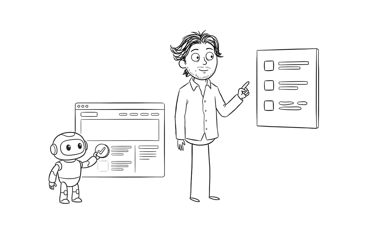
If you’re auditing an existing page, go through each item and mark it as passing, failing, or uncertain. Group the failures by impact. Fix the headline and CTA first. Everything else is secondary.
For deeper guidance on what makes the full page work, not just the fold, the landing page wireframe checklist at dee.agency covers structure from top to bottom. And if you want to understand what actually drives conversions beyond visual structure, what makes a landing page convert goes into the mechanics of copy, offer clarity, and trust.
Want someone to audit your above-the-fold section specifically? The Audit + Spec at dee.agency is a $500 focused audit on one lens, credited 100% toward follow-on work. Tell me what you’re working on.
When the checklist isn’t enough
Sometimes the above-the-fold section passes every checklist item and still doesn’t convert. That usually means one of three things:
The traffic is wrong. Qualified visitors who actually need what you offer will respond to a clear offer. Unqualified traffic won’t, no matter how good the fold is.
The offer is unclear or unconvincing. The headline is technically clear, but the thing being offered isn’t compelling enough. That’s a positioning problem, not a design problem.
The trust gap is too large. The visitor doesn’t have enough context to take action at this stage. The fix might be a case study page, a different entry point, or a lower-commitment CTA.
If you’re working through these and still not sure what’s broken, a focused audit is the fastest way to find it. The Audit + Spec looks at one specific area, gives you a prioritized list of what to fix, and costs $500. That fee is credited toward any follow-on work within 30 days.
For founders who want the whole page designed and built, not just reviewed, the $3,000 landing page design and build service covers everything from brief to deployed code at a flat fee. You can see the full range of services on the services overview.
Frequently asked questions
What should be above the fold on a service business landing page?
Above the fold, you need five things: a headline that names who you help and what they get, a subheadline with one concrete detail, a single primary CTA, at least one trust signal, and a visual that reinforces the offer. Navigation should be minimal or removed if the page is ad-driven.
How long should the headline be on a landing page?
Under 10 words is a useful target. Longer headlines can work if every word earns its place, but shorter tends to perform better above the fold because visitors read it before deciding whether to scroll.
Does the CTA have to be above the fold?
For service businesses, yes, at least one CTA should be visible before the fold. Visitors who are ready to act shouldn’t have to scroll to find out how. Secondary CTAs lower on the page give a path for visitors who need more context first.
How do I know if my above-the-fold section is working?
Set up scroll tracking in your analytics tool. If a large percentage of visitors leave without scrolling past the fold, the headline, offer, or trust signals aren’t landing. Heatmaps and session recordings also show where attention drops off.
What’s the difference between a landing page audit and a full redesign?
An audit diagnoses the specific friction points and tells you what to fix and why. A redesign rebuilds the page based on those findings. If you’re not sure what’s wrong, start with the Audit + Spec at $500 before committing to a full build.
Does the hero image matter for conversion?
It matters more for trust and clarity than direct conversion. A relevant, fast-loading visual reinforces the headline and makes the page feel credible. A generic stock photo does neither. If the image isn’t earning its place, remove it.
Ready to fix what’s above the fold? The $3,000 landing page design and build service is a flat-fee engagement that covers strategy, design, and code. Or start with the $500 Audit + Spec if you want a clear picture of what to fix before building anything. Get in touch to start.

Got a project worth shipping? Send the brief.
Quote and kickoff date back in a day, usually faster. If it's not a good fit I'll say so.