

Landing Page Lead Qualification Checklist
Use this landing page lead qualification checklist to improve inquiry quality with clearer fit criteria, pricing, form questions, and next steps.
A landing page lead qualification checklist helps a service business attract inquiries that match its offer without turning the page into an interrogation. The page should state who the service is for, what it costs, what the buyer receives, and what happens next. The form should then collect only the information needed to decide whether a conversation or another next step makes sense.
Dee Agency’s Landing Page Design & Build is $3,000. That visible price is itself a qualification signal: it lets visitors make an informed decision before submitting a form. Use this checklist to review the full path from offer clarity to confirmation.
What does lead qualification mean on a landing page?
Landing-page lead qualification means helping a visitor determine whether the offer fits before asking them to contact the business. It also means collecting enough context to route the inquiry appropriately.
Qualification is not the same as adding more required fields. A long form can still produce vague inquiries if the page has not explained the service. A short form can produce useful inquiries when the visitor already understands:
- The problem the service addresses
- The type of buyer or project it suits
- The deliverable and boundaries
- The price or a meaningful price anchor
- The expected next step
- Any clear reasons the service may not fit
The page and form should work together. The page answers common fit questions; the form collects the few details that vary by project.
If the page needs broader form QA first, use the landing page form checklist alongside this guide.
1. Define fit before writing the form
Start with an internal definition of a qualified inquiry. Without one, form questions tend to reflect curiosity rather than a real decision process.
Write down the criteria that materially change what happens next. For a fixed-scope landing-page service, those criteria might include:
- The buyer needs one focused landing page rather than a large website
- The project has a defined offer or a clear decision-maker
- The buyer understands the $3,000 service price
- Required brand, product, or offer information can be provided
- The desired launch has enough flexibility for proper review and QA
These are examples of decision criteria, not universal rules. A different service might care about technical access, team ownership, regulatory review, or an existing workflow.
Separate hard constraints from useful context. A hard constraint can make the project impossible or outside scope. Useful context helps prepare for the first response but should not automatically reject an inquiry.
A practical internal table is enough:
| Criterion | Why it matters | Where to communicate it |
|---|---|---|
| Offer type | Prevents scope mismatch | Hero and service overview |
| Price | Sets a real buying threshold | Pricing or offer section |
| Deliverable | Clarifies what is included | Offer section |
| Required inputs | Reveals readiness | Process section and form |
| Timing constraints | Identifies urgent mismatches | FAQ and form |
| Next step | Reduces uncertainty | CTA and confirmation page |
This exercise prevents the form from becoming the first place a visitor discovers essential information.
2. Put qualification information on the page
A visitor should not have to submit personal details to learn the basic terms of the offer. Place the most important fit information where it supports the decision.
Name the buyer and problem
Use direct language about the situation the service addresses. “For teams launching one paid campaign” is more useful than “for ambitious brands.” The first statement helps someone self-select; the second is broad enough to mean almost anything.
Avoid defining the audience through invented proof or exclusionary posturing. The goal is clarity, not making the service sound artificially scarce.
Explain the deliverable and boundary
State what the buyer gets and what the engagement does not cover. For example, a landing-page build may include strategy, copy, design, code, and deployment while remaining distinct from a multi-page website or an ongoing marketing retainer.
Boundaries prevent a qualified buyer from arriving with a different mental model. They also make the CTA feel safer because the visitor knows what the conversation is about.
Show the price
Visible pricing is one of the clearest qualification tools for a productized service. Dee Agency’s Landing Page Design & Build is $3,000. A visitor can evaluate that amount before investing time in a form.
If a service cannot use one fixed price, explain the pricing model or a genuine starting point. Do not publish a range so broad that it avoids giving useful information. The purpose is to support a decision, not merely satisfy a pricing-section convention.
For a deeper review, the landing page pricing section checklist covers placement, inclusions, exclusions, and CTA alignment.
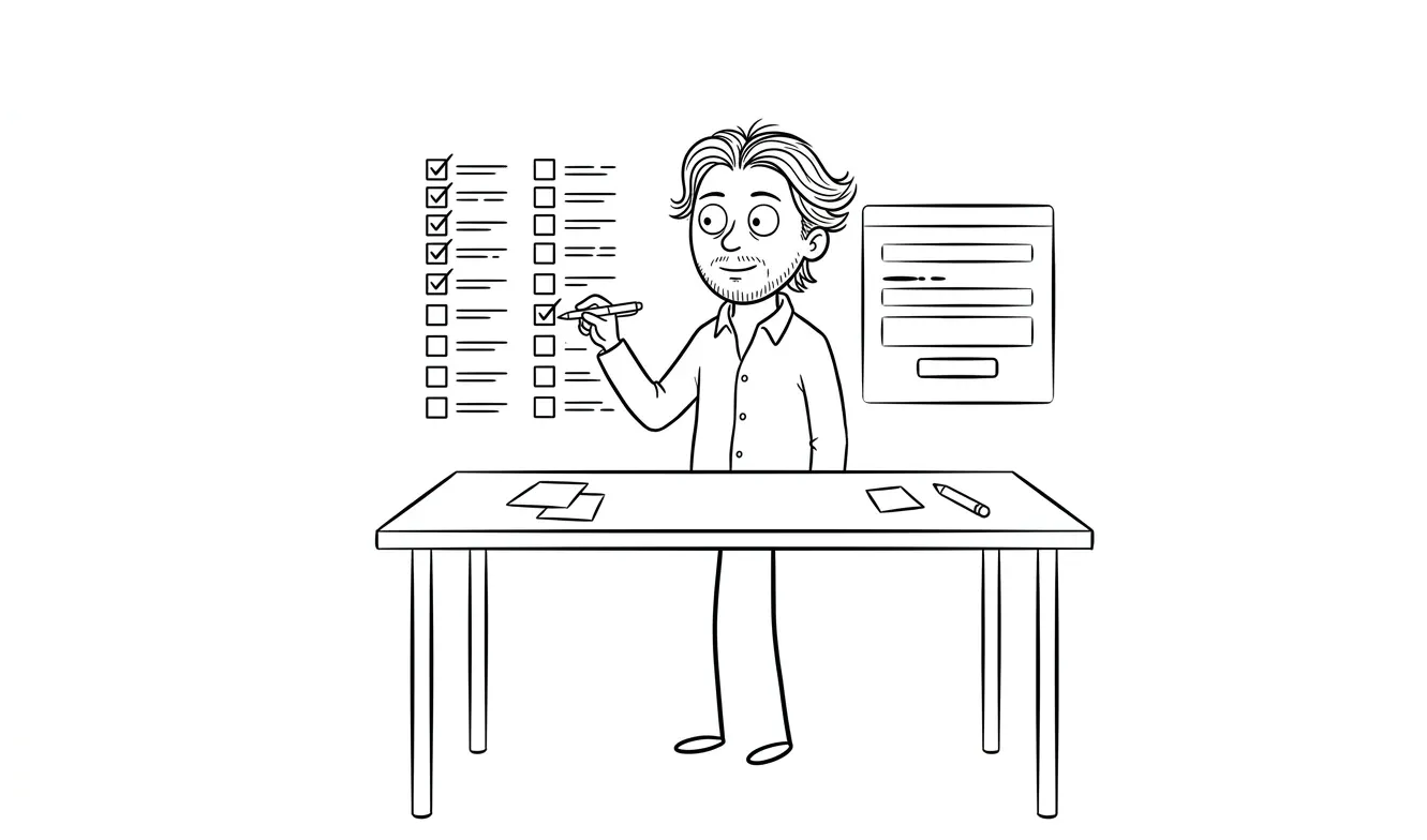
3. Ask only decision-useful form questions
Every required question should have a job. Before adding a field, complete this sentence:
The answer changes our next step by ______.
If there is no clear answer, the field may belong in a later conversation or may not be needed at all.
A useful service inquiry form might ask for:
- Name and contact details — enough to reply reliably
- Company or project URL — when reviewing the current experience matters
- What needs to be built or fixed — a short description in the buyer’s language
- Current stage — idea, existing page, redesign, or active campaign
- Relevant constraint — timing, platform, approval, or required integration
- Price acknowledgment — when the service has a clearly published fixed price
Do not ask for information already stated elsewhere in the submission. If the visitor chose a service-specific CTA, preserve that choice rather than asking them to select the same service again.
Avoid demanding a complete project brief before the business has established mutual fit. Detailed content inventories, stakeholder lists, analytics access, and technical credentials usually belong after the initial qualification step.
4. Write questions buyers can answer accurately
A field can be short and still be confusing. Use labels that make the expected answer obvious.
Weak question:
Describe the project.
Stronger question:
What are you trying to launch or improve, and what is blocking it now?
The stronger version gives the visitor two concrete prompts without requesting an essay.
Use helper text when a question could be interpreted several ways. If asking about timing, distinguish a fixed external date from a preference. If asking about budget, explain whether the field confirms a published price, selects a range, or describes a broader implementation budget.
Keep examples generic. Placeholder text should not look like a real testimonial, client result, company, or project claim. A structural example such as “Existing page needs a clearer offer and form flow” is enough.
Also make response options complete. If a multiple-choice question cannot cover every legitimate situation, include “Not sure yet” or a short “Other” field rather than forcing an inaccurate answer.
5. Separate required fields from optional context
Required fields should support an immediate routing or fit decision. Optional fields can help prepare a more useful reply without blocking submission.
A sensible distinction might be:
Required
- Name
- Project need
- Current stage
- Acknowledgment of the published service price
Optional
- Current URL
- Preferred timing
- Additional context
- Referral source
Mark optional fields explicitly. Do not rely on an asterisk convention that forces visitors to infer whether unmarked fields are optional.
Be careful with phone numbers. If the next step is an email reply or scheduled call, requiring a phone number adds information that may not be used. Ask for it only when phone contact is part of the stated process.
The same rule applies to company size, revenue, job title, and marketing budget. These fields can be relevant in some sales processes, but they should not be collected by habit.
6. Make price acknowledgment useful, not adversarial
When a fixed-price service is clearly presented, the form can confirm that the visitor has seen it. The wording should support alignment rather than test obedience.
Useful wording:
Landing Page Design & Build is $3,000. Is that consistent with the investment planned for this project?
Possible responses:
- Yes
- A focused audit would be a better starting point
- Not sure yet
This creates a helpful route for uncertainty. Dee Agency’s $500 Audit + Spec examines one focused lens at a time, not the whole business. The fee is credited 100% toward follow-on work booked within 30 days. That can be a more appropriate next step when the buyer has not yet identified what needs to change.
Avoid checkbox language that sounds like a contract when the visitor is only requesting contact. Final commercial terms belong in the proposal or agreement, not a lead form.
7. Design a fair route for poor-fit inquiries
Qualification should not end in a silent rejection screen. If a visitor selects an option that clearly falls outside the offer, provide a useful next step where possible.
Examples include:
- Link a broad website request to the services overview
- Direct an unclear diagnosis to the focused Audit + Spec
- Explain that a fixed-price landing-page engagement covers one page rather than a full site
- Offer a relevant guide when the visitor is still researching
- Provide the standard contact route when the form logic cannot determine fit
Do not use conditional logic to conceal the submit button without explaining why. The visitor should understand what changed and what they can do next.
Be equally careful with automated scoring. A score can help route submissions internally, but it should not create false precision. A thoughtful inquiry with an unusual answer may be more useful than a submission that happens to match every dropdown.
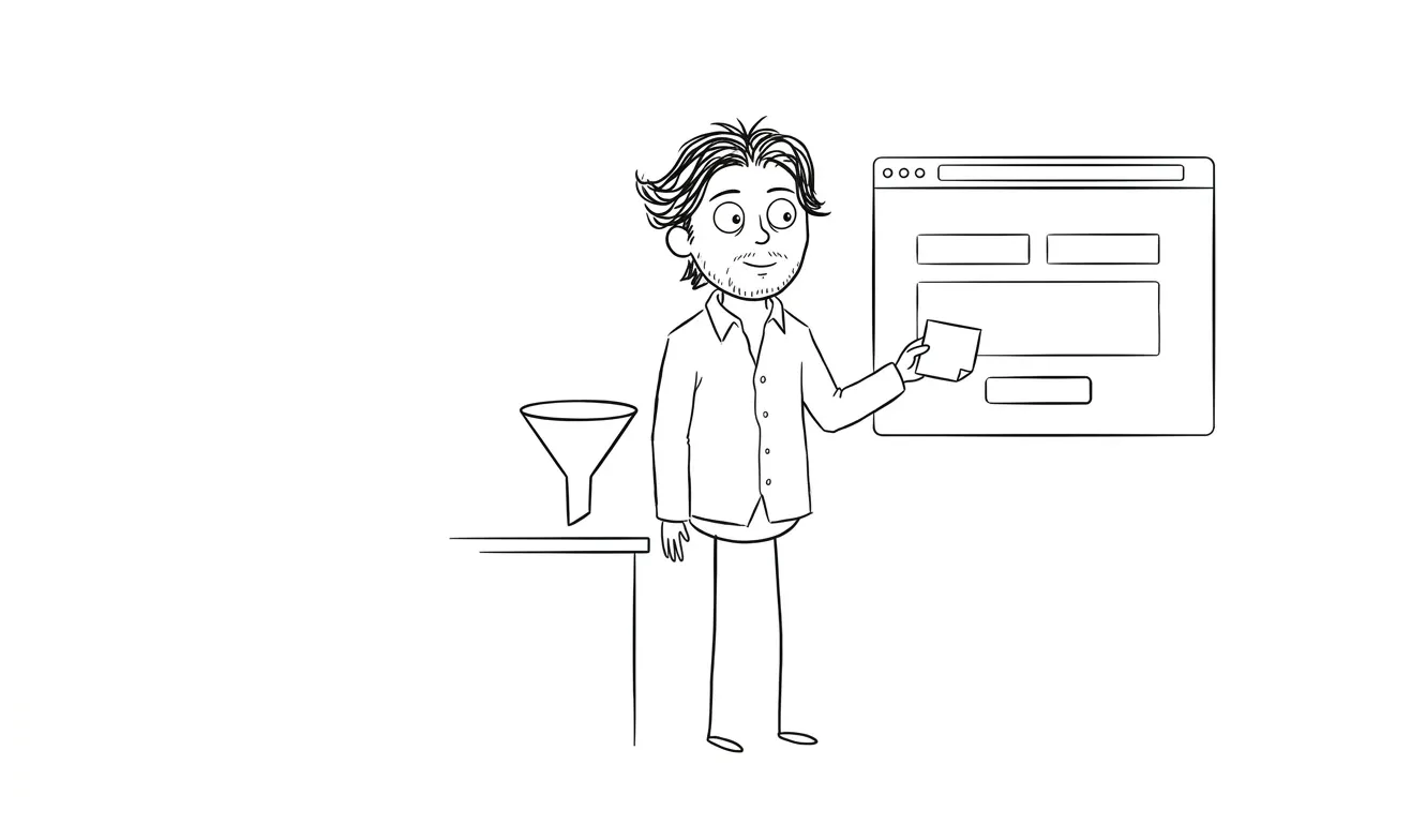
8. Align the CTA, form, and confirmation state
Qualification breaks when each step makes a different promise. Review the full sequence:
- CTA: What action does the button promise?
- Form heading: Does it name the same action?
- Questions: Do they fit that stage of commitment?
- Submit button: Does it describe what submission does?
- Confirmation: Does it explain the actual next step?
- Follow-up: Does the email match the timing and process stated on the page?
If the CTA says “Start a project,” but the confirmation says the inquiry will first be reviewed for fit, the initial wording may overstate the commitment. “Share project details” or “Request a project review” can be more accurate.
The confirmation page should state whether the submission was received, what review happens next, and how the response will arrive. The landing page thank-you page checklist covers this post-submit experience in detail.
Do not promise a response time unless the business can consistently meet it. A clear description of the next step is better than an unsupported deadline.
9. Test qualification on mobile and with assistive technology
A logically sound form can still fail in use. Test it as a visitor would, not only as the person who designed it.
Check that:
- Labels remain visible while typing
- Input types trigger appropriate mobile keyboards
- Error messages identify the field and explain the correction
- Focus moves predictably after validation errors
- Radio buttons and checkboxes have large, labeled targets
- Conditional fields appear without shifting the page unpredictably
- Required and optional status is announced clearly
- The submit button remains reachable above the mobile keyboard
- A completed form survives a recoverable validation error
- The confirmation message receives focus or is announced
Run through several honest scenarios: a strong fit, an uncertain visitor, a request outside scope, and a person who skips every optional field. None should encounter a dead end or be forced to provide inaccurate information.
For implementation details, the W3C form instructions explain labeling and input guidance, while the W3C form validation guide covers accessible error feedback. The GOV.UK question-page pattern is also a useful reference for asking one clear, decision-relevant question at a time.
A compact landing page lead qualification checklist
Before publishing, confirm the page and form meet these conditions:
- The service names a specific buyer situation or problem
- The deliverable and major exclusions are clear
- The price or pricing model is visible before the form
- Every required field changes routing or the next decision
- Optional fields are labeled as optional
- Questions use plain language and useful helper text
- Examples are generic and do not imply fake proof
- Price acknowledgment supports uncertainty without sounding contractual
- Poor-fit answers lead to a helpful alternative where possible
- CTA, form heading, submit button, and confirmation describe one coherent process
- Validation errors are specific and accessible
- Mobile completion has been tested end to end
- The follow-up matches what the page promised
When should you audit the qualification path?
Audit the path when inquiries repeatedly misunderstand the offer, arrive with incompatible scope, abandon a confusing form, or reach a confirmation state that does not explain what happens next. Review one focused lens: the path from offer information through submission and response.
Do not assume the form is the problem. The real gap may be hidden pricing, vague deliverables, a CTA that promises too much, or a poor post-submit experience. A focused review should trace evidence across the entire path before recommending more fields or stricter filters.
For a bounded diagnosis, Dee Agency’s $500 Audit + Spec reviews one focused lens and produces a prioritized implementation spec. The full fee is credited toward follow-on work booked within 30 days. If the need is already clear, the $3,000 Landing Page Design & Build covers strategy, copy, design, code, and deployment for one focused page.
Share the project details with Dee Agency to choose the appropriate starting point.

Got a project worth shipping? Send the brief.
Quote and kickoff date back in a day, usually faster. If it's not a good fit I'll say so.