
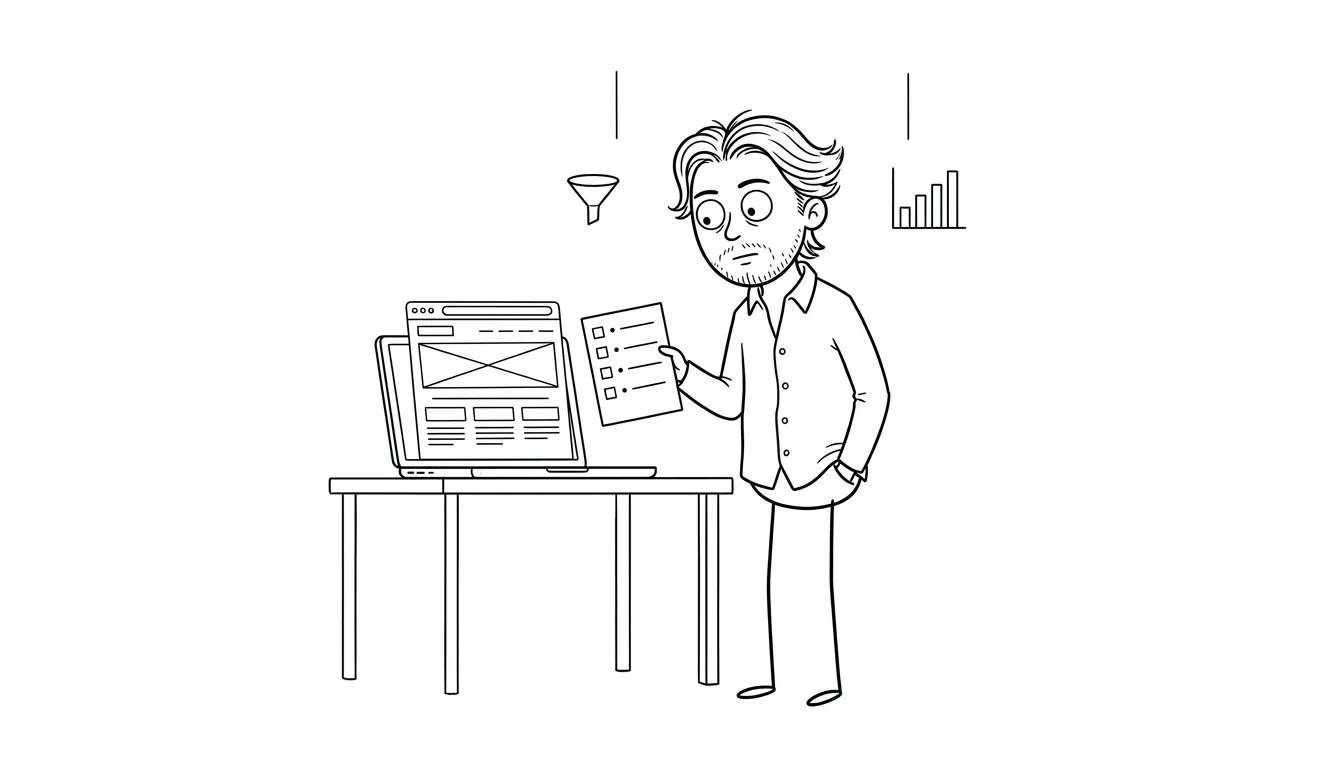
Landing Page Pricing Section Checklist
Use this landing page pricing section checklist to show price, scope, buyer fit, objections, and stronger CTA context right before design starts.
A landing page pricing section checklist helps you decide what price to show, what scope belongs beside it, and what a visitor needs to understand before they contact you. The goal is not to make every service cheap or simple. The goal is to reduce pricing ambiguity, qualify better-fit inquiries, and connect the offer to the next action. Dee Agency’s $3,000 Landing Page Design & Build service uses this kind of offer clarity before design starts.
Why pricing clarity belongs on the landing page
A service landing page has one job: help the right visitor understand the offer well enough to take the next step.
Pricing is part of that decision. If the page hides every cost detail, the visitor has to guess whether the service is in range, whether the project is too small, whether the scope matches their problem, and whether contacting you will start a useful conversation or a sales maze.
That does not mean every landing page needs a full pricing table. Some services need discovery first. Some have ranges. Some have flat packages. Some start with a diagnostic. But the page should still answer the pricing question honestly enough that a qualified buyer can self-select.
Nielsen Norman Group’s guidance on trustworthy web design is useful here: important information should be easy to access, and hidden costs can damage trust. For service pages, pricing clarity is one of the fastest ways to show that the business understands how buyers evaluate risk.
A pricing section is not just a number. It is a decision aid: price, scope, proof, caveats, and the next step in one place.
Use this landing page pricing section checklist before you write copy, design the section, or rebuild the page.
1. Decide what pricing model the page should show
Start by naming the pricing model before you touch the design. A vague pricing section usually comes from a vague offer.
Common service-business pricing models include:
- Flat fee: one clear price for a defined package
- Starting at: a minimum project price with scope variables explained
- Range: a realistic range for projects with predictable variation
- Tiered packages: multiple packages for different buyer needs
- Diagnostic first: a paid audit or strategy step before implementation
- Custom quote: useful only when the page explains why scope cannot be priced upfront
The pricing model should match how the service is actually sold. If the offer is productized, show the flat fee. If the work varies because of page count, integrations, compliance, migration, or stakeholder complexity, explain the variables. If the buyer needs diagnosis before implementation, show the diagnostic price and what happens after.
For Dee Agency, the service truth is deliberately simple:
- Audit + Spec is $500 for one focused lens, credited 100% toward follow-on work if booked within 30 days.
- Landing Page Design & Build is $3,000.
- AI Integration & Automation is $3,000.
- AI Visibility / GEO Fix is $3,000.
- Idea to MVP is $9,000.
That level of clarity makes the next step easier. A visitor can tell whether the offer is in range before filling out a form.
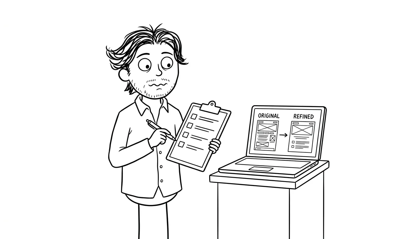
2. Put the number near the value, not in isolation
A price without scope feels random. A price beside the right context feels easier to evaluate.
Your pricing section should answer four questions around the number:
- What is included? Name the core deliverables, not every internal task.
- Who is it for? Define the buyer or situation the price is built around.
- What changes the scope? Explain what would make the project smaller, larger, or not a fit.
- What happens next? Give the visitor a concrete action after they understand the price.
For a flat-fee landing page offer, that might look like:
Landing Page Design & Build: $3,000
For one focused campaign, service, or offer page. Includes page structure, copy refinement, visual design, responsive build, analytics-ready launch basics, and handoff. Best when you already know the offer and need a sharper page to sell it.
That paragraph does more than announce a price. It frames fit, scope, and the reason someone would buy.
A weaker version would say:
Landing pages start at $3,000. Contact us for details.That is technically pricing, but it creates new questions instead of resolving them.
3. Explain what is included without writing a contract
A pricing section is not a statement of work. It should give enough scope to help the buyer understand the offer, then move the detailed agreement into the sales or kickoff process.
Include the items that affect the buying decision:
- Page type or page count
- Copywriting or copy refinement expectations
- Design and build responsibilities
- Mobile/responsive coverage
- Analytics, forms, or integrations at a basic level
- Review rounds or decision points
- Launch support or handoff expectations
- What the buyer needs to provide
Avoid turning the section into a dense legal block. If the buyer needs a microscope to understand the offer, the landing page is doing too much at once.
A practical pattern is:
Included:
- One focused landing page
- Offer and section structure
- Copy polish against the chosen angle
- Custom visual design
- Responsive build
- Basic form and analytics handoff
Then add a separate line for what is not included:
Not included by default: multi-page sites, brand identity systems, complex backend integrations, paid ad management, or ongoing CRO retainers.That second line matters. Clear exclusions can prevent mismatched inquiries without sounding defensive.
4. Add fit signals before the CTA
The pricing section should help the visitor decide whether the offer is for them.
Good fit signals include:
- The type of business or team the service is built for
- The stage of the project
- The level of existing clarity needed before starting
- The kind of problem the offer solves
- The situations where a smaller diagnostic is better than a build
For example:
Best fit: you have one offer, one audience, and one primary conversion goal. If the problem is still unclear, start with a focused Audit + Spec instead.That line protects both sides. It tells ready buyers to move forward and uncertain buyers to choose the diagnostic path.
This is where internal links can do real work. A page about landing page pricing can naturally point visitors toward:
- the $3,000 landing page build if they are ready to implement
- the $500 focused Audit + Spec if they need to diagnose one lens first
- the services overview if they are comparing options
- the contact page if they are ready to share the brief
Do not hide all of those choices in the footer. Place the most relevant path near the price.
5. Handle pricing objections without fake urgency
A pricing section often fails because it tries to pressure the visitor instead of answering the obvious concerns.
Useful objection handling sounds like:
- “Is this enough for my situation?”
- “What happens if I already have copy?”
- “What if I need multiple pages?”
- “What if the offer is not clear yet?”
- “What do I need before kickoff?”
- “How do I know whether this is the right service?”
Weak objection handling sounds like:
- “Only a few spots left” without a real reason
- “Guaranteed result” without proof
- “This pays for itself instantly” without evidence
- “Everyone needs this” when the offer has clear fit limits
CXL’s article on value-based SaaS pricing pages is aimed at software, but the underlying lesson still helps service pages: the pricing section needs to communicate value, not just display a cost. For services, that means explaining why the offer exists, what outcome it supports, and what scope the price covers.
You can handle objections with short copy blocks:
Already have copy? Great. The build can start from your draft and tighten the structure, hierarchy, and CTA path.Need more than one page? Use the contact form to share the page list. The $3,000 package is built for one focused landing page, so multi-page scope needs a separate estimate.Not sure what is broken? Start with the $500 Audit + Spec. It reviews one focused lens first, and the fee is credited toward follow-on work if booked within 30 days.That is clearer than a vague “contact for custom pricing” line.
6. Make the CTA match the pricing decision
Once someone reads the pricing section, the CTA should match their state of mind.
If the price is clear and the offer is defined, the CTA can be direct:
Start a $3,000 landing page buildIf the buyer may need diagnosis first, the CTA can split the path:
Ready to build? Share the brief.
Not sure what to fix? Start with a focused audit.
If the service is custom or range-based, the CTA should tell the visitor what to include:
Share your offer, target audience, current page, timeline, and what needs to change.Avoid CTAs that create unnecessary uncertainty:
- “Learn more”
- “Get started”
- “Submit”
- “Let’s chat”
Those can work in navigation, but pricing sections benefit from specificity. The visitor has just considered money. Tell them what happens next.
Also avoid first-person CTA phrasing such as “tell me what you are working with” or “this package is mine.” Use neutral Dee Agency service language instead:
Share your project details and Dee Agency will reply with fit, scope, and the cleanest next step.7. Keep the pricing section scannable on mobile
Pricing sections often look tidy on a desktop mockup and become painful on a phone.
Before publishing, check the mobile version for:
- Price visible without hunting
- Package name and price close together
- Included items readable without tiny text
- CTA visible after the scope explanation
- No cramped comparison tables
- No important caveats hidden in low-contrast text
- Form fields that do not interrupt the pricing decision too early
If you need a table, keep it simple. Many service offers work better with a compact card than a multi-column pricing grid.
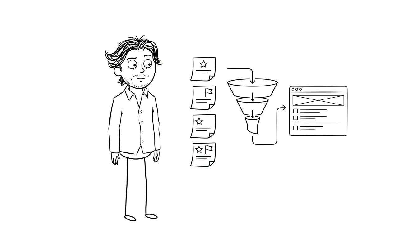
A good mobile pricing card can use this structure:
Landing Page Design & Build
$3,000 flat fee

Best for one focused offer, campaign, or service page.

Includes: structure, copy polish, visual design, responsive build, and launch handoff.

CTA: Share your project details
That is enough for a buyer to decide whether to continue.
8. Check the pricing section against the rest of the page
The pricing section should not contradict the hero, FAQ, form, or service copy.
Before publishing, scan for these problems:
- Hero says “custom strategy,” pricing says “fixed package,” and no one explains the difference
- Pricing says “starting at,” but the page never explains what raises scope
- FAQ says “custom quote,” but the pricing card shows a flat fee
- Form asks for details unrelated to the offer
- CTA says “book a call,” but the process says “send a brief”
- Footer or old blog posts mention outdated prices
- Internal links point to removed or outdated article paths
This consistency check is boring in the best way. It catches the small contradictions that make buyers hesitate.
For a deeper pre-build pass, the landing page offer section checklist pairs well with this one. The offer section explains what is being sold; the pricing section explains how the buyer should evaluate it.
Landing page pricing section checklist
Use this checklist before the page goes live:
- Pricing model is named. Flat fee, starting price, range, tiers, diagnostic first, or custom quote.
- The number has context. Scope, fit, and next step sit near the price.
- Included items are clear. The buyer can understand the core deliverables without reading a contract.
- Exclusions are honest. The page explains what is not included by default.
- Fit signals are visible. The page says who the offer is for and when another path is better.
- Objections are answered. Common pricing questions are handled without fake urgency or unsupported guarantees.
- CTA matches the decision. Ready buyers and uncertain buyers each have a clear next action.
- Mobile layout works. Price, scope, and CTA remain readable on small screens.
- Copy is consistent. Hero, FAQ, form, and pricing language do not contradict each other.
- Internal links are current. Service links point to Dee Agency paths like
/landing-page,/audit,/services, and/contact.
If the pricing section fails several of these checks, the problem may not be visual design. It may be offer clarity.
When to use an audit before changing the pricing section
Do not redesign the whole landing page just because the pricing block feels weak.
Use a focused audit first when:
- The offer itself is unclear
- The page gets traffic but weak inquiries
- The team disagrees about whether to show pricing
- Visitors ask the same pricing questions repeatedly
- The service has changed but the page still uses old positioning
- The page mixes multiple offers into one CTA
The $500 Audit + Spec is built for that situation. It audits one focused lens at a time, such as pricing clarity, offer structure, conversion friction, AI visibility, or MVP scope. If follow-on work is booked within 30 days, the audit fee is credited 100% toward that work.
If the offer is already clear and the page needs sharper execution, the $3,000 Landing Page Design & Build service is the implementation path.
Final answer
A good pricing section makes the buyer’s next decision easier. It does not need to reveal every operational detail, but it should show the price model, explain the scope, name the fit, answer obvious objections, and point to the right next step.
If your landing page pricing section currently says only “contact for pricing,” ask one sharper question: what would a qualified buyer need to know before contacting you?
That answer is usually the section you should build.
If you want Dee Agency to review one pricing or conversion lens before you rebuild, start with the $500 focused Audit + Spec. If you already know the offer and need the page designed and built, use the $3,000 Landing Page Design & Build service or share your project details.

Got a project worth shipping? Send the brief.
Quote and kickoff date back in a day, usually faster. If it's not a good fit I'll say so.