

Landing Page Form Checklist for Service Businesses
A 15-point landing page form checklist for service businesses: field count, qualification questions, mobile UX, handoff setup, and analytics tracking.
A landing page form checklist for service businesses helps you audit every element of your contact form before you rebuild or optimize a landing page. This checklist covers 15 areas: form goal, field count, label clarity, required vs optional fields, qualification questions, budget and timeline wording, privacy reassurance, spam protection, mobile tap targets, inline validation, error messages, success state, calendar or email handoff, analytics events, and audit timing. Running through it before you touch layout or copy saves you from shipping a form that looks clean but quietly kills conversions.
Why the form is where most service landing pages break
You can have a solid headline, good social proof, and a clear offer. Then someone hits your form and either bails, submits garbage, or never hears back because the handoff wasn’t set up right.
Forms are the last inch before a lead becomes a conversation. Most of the attention in a landing page rebuild goes to copy and layout. The form gets treated as an afterthought, a few fields dropped in before launch.
That’s the wrong order.
Running a form checklist before you rebuild or redesign means you know what the form needs to do, who it needs to qualify, and how it needs to behave on every device before a single pixel gets moved.
A form that looks clean but asks the wrong questions, or breaks on mobile, or sends leads nowhere, costs you real business.
If you want a broader look at what else affects conversion beyond the form, this landing page conversion audit checklist covers the full picture including headlines, CTAs, trust sections, and above-the-fold structure.
What makes a landing page form checklist for service businesses different
Service businesses aren’t selling a $29 software plan. The stakes of every inquiry are higher. A single qualified lead might be worth thousands of dollars. That changes how you should think about every field on the form.
Product companies often optimize forms for volume. More submissions, more signups, more free trials. Service businesses need something different: qualified conversations. You’d rather have five genuine leads than 50 time-wasters.
That tension shapes every decision in this checklist. The goal isn’t the shortest form or the longest one. It’s the right form for what you’re actually trying to accomplish.
It also means you probably care more about what happens after submission than a SaaS product does. A missed lead notification, a slow response, a confusing thank-you page, these aren’t just UX problems. They’re revenue problems.
Keep that in mind as you go through each area below.
Landing page form checklist: the 15 areas to review
1. Form goal
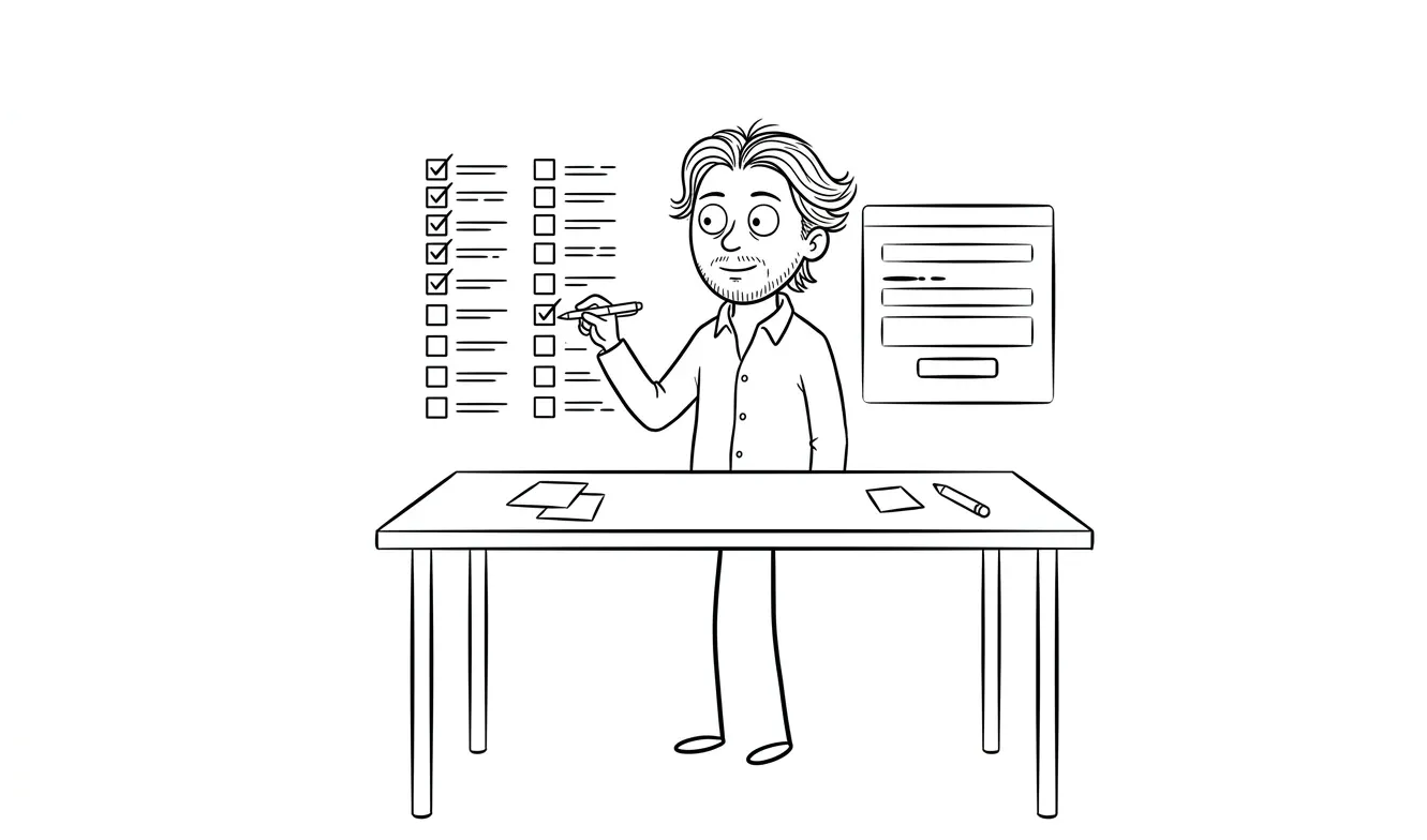
Before anything else, write down one sentence describing what this form is supposed to do.
Not “collect leads.” Something specific: “Get a qualified prospect to book a 30-minute discovery call” or “Get enough info to send a same-day proposal.”
If you can’t write that sentence, the form will try to do too many things and end up doing none of them well. Every field, every label, every CTA button should serve that one goal.
This sounds obvious. Many forms are built without this sentence ever being written, and it shows.
2. Field count
Count your fields. Then question each one.
For most service business landing pages, three to five fields is the sweet spot. Name, email, a brief description of what they need, maybe one qualifier. That’s usually enough to start a conversation.
Every additional field reduces completion rate. That’s not a theory, it’s a consistent pattern across conversion research. The question isn’t “what would be nice to know?” It’s “what do I actually need to move this forward?”
If you’re finding yourself wanting eight fields, the form probably shouldn’t be on the landing page. It should be a short intake questionnaire sent after first contact.
3. Field labels
Check every label out loud.
Labels should say exactly what you want, in plain language. “Full name” not “name.” “Best email address” if you’re going to use it to follow up. “Tell me what you’re working on” if you want context, not just a project name.
Placeholder text inside the field doesn’t count as a label. It disappears the moment someone starts typing, and then they forget what they were supposed to write. Use visible labels above or beside every field.
4. Required vs optional fields
Mark required fields clearly. Don’t mark everything as required unless it actually is.
If you mark every field required, people read that as friction and either rush through with low-quality answers or leave. If you mark nothing, you get half-filled submissions with no email address.
A reasonable split: name, email, and your main qualifier are required. Anything else is optional.
5. Qualification questions
This is the one field most service business forms get wrong.
You want to know if this person is a fit before you spend an hour on a call. But you don’t want to interrogate them on a landing page.
One well-chosen question solves this. Something like “What are you trying to accomplish?” or “What’s your current situation with [your service]?” or a dropdown with four clear options that reflect the types of projects you actually take on.
The goal is to surface context, not to gatekeep. You’re looking for a signal, not a full brief.
Think about the last five projects you took on. What single piece of information would have told you fastest whether each was a fit? That’s probably your qualification question.
6. Budget and timeline wording
If you ask about budget or timeline, how you word it matters.
“What’s your budget?” reads as blunt and puts people on the defensive. “Do you have a budget range in mind?” is better. A dropdown with ranges is better still, because it gives people options rather than asking them to name a number they’re not sure about.
Timeline questions work the same way. “When are you hoping to get started?” is less pressured than “What’s your deadline?” and tends to get honest answers.
Only ask these if they genuinely change how you respond. If you treat every inquiry the same way regardless of budget, don’t ask.
7. Privacy reassurance
Add a short line near the submit button. Something like “I won’t share your information or add you to a mailing list.”
This feels minor. It isn’t. A lot of people hesitate at forms because they’ve been burned by companies that treat inquiry forms as newsletter opt-ins. One sentence of reassurance removes that hesitation.
If you’re in a regulated space or collecting more than basic contact info, a link to your privacy policy is worth including too.
8. Spam protection
Check whether you have any spam protection set up.
If you don’t, service business contact forms tend to get hammered pretty quickly. The standard options are Google reCAPTCHA v3 (runs in the background without a visible checkbox), Cloudflare Turnstile (privacy-friendly, no image puzzles), or a simple honeypot field hidden from real users but visible to bots.
Visible “prove you’re human” puzzles create friction. Use invisible or low-friction methods unless you have a specific reason not to.
9. Mobile tap targets
Open your form on an actual phone. Tap every field.
The minimum comfortable tap target size is 44x44 pixels, per Apple’s Human Interface Guidelines. Fields that are too small or too close together cause mis-taps, and people don’t try twice.
Also check that the keyboard that appears matches the field type. Email fields should trigger the email keyboard (with the @ key visible). Phone fields should trigger the number pad. If you’re using a plain text field for everything, you’re adding unnecessary friction on mobile.
This one is easy to overlook when you’re building on a desktop. Always test on a real device, not just a browser emulator.
10. Inline validation
When someone fills in a field incorrectly, when do they find out?
If the answer is “when they hit submit,” that’s a problem. By that point, they’ve filled out the whole form and now have to hunt for what went wrong.
Inline validation shows the error right after the person leaves a field. They mistype an email address, the field turns red and tells them before they’ve moved on. This is a small UX detail that meaningfully reduces form abandonment.
Check whether your form builder supports inline validation and whether it’s turned on.
11. Error messages
Check what your error messages actually say.
“This field is required” is fine. “Invalid input” is useless. “Please enter a valid email address” is clear and actionable.
Go through every possible error state and read the message out loud. If it sounds like it came from a 1998 system dialog, rewrite it in plain language. Tell people exactly what’s wrong and how to fix it.
12. Success state
What happens after someone submits the form?
This is where a lot of service business forms just stop. There’s a vague “Thanks for your message” and no indication of what happens next or when.
A good success state does three things: confirms the submission went through, sets an expectation for when they’ll hear back, and optionally suggests a next step (“Check your inbox for a confirmation” or “I typically respond within one business day”).
If you redirect to a thank-you page instead of showing an inline message, that page also needs to be properly set up for analytics. More on that in a moment.
13. Calendar or email handoff
Check what actually happens on your end when someone submits.
Does the submission go to an email you check? Which one? How fast do you respond? Is there an auto-reply that buys you time while you draft a real response?
If you use a calendar booking tool like Calendly or Cal.com, is the link in your success state or confirmation email? Is the calendar actually up to date?
This is the area most service business landing pages skip entirely. The form gets built. The notification email goes to an account that gets checked twice a week. A potential client submits, hears nothing for four days, and moves on.
Map the whole handoff, from form submission to first real human response. Every gap in that path is a place where leads die.
14. Analytics events
Is your form submission tracked in your analytics setup?
A lot of service business landing pages have Google Analytics or Plausible installed at the page level, but no event firing when the form is actually submitted. That means you can see traffic but you can’t see conversion rate. You’re flying blind on the most important action on the page.
At a minimum, you want:
- A form submission event (fires on successful submit)
- A thank-you page view if you’re redirecting (lets you set up a goal in GA4)
- Optionally, a form start event (fires when someone focuses the first field, useful for measuring drop-off)
If you’re using Google Tag Manager, GA4 form submission tracking is well documented. If you’re on a no-code builder like Webflow or Framer, check whether their native analytics tracks form events or whether you need to wire it up manually.
15. Audit timing
When should you run this checklist?
Before any landing page rebuild. Before you change pricing or positioning. When you notice conversion rate dropping without an obvious cause. When you’re setting up a new service offering.
Also run it six months after launch. Forms that worked when you were targeting one type of client sometimes stop working when your audience shifts. The qualification question that made sense for small projects might send the wrong signal to larger clients you’re now trying to attract.
Treat this as a recurring review, not a one-time task.
How to prioritize what you find
Not everything on this checklist carries equal weight. If you run through it and find five issues, you don’t need to fix all five before you move forward.
Here’s a rough priority order:
- Form goal and field count. If these are wrong, nothing else matters much.
- Mobile tap targets and inline validation. These are conversion killers that affect a large share of your visitors.
- Success state and handoff. A broken post-submit experience loses leads you already earned.
- Analytics tracking. Without it, you can’t measure anything you change.
- Labels, error messages, privacy copy. These matter, but they’re usually quick fixes.
If you want someone to run this review for you and tell you what to fix first, Dee Agency’s $500 conversion-focused landing page audit is designed for exactly that focused diagnostic pass.
Common form mistakes service businesses make
Here are the patterns that show up most often:
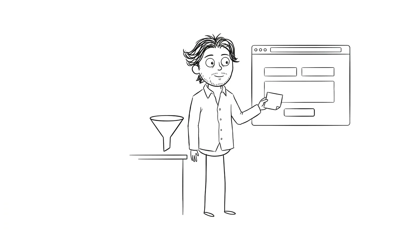
Too many fields trying to pre-qualify too hard. Seven fields asking about budget, timeline, company size, how they heard about you, preferred communication method. By the time someone gets to the submit button, they’ve decided it’s not worth it.
No qualification question at all. The opposite problem. The form asks for name and email and nothing else. You get a lot of “just browsing” submissions with no context, and every discovery call starts from scratch.
No response SLA in the success state. The form says “thanks, we’ll be in touch.” The prospect doesn’t know if that means an hour or a week. They’ve already emailed two competitors who told them exactly when to expect a response.
Spam protection that’s also user protection, against the users. Difficult CAPTCHA challenges on a contact form for a service business are almost never worth the friction they create. The volume of spam doesn’t justify the conversion loss for most service providers.
Form tracked, handoff not tracked. You can see form submissions in analytics. But nobody set up the notification email correctly, so half the submissions sit in a spam folder or a shared inbox nobody monitors.
Want a professional eye on your landing page form? Dee Agency offers a $3,000 flat-fee landing page audit and rebuild service for service businesses. Start the project brief.
Frequently asked questions
How many fields should a service business landing page form have?
Three to five fields is the right range for most service businesses. Name, email, a brief project description, and one qualification question covers what you need to start a real conversation without creating enough friction to lose prospects.
What’s the most important thing to check on a landing page form?
The handoff. Specifically, what happens after submission and how fast a real person responds. A form that collects information but routes it nowhere, or routes it to an inbox that takes four days to respond, loses leads you already earned.
Should I ask about budget on my landing page form?
Only if the answer changes how you respond. If you’d handle a $5,000 project and a $50,000 project the same way in your first response, don’t ask. If budget genuinely determines your process or whether you take the project, a dropdown with ranges is the least friction way to ask.
How do I track form submissions in Google Analytics 4?
Set up a GA4 event that fires on successful form submission. If you’re using Google Tag Manager, there’s a form submission trigger built in. If you’re redirecting to a thank-you page, tracking that page view as a conversion event is the simplest approach. Google’s GA4 documentation covers both methods.
When should I rebuild a landing page form vs just optimize it?
Optimize first. Change field count, labels, qualification questions, and the success state. Measure the results. A full rebuild is warranted when the form structure itself is wrong, for example if it’s embedded in a layout that makes it hard to redesign individual elements, or if the underlying tool doesn’t support the features you need like inline validation or custom analytics events.
Do I need spam protection on a service business contact form?
Yes, but use invisible or low-friction methods. Google reCAPTCHA v3 or Cloudflare Turnstile both work in the background without asking users to solve puzzles. A honeypot field is another solid option. Visible CAPTCHA challenges cost you conversions on a low-volume form where the occasional spam submission is a minor inconvenience.
Ready to fix your landing page form?
If you’ve run through this checklist and found problems you want fixed properly, Dee Agency’s $3,000 landing page service covers the full build including form setup, analytics, and handoff. Or if you want a focused review of what’s actually hurting your conversions before committing to a rebuild, the $500 Audit + Spec is the right starting point.

Got a project worth shipping? Send the brief.
Quote and kickoff date back in a day, usually faster. If it's not a good fit I'll say so.