

Landing Page Objection Section Checklist
A pre-build landing page objection section checklist for service businesses: price, trust, fit, timeline, and risk. Handle hesitation before design starts.
A landing page objection section checklist for service businesses helps you identify and neutralize buyer hesitation before it blocks a conversion. Cover price, trust, timeline, fit, and risk concerns in structured formats like FAQs, comparison tables, or inline reassurances. Do this work before design starts, not after. A missing objection section can leave a polished landing page with avoidable friction.
Why objection handling belongs in your pre-build checklist
Many founders think about the pitch when they’re building a landing page. Who the product is for, what it does, why it’s worth buying. That’s the right instinct. But the pitch only gets someone interested. Objection handling is what gets them to act.
When a visitor reads your landing page and doesn’t convert, it often isn’t because they failed to understand what you offer. It’s because something made them pause. The price felt unclear. They weren’t sure if you work with businesses like theirs. They wondered what happens if it doesn’t work out. They thought about the last vendor who disappointed them.
Those pauses turn into exits.
The time to map your objections is before the page exists. Not after you’ve gone through design rounds and the page is live and you’re wondering why traffic isn’t converting. Doing this work upfront means your designer has everything they need to build a page that actually closes.
If you’re not sure what’s causing friction on an existing page, a focused audit is a fast way to find out before you rebuild anything.
What makes a good objection section
Before you get into the checklist, it helps to define what you’re actually building. An objection section isn’t just an FAQ bolted onto the bottom of a page. It’s any part of the page that addresses a reason someone might not buy.
That could be:
- A dedicated FAQ block
- A comparison table showing you versus alternatives
- Inline reassurances next to a price or CTA
- A risk-reversal statement near the form
- A “who this is for / who this isn’t for” block
- A short paragraph handling the most common concern in plain language
The format matters less than the substance. What you’re doing is identifying every hesitation a qualified buyer might have, then deciding where and how to address it on the page.
According to Baymard Institute’s research on checkout and conversion friction, unaddressed concerns about trust, security, and scope are among the top reasons users abandon before converting. The same principle applies to service page conversions, not just e-commerce checkouts.
The landing page objection section checklist for service businesses
Work through these before your designer touches a file. Answer each one in writing. If you can’t answer it, that’s a signal you need to think it through before the page can be built.
Price and value objections
- Have you written down every concern a visitor might have about your price?
- Does your page explain what’s included well enough that the price feels justified?
- If your price isn’t listed, have you decided why, and do you have a plan for handling “how much does this cost” before someone leaves?
- Have you written a clear statement of what they get, by when, for what investment?
- Is there a risk-reversal or guarantee you can honestly offer? (Money-back, revision rounds, satisfaction clause, partial refund policy.)
- If you have a higher price than competitors, have you written copy that explains why without being defensive about it?
The price concern is almost never just about the number. It’s about whether the outcome is worth the risk. Your page needs to answer both.
Trust and credibility objections
- Have you listed every reason a visitor might not trust you yet?
- Do you have real social proof (testimonials, case studies, reviews, logos) that speaks to the specific outcome the page promises?
- Is your social proof specific enough to be credible? (Vague “great experience” quotes don’t move people the same way specific outcome statements do.)
- Have you addressed the “have you done this for someone like me” concern explicitly?
- Does the page make clear who is behind the service, with a real name and some professional context?
- If you’re a solo operator or small team, have you addressed that directly rather than hiding it?
Fit and scope objections
- Have you written a clear “who this is for” statement?
- Have you considered including a “who this isn’t for” statement? (Counterintuitive, but it builds trust by demonstrating you’re not desperate for every customer.)
- If your service has requirements (minimum budget, business size, project type), are those stated clearly enough that unqualified leads self-select out?
- Have you anticipated the “will this work for my situation” question and addressed it?
- If your service is specialized, have you explained what industries or use cases you have experience with?
Timeline and process objections
- Have you explained how the engagement works, step by step, in plain language?
- Does the visitor know what happens after they submit the form or click the CTA?
- Have you given a realistic timeline for when they’d see results or receive deliverables?
- Have you addressed what’s required from them (time, inputs, approvals) so there are no surprises?
- Is the onboarding process clear enough that someone can visualize working with you?
Risk and “what if it goes wrong” objections
- Have you thought through what a visitor is afraid of losing? (Money, time, reputation, opportunity.)
- Does your page address what happens if they’re not happy with the result?
- Have you been honest about what the service does and doesn’t include?
- If there are edge cases or limitations, have you handled them proactively rather than leaving them to the fine print?
- Is your contact or support path visible enough that they feel they can reach you if needed?
Comparison and alternative objections
- Have you thought about what else a visitor might be considering instead of you? (Agency, freelancer, DIY, a competitor, doing nothing.)
- Is there a comparison table or “why not X” section that honestly addresses the alternatives?
- Have you addressed the “I’ll just do it myself” objection if that’s a realistic option for your buyer?
- Have you addressed the “can’t I just use a cheaper tool” objection if relevant?
This is covered well in articles like what makes a landing page convert, where positioning against alternatives is one of the conversion levers that’s most often underdeveloped.
How to format your objection section
Once you’ve mapped the objections, you need to decide where on the page each one gets addressed and how.
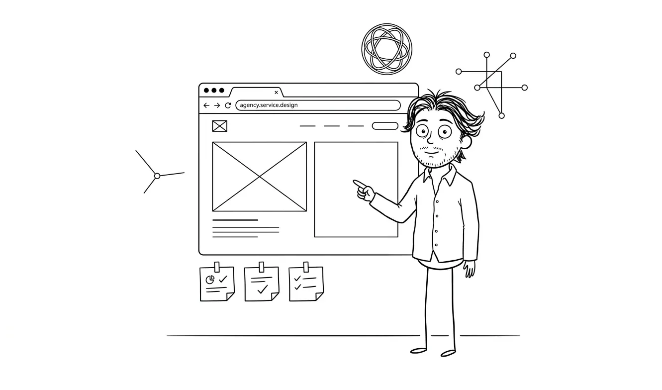
Some objections belong inline, woven into the body copy. If price is a concern, you don’t just put a line at the bottom in the FAQ. You handle it in the section where price is introduced. If trust is a concern, you don’t save proof for the very end. You place it near the first moment someone might hesitate.
Other objections work well in a dedicated FAQ block near the bottom of the page, before the final CTA. This is where you handle the more procedural questions (process, timeline, refunds, scope limits) that don’t fit naturally into the flow of the pitch.
A comparison table works well when your buyer is actively considering alternatives. It’s a confident move that shows you understand the market and aren’t afraid of the comparison.
Here’s a simple structure for deciding:
| Objection type | Best placement |
|---|---|
| Price / value | Inline near pricing, plus FAQ |
| Trust / proof | Near the promise or CTA, not just at the bottom |
| Fit / who it’s for | Early in the page, after the headline |
| Timeline / process | Before or after pricing |
| Risk / guarantee | Near the CTA or form |
| Comparison / alternatives | Dedicated section or FAQ |
How to prioritize your landing page objection section checklist for service businesses
Not every objection carries the same weight. A visitor who’s already sold on your category but nervous about price needs a different response than one who isn’t sure your service applies to their situation. Treating all objections equally is a common mistake that leads to over-stuffed FAQ sections and underserved price sections.
Here’s how to prioritize:
Start with the exit question. Think about the last few times you got a “no” or no response from a potential client. What did they say? What did they ask about? Those are your highest-priority objections. They’re real, not hypothetical.
Look at what questions keep coming up on calls. If you find yourself answering the same question every time you talk to a prospect, that question belongs on your page. It’s a sign the page isn’t doing its job.
Think about what’s hardest to explain quickly. Some objections are fast to handle (“yes, we do rush projects”). Others need more space (“here’s exactly what’s included and what isn’t”). Give the harder ones more room on the page, not less.
Order by concern type, not page section. A visitor in the early awareness stage is worried about fit. A visitor scrolling past the pricing section is worried about value and risk. Your objection copy should match where someone is in the decision process when they encounter it, not just where it fits visually.
CXL’s guidance on landing page persuasion emphasizes addressing objections in context, near the moment of hesitation, rather than batching all objection handling into a single FAQ at the bottom.
Want your landing page built right the first time? The Landing Page Design & Build service at dee.agency is a flat $3,000 and covers design, copy structure, and build. Start your project here.
What to bring to your designer
Your designer should not have to invent objection copy from scratch. What they can do is structure the page so objection content lands in the right places, in the right format, with the right visual weight.
To make that possible, you need to hand them:
- A written list of your top five to eight objections, in priority order
- Draft copy or talking points for each one
- Any social proof you have that addresses specific concerns (not just generic praise)
- A decision on whether you want a dedicated FAQ block, an inline treatment, or both
- Any guarantee or risk-reversal language you’re prepared to stand behind
If that prep work isn’t done, the designer will build a beautiful page that still has gaps. Gaps that visitors notice, even if they can’t articulate why they didn’t convert.
That’s also why the landing page trust section checklist and offer section checklist pair well with this one. They cover what surrounds your objection section and how it connects to the rest of the page.
How to write objection copy that actually works
Mapping objections is the first step. Writing copy that handles them is the harder part. A few principles that hold up across service categories:

Be specific, not reassuring. “We’re responsive and easy to work with” doesn’t address anything. “You’ll hear back within one business day during the project, and every deliverable comes with two rounds of revisions” does. Specifics are credible. Reassurances aren’t.
Use the visitor’s language, not yours. If your buyers call it “getting a website built,” don’t write about “digital presence solutions.” Match the words they use when they search, ask questions, or describe the problem to a friend.
Answer the question underneath the question. “How long does it take?” often means “how long until I see results, and is this going to drag on forever?” Answer both the surface question and the underlying one. That’s what makes copy feel like it actually understands the reader.
Don’t oversell in objection copy. The goal here isn’t to hype the service again. It’s to remove doubt. Objection copy that reads like a sales pitch feels dishonest. Keep it direct and honest, even if that means acknowledging real limitations.
The Nielsen Norman Group’s guidelines on web credibility are worth reading if you want a deeper understanding of what makes copy feel trustworthy versus promotional. The short version: specificity, transparency, and accurate representation of what’s offered are the foundations of credible content.
Common mistakes to avoid
Handling objections in the wrong order. If trust is your biggest problem, don’t bury your social proof at the bottom. Map your objections by how much they matter, then design around that.
Writing FAQ answers that don’t actually answer the question. “We work with businesses of all sizes” doesn’t address the question “will this work for a bootstrapped two-person startup.” Be specific.
Using your FAQ to add marketing copy instead of handling real concerns. Every question in your FAQ should be something a real buyer has actually asked or would plausibly ask. If you’re writing questions you want to answer rather than questions buyers are asking, you’re missing the point.
Leaving the risk-reversal vague. “100% satisfaction guaranteed” with no explanation of what that means is worse than nothing. It reads like marketing noise. If you have a real guarantee, spell out exactly what it covers.
Waiting until after the page is live to think about this. That’s the main one. An objection section that’s designed in from the start performs better than one that’s retrofitted after the fact.
Frequently asked questions
What should a landing page objection section include for a service business?
At minimum, address price and what’s included, trust and proof, who the service is for, what the process looks like, and what happens if something goes wrong. These five areas cover recurring conversion blockers for service businesses. Structure them across your page, not just in a single FAQ block at the bottom.
Where should objection handling go on a landing page?
The most important objections (price, trust, fit) should be handled inline, near the moment the concern is likely to arise. A dedicated FAQ block near the bottom of the page works well for procedural questions about process, timeline, and refunds. Don’t save all your objection handling for the end.
Should I include a comparison table on my landing page?
If your buyers are actively comparing you to alternatives, yes. A comparison table is a confident, readable way to show how you stack up without making the visitor do the work. Keep it honest and specific. Vague claims in a comparison table (“better quality,” “more responsive”) don’t build trust.
How many FAQ questions should a service landing page have?
Five to eight questions is a practical range for most service pages. Fewer than five and you’re probably missing real concerns. More than 10 and it starts to feel like a terms-of-service page rather than a conversion tool. Prioritize by how often the question actually comes up and how much the answer would move a hesitant buyer.
Do I need a “who this isn’t for” section?
Not always, but often yes. For service businesses where a bad-fit client creates real problems for both parties, stating clearly who you don’t serve builds more trust than trying to appeal to everyone. It also reduces unqualified inquiries, which saves time on both sides.
When should I use a focused audit instead of building a new page?
If you already have a landing page and you’re not sure whether the problem is your objection handling, your offer, your design, or something else, a focused audit is the right first step. It’s $500 and gives you a clear diagnosis of what’s actually blocking conversions, which is far cheaper than rebuilding the wrong thing.
Ready to build a landing page that handles objections from the start?
The Landing Page Design & Build service at dee.agency is $3,000 flat. It includes design, copy structure, and a production build, with the prep work done right so your page addresses real buyer concerns from day one.
If you’re not sure what’s holding your current page back, start with a focused audit at $500. The fee is credited in full toward the landing page project if you move forward within 30 days.

Got a project worth shipping? Send the brief.
Quote and kickoff date back in a day, usually faster. If it's not a good fit I'll say so.