Signs Your Product Needs a UX Audit
Conversion dropping, support tickets piling up, team disagreeing on fixes? These are the clearest signs your product needs a UX audit. Here's what to look for.
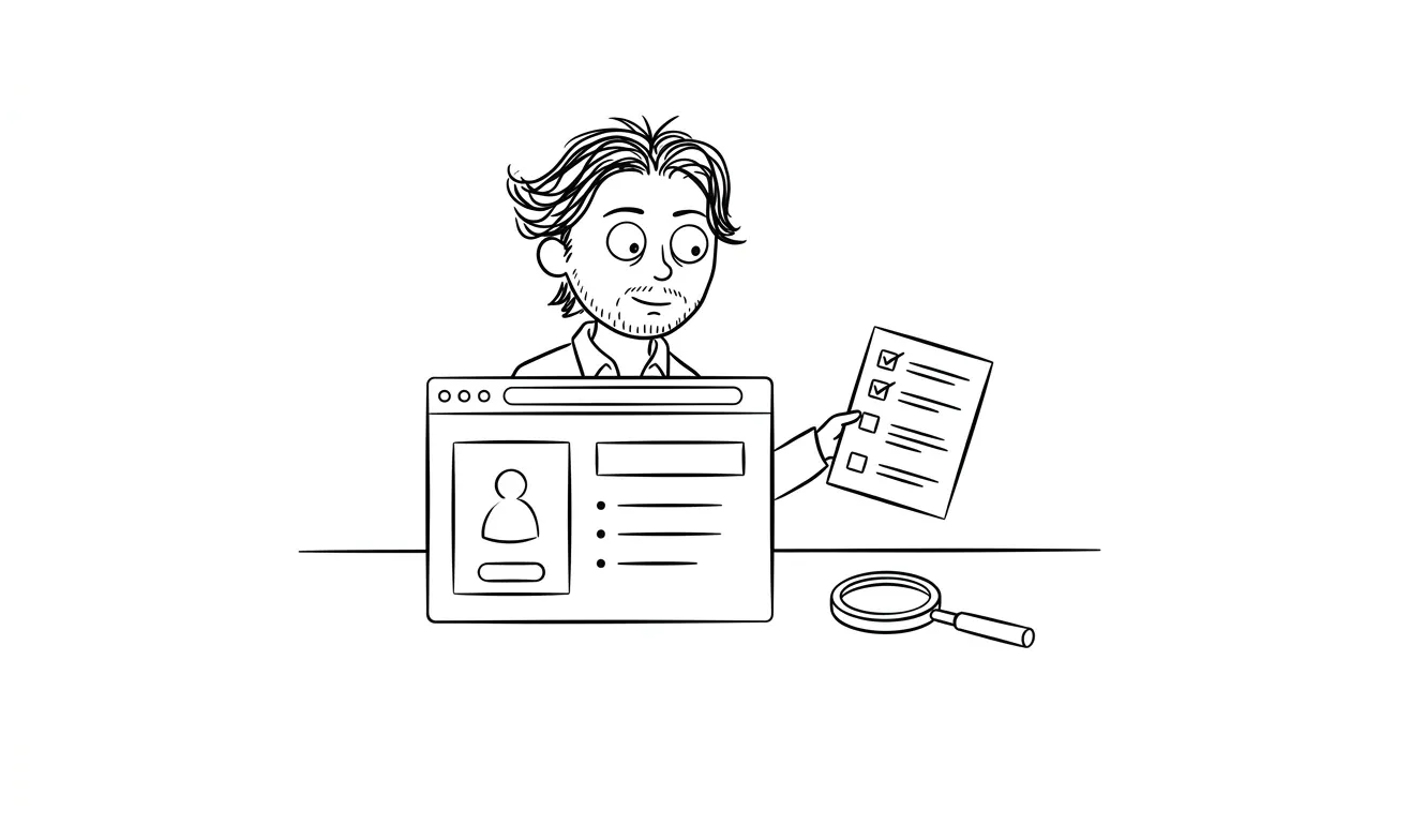
Your product probably needs a UX audit if users are dropping off before converting, support tickets keep covering the same issues, or your team can’t agree on what to fix first. These are the clearest signs something is wrong at the interface level, not the marketing level. At dee.agency, I run a focused Audit + Spec that looks at one specific lens, finds the friction, and tells you exactly what to do about it.
The 7 signs your product needs a UX audit
Knowing when to audit is half the battle. Most founders wait too long, usually until churn is already a problem or a product rewrite is on the table. But the signals show up earlier than that. Here are the seven I see most consistently.
1. Users aren’t converting, and you don’t know why
Traffic is coming in. People are signing up or landing on your page. But conversion is lower than it should be, and you can’t pinpoint the cause.
This is the most common reason founders reach out. They’ve tweaked the headline, changed the button color, maybe run a split test or two. Nothing moves the needle. The problem usually isn’t any single element. It’s the cumulative friction in the flow, things like unclear value props, form fields that feel like too much work, or a next step that isn’t obvious.
A UX audit maps that friction. It gives you a ranked list of what’s actually hurting conversion, not just what looks different from a competitor’s site.
2. You get the same support questions over and over
If your support inbox keeps seeing the same questions, that’s a UX signal. It means users are hitting a wall at the same place in your product.
“How do I find my API key?” “Why didn’t my payment go through?” “Where do I connect my account?” If your team knows these questions by heart, that’s not a user education problem. That’s a product design problem.
A UX audit looks at those repeat friction points and figures out where the interface is failing to communicate clearly. The goal is to answer those questions before users have to ask them.
3. Your team disagrees about what to fix
This one is subtle but really common. You’ve got opinions from your developer, your designer, your co-founder, maybe an advisor or two. Everyone thinks something different is the problem.
Without a structured look at the product, those conversations go in circles. You end up making decisions based on whoever argues loudest rather than what the data and design principles actually support.
An audit cuts through that. It brings in outside eyes with a clear framework and gives you something concrete to align around. That’s worth a lot even if the individual findings aren’t surprising.
4. You’re getting churn but users aren’t telling you why
Exit surveys help, but most users don’t fill them out. And the ones who do often say something vague like “didn’t fit my needs” or “too complicated.”
That last one is a flag. “Too complicated” almost always means the UX is making something feel harder than it is.
When users say a product is “too complicated,” they’re usually describing friction, not complexity. A UX audit helps you tell the difference.
If you’re seeing churn without a clear reason, a UX audit can surface what users are experiencing before they leave. Not through surveys. Through actually looking at the flows.
5. Your onboarding drop-off is high
This is a specific, trackable version of the conversion problem. If users sign up but don’t activate, or activate but don’t come back, onboarding is usually where things fall apart.
Onboarding is where first impressions get made and where most products ask users to do too much, too fast. A five-step setup flow that isn’t explained well will lose people every time. So will an empty state that doesn’t tell the user what to do next.
A UX audit of your onboarding flow looks at the number of steps, the clarity of each screen, and whether the path to value is obvious. Usually there are two or three places where users are clearly getting lost.
6. Your product has grown organically and nothing quite fits together
This one is less about a single problem and more about accumulated debt.
You launched with a small feature set. You added things over time based on user requests, business needs, or good ideas that seemed independent at the time. Now the navigation doesn’t quite make sense. Some features feel buried. Others feel redundant. The visual language isn’t consistent.
This is extremely common in products that have been running for a year or more without dedicated design oversight. The product works, but it doesn’t feel coherent.
A UX audit here isn’t looking for broken flows. It’s identifying what’s inconsistent, what’s confusing, and what’s going to cause problems at scale.
7. You’re about to raise money or do a big push
If you’ve got a product review meeting coming, a demo for investors, or a major marketing push on the way, you want your product to hold up to scrutiny.
Investors look at products critically. So do customers who are ready to pay but not quite convinced. A rough edge in the wrong place, a confusing onboarding step, an error message that sounds like it was written by an engineer for an engineer, these things matter when the stakes go up.
Getting an audit done before a major push gives you a prioritized fix list with enough time to actually act on it.
More signs your product needs a UX audit (beyond the obvious ones)
The seven above are the most common triggers. But there are subtler signals worth paying attention to, especially if none of the obvious ones quite fit your situation.
Feature requests that are already there
Users ask for things that already exist in your product. That’s a navigation and discoverability problem. If people can’t find a feature, it might as well not exist. This shows up a lot in products that grew quickly or that added features without revisiting the information architecture.
The fix isn’t always adding a search bar or a tooltip. Sometimes it’s reorganizing how features are grouped, renaming things to match how users actually talk about them, or surfacing something that’s buried three clicks deep.
Your NPS is middling and you can’t move it
Net Promoter Score sits in the “meh” range, somewhere between 20 and 40, and you’ve been running product sprints without seeing it improve. That plateau often means you’re fixing the wrong things. Not broken things, just not the things that matter most to users.
A UX audit gives you a different lens. Instead of pulling features from a backlog, you’re looking at the actual experience, where it delights, where it frustrates, and what the gap is between those two things.
Users are completing tasks but not coming back
Activation is happening. Retention isn’t. This is one of the harder problems to diagnose because users aren’t failing at the product. They’re just not finding enough reason to return.
Sometimes that’s a product-market fit issue. But often it’s a UX issue. The product doesn’t communicate what else it can do. There’s no reinforcement loop, no moment that makes returning feel valuable. An audit can identify those missing hooks.
The Nielsen Norman Group’s research on user experience and business outcomes is worth reading here. Their long-running work on usability ROI makes a strong case for auditing before you assume you have a positioning problem.
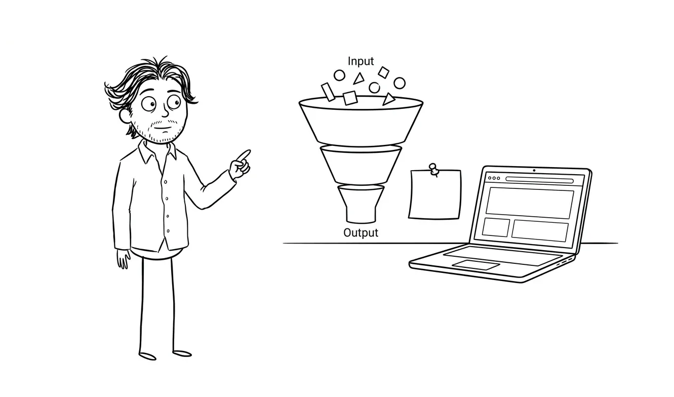
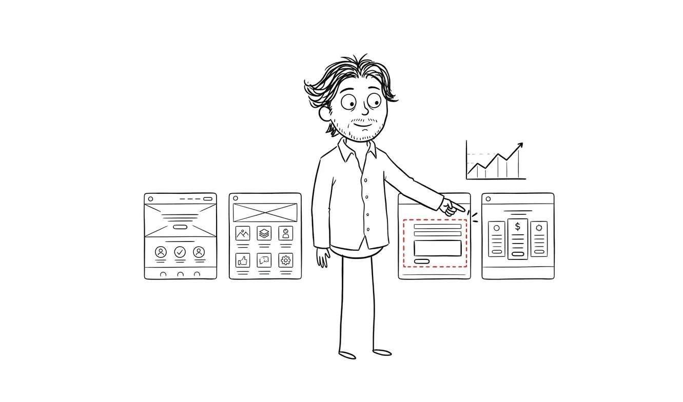
What a UX audit actually looks at
An audit isn’t a redesign. It’s a diagnostic. The output is a clear picture of what’s broken, what’s confusing, and what to fix first.
My Audit + Spec focuses on one specific lens per engagement. That might be conversion, onboarding, navigation, or something else depending on what you’re seeing. I don’t try to boil the ocean in a single pass. Focused beats comprehensive when you’re trying to make decisions quickly.
The deliverable is a spec, not a slide deck. You get something you can actually hand to a developer or designer and act on.
At $500, it’s credited toward any follow-on work within 30 days. So if the audit reveals you need a bigger fix, that $500 applies. It’s designed as a starting point, not a standalone product.
What a UX audit won’t solve
Worth being clear about this. An audit finds the problems. It doesn’t fix them automatically.
If your conversion is low because your positioning is wrong, a UX audit will surface friction in the interface but it won’t fix the underlying messaging. That’s a different kind of problem.
Same goes for technical bugs, backend issues, or pricing mismatches. A UX audit is specifically about the interface, the flows, the information architecture, and the experience of using the product.
If the audit reveals you need a new landing page, that’s where my landing page design and build service comes in. If the audit reveals your onboarding flow needs a significant overhaul, we can talk about a larger engagement through MVP-level design work. The audit clarifies the path. The follow-on work gets you there.
How to prepare before getting an audit
You don’t need to do much. But a few things make the process faster and more useful.
Give access to analytics if you have them. Knowing where drop-off happens in a funnel is much more useful than guessing. If you use Mixpanel, Amplitude, Hotjar, PostHog, or even basic Google Analytics, share what you have.
Write down the symptoms you’re seeing. Not theories, symptoms. “30% of users who start our signup flow don’t complete it.” “We get 10 support tickets a week about finding the settings page.” Concrete observations are more useful than “the product feels clunky.”
Share your support log if you can. Even just the top five most common questions.
That’s really it. I can work from a live product, a staging environment, or even Figma files if the product isn’t live yet.
UX audit vs.full redesign: how to know which you need
This question comes up a lot.
A redesign makes sense when the product is fundamentally broken at a structural level, when the navigation is so tangled it can’t be untangled incrementally, or when the visual language is so inconsistent it’s undermining trust.
An audit makes sense when something specific is wrong but you’re not sure what, when you have a working product that just isn’t performing as expected, or when you need an outside perspective before making a big bet on a fix.
Most products I look at need an audit, not a redesign. The problems are usually more specific than they feel from the inside.
The hardest part of a redesign isn’t the design. It’s figuring out what the actual problem is. An audit does that first.
For a more detailed breakdown of what the audit process looks like step by step, I covered it in what is a UX audit and when does your product actually need one.
Common UX mistakes that audits consistently find
After doing this work across different product types, certain patterns show up repeatedly.
Poor empty states are near the top. When a user first logs in and sees a blank dashboard with no guidance, that’s a conversion moment that gets wasted. The Baymard Institute’s research on onboarding UX covers empty states extensively and the principles apply well beyond e-commerce.
Unclear error messages are another one. “Something went wrong. Please try again.” is not helpful. Users don’t know if they did something wrong, if the system is down, or if their data was saved.
Navigation that grows without intention. Features get added, a link gets stuck in the header, something else goes in a dropdown, and eventually the navigation hierarchy stops making sense.
Overly long forms. Most forms ask for more than they need, especially at signup. If you’re asking for company size, job title, and phone number before a user has seen any value, you’re losing people. Google’s research on form design is a solid reference if you want to go deeper on what actually reduces drop-off in signup flows.
Inconsistent interactive patterns. One button does X when you click it. Another similar button shows a modal. A third navigates somewhere. Users build mental models fast and break when those models don’t hold.
I wrote more about common UX mistakes in SaaS products if you want to go deeper on any of these.
How often does a product need a UX audit?
This comes up less often than the “do I need one” question, but it matters for ongoing planning.
A one-time audit makes sense before a major launch, a fundraising push, or when you’re seeing a clear problem you can’t diagnose. That’s most of what I do.
But products that are actively growing, shipping new features, and acquiring users regularly benefit from auditing on a rhythm. Every six to twelve months is a reasonable rule of thumb. The product changes, user expectations change, and friction that wasn’t there before can accumulate quickly when new features are added without design oversight.
If you’ve shipped significant changes since your last audit, or if your team has grown and there’s less design consistency than there used to be, that’s a good signal it’s time for another pass.
Seeing one of these signs in your product? The Audit + Spec at dee.agency is a focused, $500 engagement that finds the friction and tells you exactly what to fix. Tell me what you’re seeing.
Frequently asked questions
How do I know if I need a UX audit or a full redesign?
Start with an audit. A full redesign is expensive and time-consuming, and it’s often done before the actual problem is understood. An audit costs $500 and tells you whether the issue is surgical or structural. Most products need targeted fixes, not a full rebuild.
What are the most common signs your product needs a UX audit?
The clearest signs are low conversion with no obvious cause, repeated support questions about the same tasks, high onboarding drop-off, and unexplained churn. If your team can’t agree on what to fix, that’s also a strong signal. Any one of these on its own is worth investigating with an audit.
What does a UX audit cost?
My Audit + Spec is $500 for a focused, single-lens review of your product. It’s credited toward follow-on work within 30 days. Larger agencies charge anywhere from $5,000 to $25,000 for broader audits, but those often take weeks and include a lot of process overhead.
How long does a UX audit take?
A focused audit typically takes three to five business days depending on product complexity and how much access you can provide. You get a written spec at the end, not a lengthy research report.
What do I get at the end of a UX audit?
You get a prioritized spec: a clear list of what’s broken, why it matters, and what to do about it. It’s designed to be actionable, not aspirational. You can hand it to a developer or use it to scope a follow-on design engagement.
Can a UX audit help if my product isn’t live yet?
Yes. If you have Figma files, a prototype, or a staging build, an audit can find problems before you ship them. That’s often the cheapest time to fix them.
What if the audit reveals bigger problems than I expected?
That happens. The spec will be honest about the scope of what needs fixing. If it turns out you need a more significant design engagement, the $500 audit fee applies toward that within 30 days. So you’re not paying twice for the diagnosis.
Ready to find out what’s actually slowing your product down?
The Audit + Spec is the fastest way to get a clear answer. One focused lens, a prioritized spec, and a concrete path forward. Start the conversation at dee.agency.

Got a project worth shipping? Send the brief.
Quote and kickoff date back in a day, usually faster. If it's not a good fit I'll say so.