
Common UX Mistakes in SaaS Products
The most common UX mistakes in SaaS products: poor onboarding, broken navigation, feature overload, and how to fix them before they cost you users.
The most common UX mistakes in SaaS products come down to the same patterns: onboarding that doesn’t show value fast enough, navigation that made sense to the team but confuses everyone else, and features that exist because someone asked for them once. These aren’t hard problems to fix, but they’re easy to miss when you’re too close to your own product. If your SaaS has a churn problem, a conversion problem, or just “feels clunky,” the answer is almost always in the UX.
Why common UX mistakes in SaaS products are so hard to catch yourself
You use your product every day. You know where everything is. You remember why that button is in that spot. That context is actually a liability when it comes to UX, because you can’t unknow what you know.
Users come in cold. They don’t have your mental model. They don’t know your terminology. They don’t care about your architecture. They just want to accomplish something, and if your product makes that hard, they leave.
This is the fundamental challenge with SaaS UX. The people building the product are the worst judges of whether it’s working. You need either fresh eyes or a structured process, ideally both.
Most SaaS UX problems aren’t design failures. They’re familiarity failures. The team stopped seeing the product the way a new user does.
Mistake 1: Onboarding that teaches the product instead of delivering value
This is the most expensive mistake in SaaS. Users don’t sign up because they want to learn your product. They sign up because they want a specific outcome. The faster you get them to that outcome, the better your activation rate.
Bad onboarding looks like this: a six-step guided tour that walks users through every feature, ends with a checklist of setup tasks, and puts them in a half-empty dashboard with no data. By the time it’s over, they’ve spent 10 minutes and they still haven’t experienced why they signed up.
Good onboarding looks different depending on the product, but it shares a common trait: it shortcuts the user to their first “this is useful” moment. Sometimes that means importing their data immediately. Sometimes it means showing them a pre-populated example. Sometimes it means skipping the tour entirely and just putting them in front of the thing they came to do.
The question to ask isn’t “did we explain everything?” It’s “how quickly can someone see the value of this product?”
According to research published by UserOnboard, the biggest onboarding mistake is confusing feature education with value delivery. They’re not the same thing.
What to fix
Map out the path from signup to the moment a user gets genuine value. Count the steps. Count the decisions they have to make. Now cut it. Every extra step is a drop in activation.
Mistake 2: Navigation that reflects the codebase, not the user’s mental model
SaaS products often end up with navigation structures that mirror how the backend was built, or how the team thinks about the features internally. Neither of those things maps to how users actually think about their work.
Users think in terms of tasks and goals. They’re asking “how do I do X?” not “where is the X module?” If your navigation is organized by feature type, by data model, or by the order things were built, you’re making users translate between their mental model and yours constantly.
This shows up in a few specific ways:
- Settings screens buried three levels deep that users need constantly
- Dashboards that surface metrics the team cares about rather than what users act on
- Primary navigation items that are rarely used sitting next to critical workflows
- Features named after internal product terms that mean nothing to users
What to fix
Run a five-second test on your navigation. Put a new user in front of it and ask them to find something specific. Watch where they click first. That gap between their first click and where the thing actually lives is your navigation problem.
Card sorting is more rigorous if you have the time. The Nielsen Norman Group has well-documented guidance on card sorting if you want a structured method. Even informal hallway testing will show you where your mental model diverges from your users’.
Mistake 3: Too many features competing for attention
Feature creep is a product problem, but it shows up as a UX problem. When every feature gets equal visual weight, users can’t tell what they’re supposed to do. Everything looks equally important, so nothing does.
This is particularly common in SaaS because feature requests are often treated as valid by default. A customer asks for something, it gets built, it gets added to the nav. Over time you have a product that does 40 things but doesn’t feel like it does anything particularly well.
The UX fix isn’t always about removing features. Sometimes it’s about hierarchy. What does a new user need to do in their first session? Those things should be prominent. Everything else can step back. Progressive disclosure is useful here: show users what they need now, and reveal more complexity as they grow into the product.
Features are only valuable if users can find and use them. A buried feature is the same as no feature.
What to fix
Look at your product analytics. Which features do power users use vs.new users? Build your information architecture around the new user’s journey. Let power users dig deeper over time.
Mistake 4: Error messages that describe what happened instead of what to do
This one sounds small. It’s not. Error messages are often the highest-stakes UX moment in a product, and most of them are terrible.
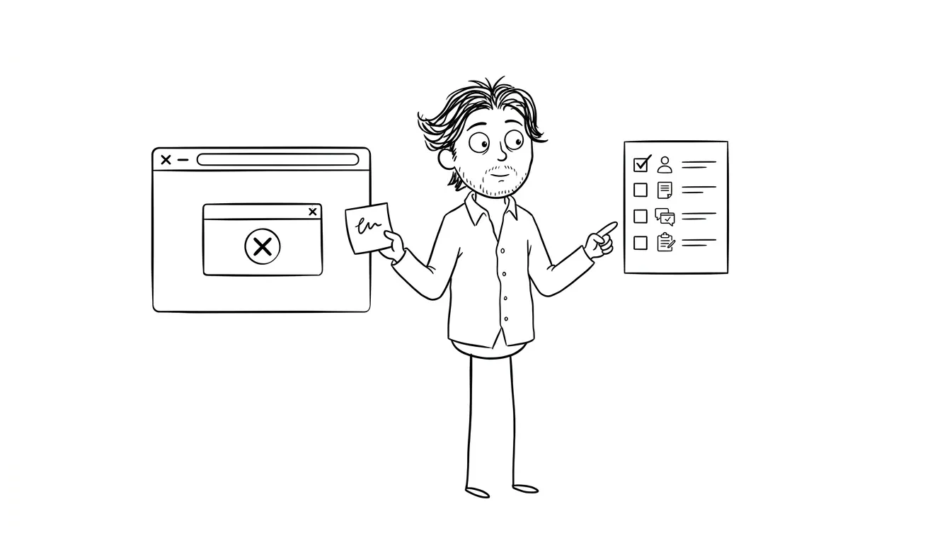
The typical bad error message: “An error occurred. Please try again.” Or worse, a raw error code that only an engineer would understand.
The problem isn’t just annoyance. It’s trust. When users hit an error they can’t resolve, they start wondering if the product is reliable. If they hit it more than once, they start looking for alternatives.
Good error messages do three things: they tell the user what went wrong (in plain language), they tell the user what to do next, and they make it easy to take that action. “Your file is too large. Maximum size is 10MB. Compress it here or upload a different file.” That’s it.
What to fix
Audit your error states. Go through every validation error, every empty state, every failure condition. Rewrite them in plain language. Include a next step. Test them with someone who didn’t write the code.
Mistake 5: Forms that ask for too much, too soon
Forms are friction. Every field you ask for is a small cost to the user. Most SaaS products ask for too much in signup forms, onboarding flows, and settings screens, usually because someone in marketing or sales wanted the data.
The result is drop-off. Users who would have converted don’t, because the form felt like homework.
The rule is simple: only ask for what you need right now to deliver value. Credit card on a free trial? Justify it, or lose signups. Company size on signup? If you’re not using it to personalize onboarding immediately, cut it.
Progressive profiling is a useful pattern here: collect information over time as users engage with the product, rather than front-loading everything into the signup flow.
What to fix
Go through every form in your product and ask: “Is this information required to deliver value right now?” If the answer is no, remove the field or move it to a later stage.
Mistake 6: Mobile experience treated as an afterthought
A lot of SaaS teams build desktop-first and then “make it responsive” at the end. That approach produces products that technically work on mobile but feel awful.
The problem is especially significant now, because users switch between devices constantly. They might check a notification on their phone, respond to something on a tablet, and do deep work on desktop. If your mobile experience is broken or degrading, you’re breaking trust every time they pick up their phone.
This doesn’t mean every SaaS needs a native mobile app. But the responsive web experience should be genuinely usable, not just technically functional.
What to fix
Define which workflows users are actually likely to do on mobile. Focus there. A dashboard view and notification handling might be all you need for mobile. Don’t try to cram the full desktop experience into a small screen. Decide what’s in scope for mobile and make that part excellent.
Mistake 7: No clear path from free to paid
For SaaS products with freemium or trial models, the upgrade path is a UX problem as much as a pricing problem. If users don’t understand what they’re missing, or if the upgrade prompt appears at the wrong moment, conversion suffers.
Common failures here: upgrade prompts that appear before users have gotten value, paywalls that don’t explain what’s behind them, and pricing pages that are so complicated users can’t figure out which plan they need.
The best upgrade moments are when a user is already engaged and hits a limit they care about. “You’ve used 80% of your storage” when someone is about to save an important file. That’s a natural prompt. A banner on the dashboard of a user who signed up 10 minutes ago is not.
What to fix
Map your upgrade prompts to specific value moments. Make sure the upgrade path explains clearly what the user gets. Test your pricing page with someone who doesn’t know your product.
The most common UX mistakes in SaaS products that kill conversion (and how an audit catches them)
Most of these mistakes aren’t obvious from the inside. They compound quietly. Onboarding friction lowers activation. Poor navigation raises support volume. Weak error states erode trust. You don’t always see the damage until it shows up in churn numbers or stalled trial conversion.
The Web Accessibility Initiative’s usability resources are a useful reminder that good UX also means accounting for users who interact with your product differently. Accessibility and usability problems often overlap in the same places.
What you need is a structured look at your product from someone who isn’t emotionally attached to the decisions that created it.
That’s what a UX audit is for. I go through your product with a specific lens, find the friction points that are hurting conversion or retention, and document what needs to change and why. It’s a focused, flat-fee engagement, not an open-ended consulting retainer.
If you want to dig into the specifics of what a UX audit involves, I wrote about it in more detail in what is a UX audit and when does your product actually need one.
For some products, the audit findings turn into a design and build engagement. If you’re earlier stage and need to ship a working product fast, the MVP design and development service covers the full build, with UX baked in from the start.
Seeing yourself in this list? I offer a flat-fee audit that diagnoses exactly these problems in your product. Tell me what you’re working on.
What to do if you recognize multiple mistakes in your product
Start with the one that affects the most users earliest in the journey. Onboarding problems compound every other problem, because users who don’t activate never get to experience the rest of your product.
Fix onboarding first. Then navigation. Then forms. Error states and mobile polish are important but they’re downstream of whether users actually understand your product.
And track it. Before you change anything, get a baseline. Activation rate, time-to-value, drop-off point in onboarding. Make one change, measure it. SaaS UX is an iterative process, but you need data to know if your changes are working.
The services overview at dee.agency covers what I can help with depending on where you are in this process.
Frequently asked questions
What are the most common UX mistakes in SaaS products?
The biggest ones are poor onboarding that fails to show value quickly, navigation that reflects internal logic rather than user goals, feature overload with no visual hierarchy, and error messages that don’t help users recover. These patterns are consistent across early-stage and mature SaaS products alike.
How do I know if my SaaS has a UX problem?
If your trial-to-paid conversion is low, your churn is high in the first 30 days, or users are contacting support for things that should be self-evident in the product, those are all UX signals. A structured product audit can identify the specific friction points faster than guessing.
How much does a UX audit for a SaaS product cost?
At dee.agency, the Audit + Spec service is a flat $500 and focuses on one specific lens: conversion, onboarding, UX friction, or another area you define. It’s credited toward any follow-on work within 30 days. Larger agencies charge significantly more, often for broader scope than early-stage products actually need.
How do I prioritize which UX problems to fix first?
Fix the problems that affect the most users earliest in the journey. Onboarding issues affect 100% of new users, so they have the highest leverage. Navigation problems affect everyone too but are slower to resolve. Error states and mobile polish matter but are lower priority than activation.
Can a UX audit help with SaaS churn?
Yes. Churn in the first 30-60 days is almost always an onboarding or activation problem. A targeted audit can identify exactly where users are losing momentum and what changes would help them reach value faster. That’s the most direct path to improving early retention.
Do I need a full redesign to fix UX problems?
Rarely. Most SaaS UX problems are fixable without a complete redesign. They usually come down to specific flows, specific screens, or specific copy choices. A focused audit identifies exactly what to fix, and often the changes are smaller than founders expect.
Ready to fix your product’s UX?
If you recognize several of these patterns in your product, the fastest path forward is a structured look at what’s actually breaking. I offer a flat-fee audit that covers one focused lens and gives you a clear spec of what to fix and how.
Or if you’re earlier stage and building from scratch, the MVP service starts with the right UX decisions baked in.
Tell me about your product and we can figure out the right starting point.

Got a project worth shipping? Send the brief.
Quote and kickoff date back in a day, usually faster. If it's not a good fit I'll say so.