Focused Audit Before Redesign: How to Decide
A focused audit finds your real conversion problem faster and cheaper than a redesign. Here's how to decide which one you actually need.
A focused audit before redesign almost always finds the real conversion problem faster and cheaper than a full overhaul. Most product friction lives in one or two specific places: a confusing headline, a broken flow, a CTA that nobody sees. A full redesign treats everything as broken when usually only a few things are. Start with a focused audit, fix the actual problem, and only redesign if the audit tells you to.
Why founders jump straight to redesign
It makes sense on the surface. The product looks outdated. Conversion is flat. Users drop off somewhere. The instinct is to wipe the slate clean and start fresh.
But that instinct is expensive. A full redesign takes weeks at minimum, costs thousands, and carries real risk: you might solve problems you didn’t actually have while creating new ones you didn’t anticipate.
The honest truth is that most conversion problems aren’t design problems. They’re clarity problems, flow problems, or trust problems, usually in one or two specific spots. A redesign touches everything. A focused audit finds exactly where things are broken.
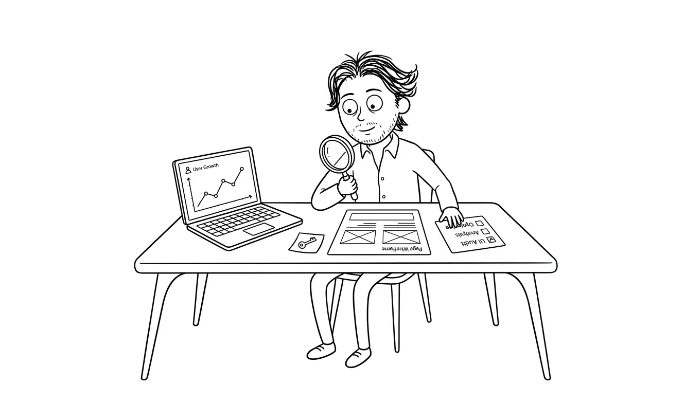
What a focused audit actually is
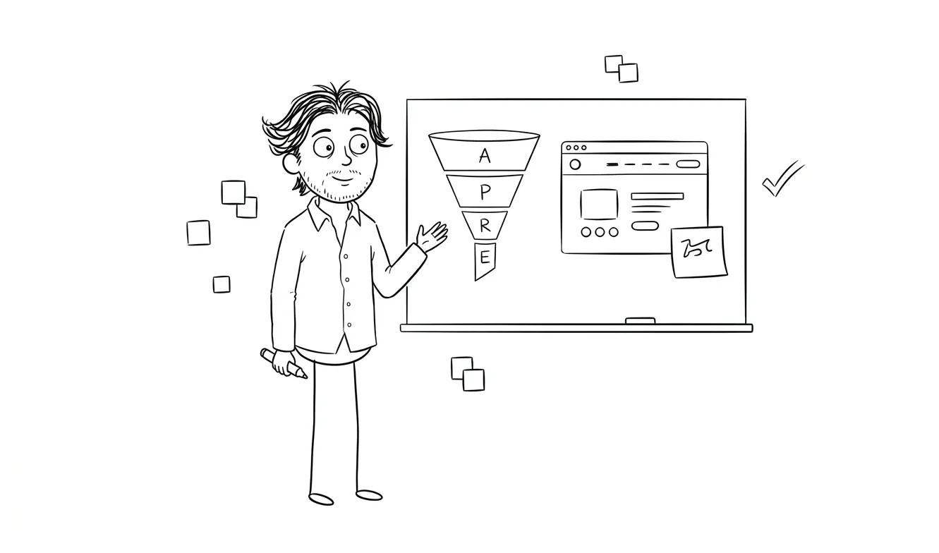
A focused audit is a single-lens review of your product. Not a general teardown. Not a “here are 47 things wrong with your site.” One lens, one priority area, one clear output.
At dee.agency, the Audit + Spec costs $500 and covers one focused lens at a time. That might be conversion friction on a landing page, UX friction in your onboarding flow, or AI visibility gaps stopping you from showing up in answer engines. You pick the area that’s causing the most pain. The audit goes deep on that one thing.
The output is a spec, not just a report. It tells you what’s wrong, why it matters, and what to do about it. If you decide to move forward with a build within 30 days, the $500 is credited toward the project cost.
A focused audit doesn’t try to fix everything. It finds the specific problem costing you the most, and gives you a clear path to fix it.
The real cost of skipping the audit and redesigning first
Here’s what usually happens when founders skip straight to a redesign.
They spend time briefing a designer. The designer makes something beautiful. It launches. Conversion stays flat or gets worse. Now they’ve spent $5,000-$20,000 and still don’t know what the actual problem is.
The worst part: they still don’t know, because a redesign doesn’t diagnose. It changes everything at once. If conversion improves, great, but you can’t tell what actually worked. If it doesn’t improve, you’re back at square one with an empty budget and a prettier version of the same problem.
A focused audit before redesign changes that completely. You go in knowing what’s broken. The redesign, if you still need one, is targeted. You’re fixing a known problem, not gambling.
Signs you probably need an audit, not a redesign
Not every product problem needs a ground-up rebuild. Here are the patterns that usually point to an audit first.
Conversion is lower than expected but traffic is decent. If people are arriving and not converting, the problem is usually on the page, not the product. An audit of your landing page or signup flow will almost certainly find it faster than a full redesign.
Users drop off at a specific step. If your analytics show a consistent exit point, that’s a scoped problem. A focused review of that one step, the copy, the layout, the friction, is far more targeted than rebuilding the whole product around it.
The product works but doesn’t feel trustworthy. This is usually a credibility and clarity problem. Again, an audit finds it. A redesign might fix it by accident, or might miss it entirely.
You have a hunch but no diagnosis. You know something is wrong. You just don’t know what. That’s exactly what an audit is for.
You’re about to spend real money on redesign or paid traffic. Spending $3,000-$10,000 on a redesign or an ad campaign before you know what’s broken is high-risk. A $500 audit first changes the risk profile completely.
When a focused audit before redesign isn’t enough
There are cases where an audit is the right first step but a redesign is the right second step.
If the audit reveals that the core visual language is undermining trust across the whole product, you might need a rebrand and layout overhaul. If the information architecture is structurally broken, not just in one spot, a larger rebuild makes sense. If the product has grown in too many directions and needs a strategic reset, a redesign might be justified.
But in those cases, the audit is still the right starting point. It lets you walk into the redesign with a clear brief. You know what’s broken and why. The designer or developer you hire has a target. That’s worth $500 before any larger investment.
If the audit does point toward a full build, the credit transfers. The $500 goes toward the follow-on project if you move within 30 days. So there’s no penalty for finding out you need more work. You’re just spending $500 to know what you’re actually buying.
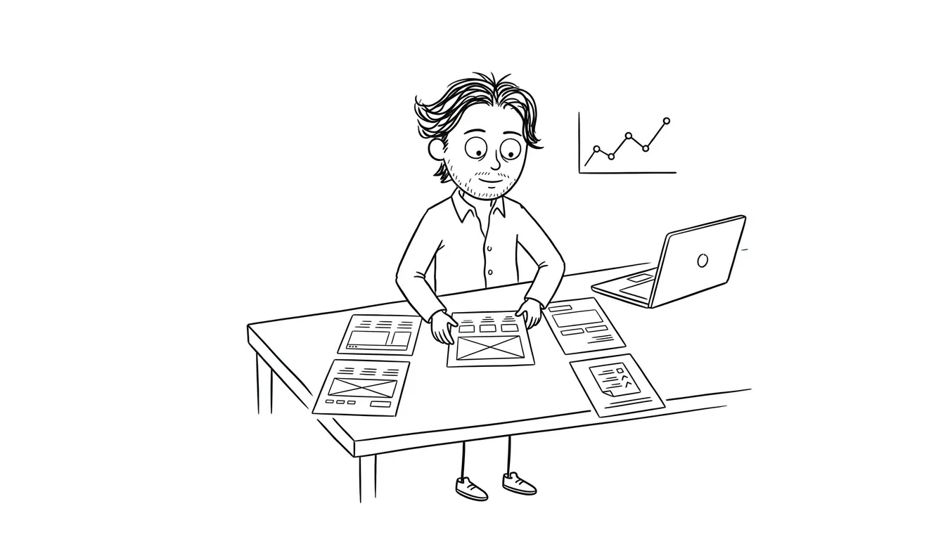
What a focused audit finds that a redesign misses
Redesigns optimize for aesthetics and structure. Audits optimize for finding the problem.
Here are things that audits commonly surface that redesigns tend to gloss over.
Headline clarity. The single biggest predictor of whether someone stays on a landing page is whether they understand what the product does in the first five seconds. A redesign might keep the same vague headline in a prettier font. An audit flags it immediately.
CTA placement and friction. A conversion audit will map where the primary action is, how many steps it takes to complete, and where users are dropping off before they get there. A redesign might move the button around without diagnosing why it wasn’t working.
Trust signals. Social proof, security indicators, real photography versus stock images. These are quick wins that can move conversion significantly without a single layout change.
Mobile experience gaps. If most of your traffic is mobile but your product was built desktop-first, there are almost always specific friction points. An audit finds them. A desktop-focused redesign might make them worse.
Copy, not design. This is the big one. Most conversion problems are copy problems. The design is fine. The words are wrong. A designer doing a full redesign won’t fix your copy. An audit will tell you exactly what needs to be rewritten and where.
How reading speed and attention patterns affect what you find
One thing audits surface that redesigns almost never address: how people actually read your product.
Research from the Nielsen Norman Group shows that users read web pages in an F-shaped pattern, scanning left to right across the top, then down the left side. That means the top-left quadrant of your page gets far more attention than anything below the fold or in the right column.
Most founders don’t account for this when they design layouts. They put the value proposition in the hero image, the CTA in the sidebar, and the most convincing proof point at the bottom of the page. Then they wonder why conversion is low.
An audit looks at your page with this pattern in mind. Where is your strongest message? Does it land in the first two seconds? Is the primary action visible without scrolling? Is the left-column content doing work, or is it wasted space?
A full redesign might rearrange furniture without asking these questions. A focused audit asks them first.
What good heuristics look like in practice
If you want a more structured framework for what a rigorous audit evaluates, Jakob Nielsen’s 10 usability heuristics are the closest thing to a standard in the industry. They were originally written for interface design, but they map cleanly to landing pages and conversion flows.
The ones that show up most often in conversion audits:
- Visibility of system status. Does the user know where they are in the flow? Multi-step signups that don’t show progress lose people.
- Match between system and the real world. Are you using jargon that makes sense to you but not to your user? This is almost always a copy problem.
- Error prevention. Are forms hard to fill out? Are validation messages helpful or generic?
- Recognition rather than recall. Can a first-time visitor figure out your product without having to remember what they read three screens ago?
None of these take a redesign to fix. Most of them take targeted copy changes, a reorganized flow, or a better onboarding step. A focused audit finds which ones apply to your specific product.
How to use an audit to scope a better redesign
If you do a focused audit and it confirms that a redesign is needed, you’re now in a much better position than you were before.
You have a specific brief. You know which pages are underperforming and why. You know which flows are broken. You have a spec that tells you what the redesigned version needs to accomplish, not just look like.
That’s a better starting point for any design conversation. It also protects you from scope creep. If you go into a redesign project with “we want a fresh look,” you’ll end up paying for things you don’t need. If you go in with “the onboarding flow loses 40% of users at step two and the copy on the pricing page doesn’t address the main objection,” you’re buying a solution to a known problem.
My landing page design and build service works best when we know what’s not working about the current one. An audit creates that clarity before we start building.
How to run a lightweight audit yourself before spending anything
You don’t always need to hire someone for a first pass. Here’s a quick self-audit to see if your conversion problem is obvious.
- Read your homepage headline out loud. Could a stranger explain what you do from that sentence alone?
- Count the steps between landing and completing the main action. Every extra step loses people.
- Check your analytics for exit pages and drop-off points. Where are users leaving?
- Open your product on a mobile device you’ve never used it on before. What’s confusing?
- Ask someone who doesn’t know your product to describe it after 30 seconds on your site.
If you can’t identify the problem from that exercise, that’s when an outside audit is worth it. Not because you’re not capable of finding it, but because familiarity blinds you to your own product’s friction. Fresh eyes on a focused lens will almost always find things you’ve stopped seeing.
Google’s own guidance on page experience is worth scanning too. It covers the signals that affect both rankings and user satisfaction, and several of them, Core Web Vitals in particular, are things a focused audit should flag if they’re dragging down your conversion.
That’s a point I make directly in the article on what makes a landing page convert: familiarity is the enemy of clear-eyed diagnosis.
Not sure where your product is losing people? A focused audit + spec is $500 and covers one priority area in depth. If you move forward with a build within 30 days, it’s fully credited. Tell me what you’re working on.
Focused audit before redesign: how to decide which you need
Here’s a simple decision frame.
| Situation | Start with |
|---|---|
| Conversion is lower than expected | Audit |
| Users drop off at a specific point | Audit |
| You have a hunch but no diagnosis | Audit |
| About to spend on ads or redesign | Audit |
| Design is clearly outdated and off-brand | Audit, then redesign |
| Structure is broken across the whole product | Audit, then redesign |
| You already have a clear audit-backed brief | Redesign |
| Launching a brand-new product from scratch | MVP build |
The pattern is pretty consistent. Unless you already know exactly what’s wrong and exactly what you’re building, an audit comes first.
Frequently asked questions
What’s the difference between a UX audit and a full redesign?
A UX audit diagnoses specific friction points in your product and tells you what to fix and why. A full redesign rebuilds the visual and structural design from scratch. An audit takes days and costs hundreds. A redesign takes weeks and costs thousands. For most conversion problems, the audit is the right first step.
How much does a focused audit cost?
At dee.agency, the Audit + Spec is $500 for one focused lens. It’s credited 100% toward a follow-on build if you move within 30 days. Broader agency audits typically run $2,000-$15,000 depending on scope.
Can an audit replace a redesign?
Sometimes, yes. If the audit reveals that the core layout and structure are sound but specific copy, trust signals, or flow steps are broken, fixing those targeted elements might be enough to move conversion without a full redesign. You won’t know until you audit.
What does a focused audit actually deliver?
Not just a list of problems. A spec. It covers what’s broken, why it’s costing you conversions, and what to do about it. It’s actionable output you can hand to a designer, developer, or use to brief a project.
Should I audit before spending on ads?
Yes. Sending paid traffic to a page that has conversion problems compounds the problem. Every click you buy that doesn’t convert is wasted spend. An audit before an ad campaign is one of the highest-ROI moves you can make.
Is an audit worth it if I’m planning a full redesign anyway?
Almost always. The audit gives you a clear brief for the redesign. You go in knowing what’s broken instead of hoping the new design fixes it. At dee.agency, the audit fee credits toward the follow-on build, so there’s no extra cost if you move within 30 days.
Ready to find the actual problem?
If conversion is flat and you’re not sure why, a focused Audit + Spec is the fastest way to find out. One lens, one priority area, a clear spec. $500, credited toward your build if you move forward within 30 days.
Tell me what you’re working on and we’ll figure out the right starting point together.

Got a project worth shipping? Send the brief.
Quote and kickoff date back in a day, usually faster. If it's not a good fit I'll say so.