
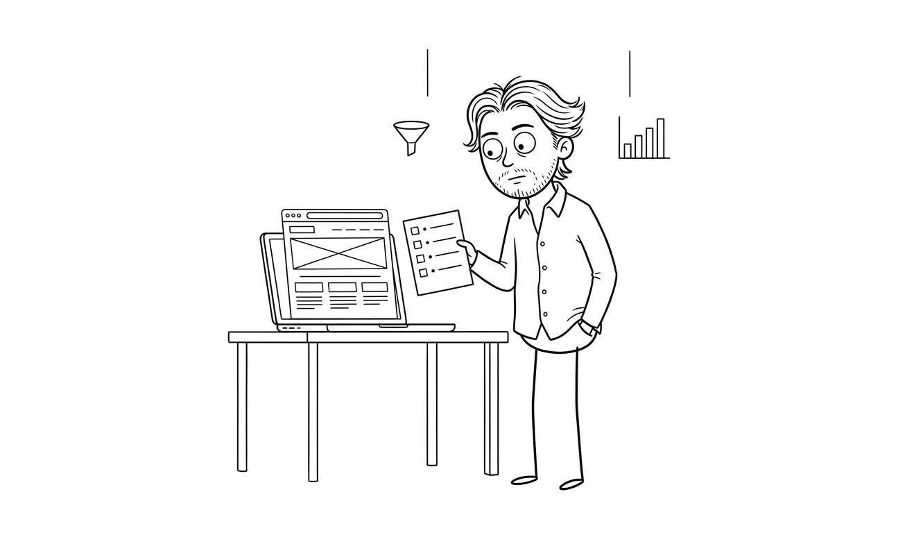
Landing Page Offer Section Checklist
12-point checklist for service businesses to define their landing page offer section before design starts. Covers deliverable, price, client, and CTA.
A landing page offer section checklist for service businesses helps you define exactly what you’re selling, for whom, and at what price before a single pixel gets placed. Without it, designers fill the gap with guesses, and guesses produce vague, unconvincing copy that doesn’t convert. This checklist covers what your offer section needs to communicate: the specific deliverable, who it’s for, what’s included, the price or price signal, and what happens next.
Why the offer section is where most landing pages break down
Most service landing pages have a hero, some features, maybe testimonials, and then a CTA button. The offer section, the part that actually tells someone what they’re buying, gets half a paragraph and a price buried in fine print.
That’s a problem because visitors aren’t reading linearly. They’re scanning. They jump to the offer to answer one question: “Is this for me, and is it worth it?” If that section doesn’t answer clearly, they leave.
The offer section is where your visitor makes the decision. If it’s vague, they default to “no.”
Designers can’t fix this after the fact. If the underlying offer isn’t defined before design starts, you end up with a beautiful page that still doesn’t convert. The checklist below is what to sort out before you hand anything off.
The landing page offer section checklist for service businesses
Work through each item before design starts. Some of these feel obvious until you try to write them down and realize you don’t have a clean answer.
1. Name the deliverable exactly
What does the client walk away with? Not a vague outcome like “better marketing” but the actual thing: a 5-page website, a 90-minute strategy session, a monthly content calendar, a custom automation built in Make.
If you can’t name it in one sentence, the offer isn’t tight enough yet.
2. Name your specific client
“Small businesses” is not a client. Who specifically are you selling this to? A solo therapist trying to fill a practice? A SaaS founder preparing for a launch? A contractor who gets all their leads by word of mouth and wants to change that?
The more specific you are, the more the right person feels seen, and the more confidently a designer can write microcopy that matches the reader’s situation.
3. Define what’s included
List every component. Not bullet points for marketing’s sake, but an honest inventory. This serves two purposes: it helps the designer show value clearly, and it forces you to stop hiding behind vague language like “full-service” or “end-to-end.”
If your offer includes a discovery call, three revision rounds, a Figma file, and a live site, say that. If it includes one revision, say that too.
4. Confirm what’s excluded
Scope creep on a landing page usually starts because the page didn’t say what wasn’t included. Does the price include copywriting? Hosting? Domain? If a client has to ask, the offer section failed.
One short “not included” line prevents a lot of confusion later.
5. State the price or give a clear signal
If you publish your price, great. Put it prominently. If you don’t publish exact pricing, you still need to give a signal. “Projects start at $X” or “most clients invest $X-$Y” is honest and lets people self-qualify.
A designer can’t layout a pricing block if you haven’t decided on the number or the framing. And if you’re embarrassed by the price, that’s a different problem.
6. Name the format
Is this async or do you meet on calls? Is it a fixed-scope project or ongoing? Is there a defined timeline? People buying a service want to know what working with you actually looks like. Format answers that.
7. Define the timeline
How long does this take? Visitors want to know if they’ll have results in two weeks or six months. If you can’t commit to a timeline, give a range. But give something. “Varies” is not an answer.
8. Describe the next step
What does someone do to buy? Schedule a call? Fill out a form? Pay upfront? The offer section should end with one clear action, not three options.
This connects directly to what goes in your CTA. If you haven’t defined the next step, the designer will pick one for you, and it might not match your actual process. Check out the landing page CTA checklist for exactly how to structure that piece.
9. Anticipate the main objection
Every service offer has one. It might be price, timeline, trust, fit, or effort required from the buyer. Name it. You don’t have to put the objection verbatim on the page, but your offer section should address it implicitly, either through the deliverable list, the guarantee, or the way the outcome is framed.
10. Decide on a guarantee or risk reversal
You don’t need one. But if you have one, this is where it lives. A money-back guarantee, a free revision policy, a satisfaction clause. Whatever it is, it belongs near the price, not buried in the footer.
If you don’t have a guarantee, that’s fine. Just make sure the rest of the offer is tight enough that the risk feels low anyway.
11. Confirm the outcome, not just the output
Features tell. Outcomes sell. The deliverable is the output. The outcome is what changes for the client. “A live landing page” is an output. “A landing page that converts cold traffic into booked discovery calls” is an outcome.
Both belong in the offer section. The output gives specificity. The outcome gives motivation.
12. Check for jargon
Read your offer section out loud to someone outside your industry. Any word that makes them ask “what does that mean?” is a word to replace. This is especially common in tech, legal, finance, and health services.
What happens if you skip this before design
Designers work with what they’re given. If you hand off a brief that says “consulting services for growing businesses,” the designer fills in the blanks. The headline becomes generic. The CTA becomes vague. The layout mirrors every other consulting page.
A vague brief produces a beautiful page that still doesn’t tell anyone what they’re buying.
This is the most common reason a landing page looks good but doesn’t convert. The design did its job. The offer didn’t.
Going back to fix the offer after the page is built is more expensive than getting it right before. You’re not just editing copy, you’re often restructuring the layout, rewriting the headline, and rethinking the CTA. That adds time and rounds.
How to use this landing page offer section checklist on an existing page
If your landing page is live and underperforming, run the checklist against what’s already there. Each unanswered item is a potential friction point.
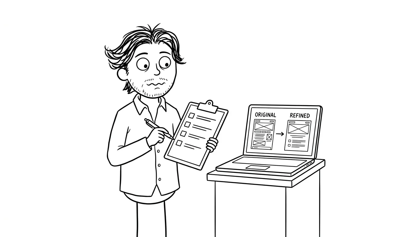
Start with items 1, 2, 5, and 8. Those four alone, the deliverable, the client, the price, and the next step, cover the most common reasons visitors leave without converting.
For a more structured look at what’s actually blocking conversion on an existing page, a focused conversion audit covers exactly this. The audit looks through one lens, costs $500, and the fee applies to any follow-on work booked within 30 days.
Running the checklist as a team
If you’re working with a designer, copywriter, or marketing person, go through each item together before the briefing call. It’s faster than explaining your offer three times in three different conversations, and it surfaces disagreements early.
The landing page wireframe checklist pairs well here. Once your offer is defined, that checklist handles the structural layer before design begins.
Running the checklist solo
If you’re a solo founder doing this yourself, print the quick-reference table at the bottom of this article and fill it in by hand. Writing forces clarity. Typing encourages hedging.
Any item you can’t fill in with a specific answer is a sign your offer still needs work. That’s the whole point. Better to find out here than after launch.
What good offer sections actually look like
It helps to have a mental picture of what you’re building toward. A well-structured offer section for a service business typically has these elements in order:
- A direct headline stating the service and who it’s for
- One or two sentences on the outcome (what changes for the client)
- A bulleted list of what’s included, with specifics
- A price or honest starting range
- A brief note on timeline and format
- One CTA button
That’s it. Six elements. If a designer is working from a brief that answers all 12 items in the checklist above, they can build a section like this in a single pass. If they’re working without that, they’ll make layout decisions that bury the wrong things and highlight the right ones only by accident.
Good offer sections don’t need to be clever. They need to be clear. Nielsen Norman Group’s research on web scanning behavior has been consistent for years: users read in F-patterns and skip large blocks of text. That means your offer needs to be structured so the key facts, the deliverable, the price, the next step, are visible in the first scan, not buried in paragraphs.
How the offer section connects to the rest of the page
The offer section doesn’t live in isolation. It’s the centerpiece, but it supports and gets supported by everything else on the page.
Trust section
Your trust signals (testimonials, logos, credentials) should validate the outcome you named in the offer. If your offer promises a 10-day turnaround, your testimonials should reference speed. If your offer promises clarity for confused founders, your testimonials should talk about clarity.
Mismatched trust signals create subtle confusion. The visitor reads the offer, then reads a testimonial that seems to be about a different service. That disconnect erodes confidence even if neither piece is dishonest.
See the landing page trust section checklist for how to structure that piece correctly.
Form section
The form should match the friction level of your offer. High-ticket services warrant a short qualifying form. Simple, low-cost services should just ask for a name and email.
If your offer requires the client to share context before you can help them, ask for it in the form, but only what you actually need. The landing page form checklist has a full breakdown of what to ask and what to skip.
Hero section
The hero sets up a promise. The offer section delivers on it. If your hero says “get more clients without cold outreach,” your offer section needs to show exactly how that happens, specifically, not generally.
A disconnect between hero and offer is one of the most common reasons landing pages underperform. The visitor feels misled, even if nothing on the page is technically false. The landing page hero section checklist covers how to frame that setup correctly.
CTA placement
Your primary CTA should appear once before the offer section, once inside it, and once after. The offer is the reason someone would click. Make sure it’s close to the thing that convinced them.
Common offer section mistakes service businesses make
Beyond the checklist items themselves, a few patterns show up repeatedly on service pages that don’t convert.
Burying the price. Some service providers hide the price to avoid sticker shock. The effect is the opposite of intended. Visitors assume the price is too high to show. If you have pricing anxiety about your own offer, that’s worth addressing separately. April Dunford’s work on positioning makes a compelling case that pricing confidence comes from clarity about the value you deliver, not from hiding the number.
Writing for everyone. “Perfect for any business looking to grow” means nothing. The broader the audience claim, the less any individual reader feels it applies to them. A specific client description does more for conversion than a wide net.
Listing features without outcomes. A long bulleted list of deliverables reads like a spec sheet. Add one line at the top that explains what all those deliverables add up to for the client. That’s the outcome. The list below it is the proof.
No clear next step. If the offer section ends and the visitor has to scroll back up to find the CTA, or worse, figure out whether to call or email, you’ve lost them. The next step belongs at the bottom of the offer, not elsewhere on the page.
The offer section checklist: quick reference
Here’s the full list in table format for reference before a design briefing or page review.
| Item | What to confirm |
|---|---|
| Deliverable name | One-sentence description of what the client gets |
| Target client | Specific, not demographic |
| What’s included | Full component list |
| What’s excluded | At least one clear exclusion |
| Price or signal | A number or honest range |
| Format | Async, calls, hybrid |
| Timeline | Fixed or ranged estimate |
| Next step | One action only |
| Main objection | Named and addressed |
| Guarantee | Present or intentionally absent |
| Outcome statement | What changes for the client |
| Jargon check | Readable to an outsider |
When you’re ready to build
If your offer is defined and you’re ready to put it on a page, the Landing Page Design & Build service at Dee Agency covers the full process for $3,000. That includes layout, design, copy structure, and a live page built to convert, all from a single brief. Check the services page for what’s included.
If you’re not sure your offer is tight yet, start with the audit. A focused $500 conversion audit will find where the offer section breaks down and give you a clear spec to hand off.
Frequently asked questions
What should be in the offer section of a landing page?
The offer section should name the deliverable, identify the target client, list what’s included, state the price or a price signal, and define the next step. Those five elements answer the main questions a visitor has before deciding to contact you.
How long should a landing page offer section be?
Long enough to answer the key questions, short enough to skim in under 30 seconds. For most service businesses, that’s a headline, two to four sentences of context, a short feature list, pricing, and one CTA. Avoid over-explaining or burying the price at the bottom.
Should I include pricing on my service landing page?
Publishing a price or a starting range helps visitors self-qualify before contacting you, which means the leads you get are more likely to be a fit. If pricing varies significantly by scope, “projects start at $X” is more helpful than no number at all.
Why does my landing page get traffic but no conversions?
Usually the offer section isn’t doing its job. Either the deliverable is vague, the price is hidden, the next step is unclear, or the target client is too broad. Run the offer section checklist against your current page and see which items don’t have clear answers.
When should I do a landing page audit instead of a redesign?
If the page is live and getting traffic, start with an audit. A redesign without diagnosis often replicates the same problems with a new visual layer. A focused audit finds the actual friction point, so any changes you make are targeted. Dee Agency’s audit service is $500 and credits toward follow-on work.
What’s the difference between an output and an outcome in a service offer?
An output is what you deliver: a landing page, a report, a strategy document. An outcome is what changes for the client as a result: more booked calls, a cleaner process, a clear go-to-market message. Good offer sections include both. The output builds trust; the outcome creates motivation.
Ready to put your offer on a page? The Landing Page Design & Build service at Dee Agency is $3,000 flat and covers everything from brief to live site. Start the conversation here.

Got a project worth shipping? Send the brief.
Quote and kickoff date back in a day, usually faster. If it's not a good fit I'll say so.