
Landing Page Conversion Audit Checklist
A structured landing page conversion audit checklist covering headlines, CTAs, trust signals, mobile, speed, and analytics. Find your real bottleneck fast.
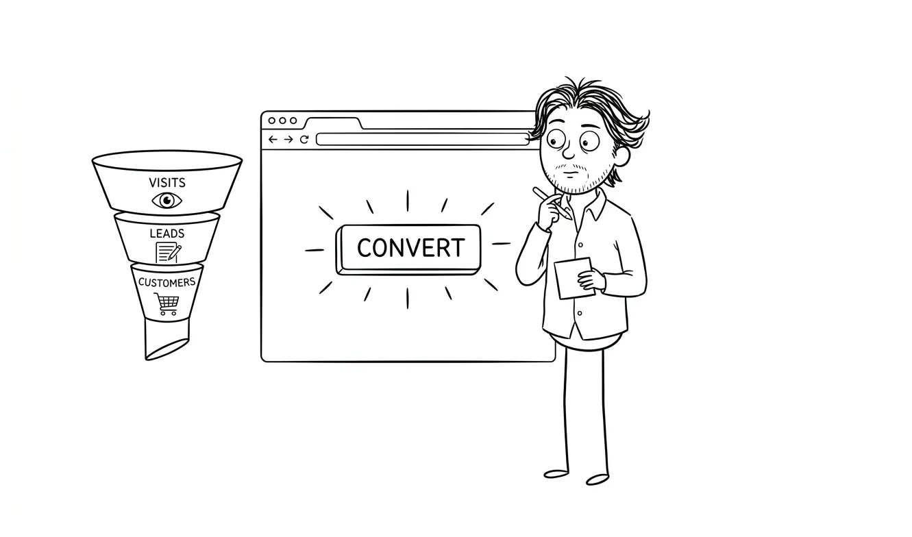
You’ve got traffic but conversions are flat. Before you redesign anything, run a landing page conversion audit: a structured review of your headline clarity, offer framing, proof elements, CTA mechanics, form friction, mobile layout, page speed, and analytics setup. This checklist is aimed at founders and small teams who know people are landing on the page but don’t know why they’re leaving. Work through it in order. The bottleneck is almost always one or two things, not everything at once.
What a landing page conversion audit actually is
A conversion audit isn’t a redesign. It’s a diagnosis. You’re not changing anything yet, you’re finding the one thing most likely to be killing your conversions.
Most founders skip this step. They see a low conversion rate and assume the page needs to look better. Sometimes that’s true. More often, the issue is a blurry headline, a call to action that’s buried below the fold, or a mismatch between what an ad promised and what the page delivers. Those are fixable without touching the visual design at all.
The goal of this audit is to find your clearest bottleneck before you spend money or time on a rebuild.
A focused audit finds one real problem and gives you something to act on. That’s more useful than a 40-point report that overwhelms your team and gets shelved.
Work through each section below. Flag anything that fails. Prioritize by impact, not by how easy it is to fix.
Landing page conversion audit checklist: positioning and headline clarity
This is where most landing pages fail. If a visitor can’t tell within five seconds what you do, who it’s for, and why it matters, they leave.
Checklist:
- Can a first-time visitor understand your offer without scrolling?
- Does the headline name a specific outcome or benefit, not just a feature?
- Is it clear who this is for? (A headline like “The platform for teams” tells almost no one anything.)
- Does the subheadline add information, or does it just restate the headline in different words?
- Is there a mismatch between what your ad/email/source traffic says and what the headline says on arrival?
That last one is underrated. If your Google ad says “fast invoicing for freelancers” and the headline reads “Modern financial tools for independent professionals,” you’ve already lost people in the first two seconds.
The five-second test is a real and useful gut check. Share your page with someone who doesn’t know your product and ask them what they think it does. Their answer will tell you a lot. What makes a landing page convert covers this in more depth if you want to go deeper on the structure side.
One thing that often gets missed here: the page title in the browser tab. It’s a small thing, but if someone opens your page alongside four other tabs, the tab label is their only reference point. “Untitled” or a truncated URL tells them nothing. A short, specific label keeps you in the running.
Section 2: Offer framing and value clarity
A good headline gets people to read the next line. Good offer framing keeps them reading and moves them toward action.
Checklist:
- Is it immediately clear what someone gets when they sign up, buy, or fill out the form?
- Is the price visible if it’s relevant? (Hiding it usually hurts more than it helps.)
- Do you explain the outcome, not just the features?
- Is there a clear differentiator? Not “we’re better,” but specifically how you’re different.
- Does the page answer the question “why now?” Urgency doesn’t have to be fake scarcity; it can be a real reason to act today.
A common trap is writing copy that sounds good to you because you built the product. It makes perfect sense to you. The person landing on the page has zero context and maybe 30 seconds of patience. Write for them.
One test worth running: read your copy out loud. If you’d never say it in a conversation, it probably shouldn’t be on the page. Phrases like “end-to-end workflow orchestration” or “holistic growth enablement” say nothing to someone who doesn’t already know what you do. Replace them with plain descriptions of what happens when someone uses your product.
Section 3: Social proof and trust signals
People don’t trust landing pages by default. Proof is how you earn that trust.
Checklist:
- Are there testimonials on the page? (Not buried at the bottom, but near the main CTA.)
- Do the testimonials mention a specific result or outcome, or are they generic (“Great product, highly recommend!”)?
- Is there a logo wall if you have recognizable clients or partners?
- Are there trust signals relevant to your category: security badges, certifications, press mentions, review counts?
- If you have a free trial or guarantee, is it visible and prominent?
- Is there any social proof near the primary CTA specifically?
Testimonials near the CTA convert better than testimonials in a dedicated section halfway down the page. If you only have generic praise to work with, ask your best customers a better question: “What was your situation before you found us, and what’s different now?”
One more thing: recency matters. A testimonial from three years ago raises questions. If you can include a date or a context clue (“after six months of using the product”), it signals that the proof is current, not a relic from a different version of the product.
Section 4: CTA mechanics and conversion friction
Your call to action is the whole point. A lot of landing pages get everything else right and then bury or confuse the CTA.
Checklist:
- Is there a primary CTA above the fold?
- Is the CTA button copy specific? (“Start your free trial” beats “Submit” or “Learn more.”)
- Is there only one primary CTA, or are you asking visitors to do three different things?
- Is the CTA button visually distinct from the rest of the page?
- Does the CTA repeat at the bottom of the page for people who scroll?
- If there’s a form, how many fields does it have? Every extra field reduces completions.
- Does the form have a clear success state? What happens after someone submits?
The number-of-fields question is worth a dedicated moment. Every field you add is a question you’re asking a stranger to answer before they’ve decided they trust you. Keep it to the minimum you actually need.
If you’re asking for more than an email and a name on a top-of-funnel page, you’re probably asking for too much.
Also look at what happens right after conversion. A blank screen or a generic “Thanks, we’ll be in touch” is a missed opportunity. The confirmation state is a chance to set expectations, reinforce the decision, and suggest a next step. Even a simple “We’ll email you within one business day” reduces post-submission anxiety.
Section 5: Mobile layout and visual hierarchy
More than half of web traffic is mobile. A page that looks great on a desktop and breaks on a phone is leaving conversions on the table.
Checklist:
- Does the hero section work on a 390px wide screen without horizontal scrolling?
- Is the CTA button large enough to tap comfortably?
- Does text get cut off or overlap on small screens?
- Are images resized and loading correctly on mobile?
- Does the mobile layout preserve the logical reading order? (Headline, subheadline, CTA, proof, details.)
- Is any critical information hidden or de-prioritized on mobile that’s visible on desktop?
Pull up the page on your actual phone, not just a browser resized to mobile. Also check on a mid-range Android, not just an iPhone. They render differently.
Pay attention to font sizes on mobile specifically. A headline that reads well at 60px on desktop might need to drop to 36px or smaller to fit without awkward line breaks. Forcing someone to read a headline that wraps at a strange syllable, or that gets cut off, makes the whole page feel unpolished before they’ve processed a single word.
Section 6: Page speed and technical basics
A slow page loses people before they ever read your headline. This isn’t a hypothetical; load time directly affects bounce rate.
Checklist:
- Does the page load in under three seconds on a mid-speed mobile connection?
- Run the URL through Google PageSpeed Insights and check both mobile and desktop scores.
- Are images compressed and properly sized? (Unoptimized images are the most common culprit.)
- Are there any render-blocking scripts slowing the initial paint?
- Does the page work without JavaScript for the core content and CTA?
- Are there any broken links, missing images, or console errors?
PageSpeed Insights will give you an actual list of what to fix and in what order. It’s free and takes two minutes. If you’re scoring below 60 on mobile, fix this before anything else.
One specific thing to check: third-party scripts. Every chat widget, analytics tool, A/B testing library, and ad pixel you add to the page adds load time. Audit what’s actually running on your page. If you added a tool six months ago and stopped using it, remove the script. Dead scripts still cost you load time.
Section 7: Analytics and tracking setup
You can’t diagnose what you can’t measure. If your analytics aren’t set up correctly, you’re making every decision blind.
Checklist:
- Is Google Analytics or an equivalent tool installed and firing on the page?
- Is there a conversion goal set up? Not just pageviews, but an actual “thank you” page view, form submission event, or button click tracked as a goal.
- Are UTM parameters being used consistently in your traffic sources so you know which channels are sending people?
- If you’re running ads, is conversion tracking installed for the relevant platform (Google Ads, Meta, LinkedIn)?
- Have you checked that form submissions actually trigger the confirmation/thank-you state and that it’s being tracked?
- Is there a session recording tool (like Microsoft Clarity or Hotjar) enabled to see how people actually use the page?
Session recordings are underused. Watching real users move through your page tells you things a heatmap can’t. You’ll see where people stop scrolling, where they get confused, and what they click that’s not actually a link.
A quick sanity check worth doing: submit your own form (or have someone else do it) and verify that the confirmation page loads correctly and that the conversion registers in your analytics dashboard. Form submissions that silently fail, redirect to an error page, or don’t fire the tracking event are more common than you’d think.
Section 8: Traffic-to-page intent match
This one gets skipped because it requires looking beyond the landing page itself. But if your traffic is coming from mismatched sources, no amount of on-page optimization will fix the conversion rate.

Checklist:
- What’s the primary traffic source hitting this page right now?
- Does the page copy match the intent of that source? (Search traffic expects answers; ad traffic expects the thing the ad promised.)
- If you’re running paid ads, is the landing page specific to each campaign, or are you sending all traffic to a generic homepage?
- Are blog readers landing here from a post about one topic and then seeing an offer about something different?
- Is there a clear, logical next step from wherever people are coming from?
Sending cold traffic from a broad awareness ad to a high-commitment purchase page almost never works. The ask has to match where someone is in their decision process.
How to use this landing page conversion audit checklist effectively
By the time you’ve worked through this checklist, you’ll have flagged somewhere between three and 15 things. Don’t try to fix all of them at once.
The checklist is a diagnostic tool, not a to-do list. Your job isn’t to check every box simultaneously. It’s to identify which single issue is costing you the most conversions right now, fix that, measure the result, and then move to the next one.
Prioritize by:
- Anything that breaks the page or makes it unusable on mobile/slow connections
- Positioning and headline issues (highest leverage, often no dev time required)
- CTA mechanics and form friction (quick wins with measurable impact)
- Missing analytics (you can’t measure improvement without this)
- Proof and trust elements (usually requires sourcing content, not just edits)
Start with one fix at a time if you can. Keep the before-state documented so you can compare. Even a quick screenshot or a note about what the conversion rate was on the day you made a change is enough. Without that baseline, you can’t tell if the fix actually worked.
One practical approach: go through the checklist and give each section a red, yellow, or green rating. Red means broken or clearly wrong. Yellow means present but weak. Green means you’re confident it’s working. Then fix all your reds before you touch any yellows. The instinct to polish already-functional elements instead of fixing broken ones is real and worth resisting.
Want a second set of eyes on your landing page? I offer a focused audit service that goes deep on one specific lens, whether that’s conversion friction, positioning clarity, or something else. The $500 fee is credited in full if you move forward with follow-on work within 30 days. Tell me about your page.
If you’ve run the audit and the problems are bigger than tweaks, it might be time for a proper rebuild. My flat-fee landing page service starts at $3,000 and includes design and development from scratch. Or if you’re not sure whether you need an audit or a full redesign, do you need a focused audit before a redesign? walks through exactly that decision.
Frequently asked questions
How long does a landing page conversion audit take?
A self-directed audit using a checklist like this one takes two to four hours for a single page. A professional audit that includes analysis, recommendations, and a written brief typically takes one to two business days. The time depends on how much analytics data is available and how many traffic sources you’re diagnosing.
What’s the most common reason a landing page doesn’t convert?
Unclear positioning is the most common culprit. Visitors can’t tell quickly enough what the product does, who it’s for, or why it’s worth their time. This usually shows up in the headline and subheadline, and it’s fixable without a redesign.
Do I need a developer to run a landing page conversion audit?
No. The audit itself is just analysis and prioritization. Some fixes (like improving headline copy or adjusting button labels) require no development at all. Others (like improving page speed or fixing mobile layout issues) may need a developer or a designer who codes. My audit service covers the diagnosis; what you do with it is up to you.
How do I know if my landing page problem is traffic or conversion?
Check your bounce rate and average time on page. If people arrive and leave in under 10 seconds at high volume, you have a positioning or intent-match problem. If they scroll and engage but don’t convert, the issue is likely offer framing, trust signals, or CTA friction.
What tools should I use for a landing page conversion audit?
Google PageSpeed Insights for performance, Google Analytics or Plausible for traffic and conversion data, Microsoft Clarity or Hotjar for session recordings and heatmaps, and a real phone for mobile testing. All of these have free tiers.
When should I redesign instead of just auditing and fixing?
If the audit reveals the page structure is fundamentally wrong (wrong audience, wrong offer, outdated positioning), or if there are five or more overlapping issues that small fixes can’t address, a redesign makes more sense than incremental patches. The article on whether you need a focused audit before a redesign can help you decide.
Ready to fix your landing page?
If you’ve run through this checklist and you’re not sure what to fix first, that’s exactly what my focused audit is for. One clear lens, a prioritized set of findings, and a path forward for $500.
If you already know the page needs a rebuild, the landing page design and build service covers everything from structure to shipping. Start the conversation and I’ll tell you which makes more sense for where you are.

Got a project worth shipping? Send the brief.
Quote and kickoff date back in a day, usually faster. If it's not a good fit I'll say so.