
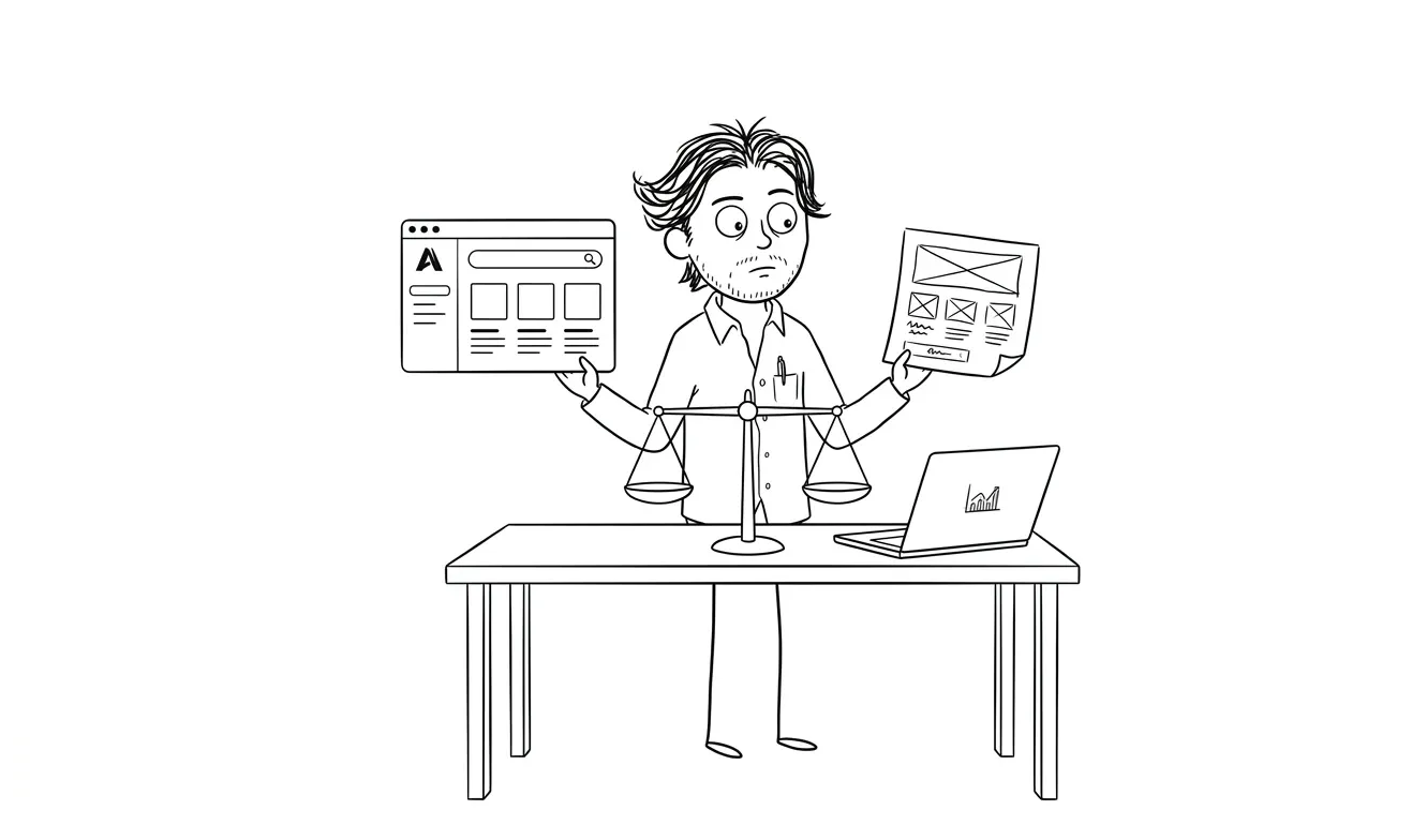
When to Invest in Design vs Ship Ugly
Know exactly when to invest in design and when to ship rough. A practical framework for founders at every product stage.
Ship ugly when you’re still learning whether the thing is worth building. Invest in design when you know what you’re building and who it’s for. That’s the core of the “when to invest in design vs when to ship ugly” question. The mistake most founders make isn’t choosing wrong once. It’s applying the same answer to every stage. Design at the wrong moment wastes money. Shipping ugly at the wrong moment loses customers you’ll never get back.
The real question isn’t design vs speed
It’s “what are you trying to find out right now?”
Every product stage has a primary job. At the very beginning, your job is to figure out if anyone wants the thing. Further along, your job is to make sure they can actually use it. Later, your job is to make sure they stick around and tell others.
Design serves different purposes at each stage. Sometimes it helps you learn faster. Sometimes it helps you convert better. Sometimes it’s pure signal, telling users this is a real product worth trusting.
Conflating those three jobs is where founders get into trouble. They polish an onboarding flow when they haven’t confirmed anyone wants to onboard. Or they ship a half-finished dashboard to paying users and wonder why churn is high.
The stage determines the priority. The priority determines how much design matters right now.
When to ship ugly: the case for rough-and-ready
There are specific situations where a rough product is the right call, and knowing them saves a lot of money and time.
You’re testing whether the problem is real
If you’re building something that solves a problem you’ve hypothesized but haven’t validated, you don’t need design. You need a test. That might be a landing page with a waitlist form. A Notion doc you send to 10 people. A Google Form. A Figma prototype you walk someone through over a Zoom call.
The feedback you get at this stage has nothing to do with visual polish. It has everything to do with whether people recognize the problem, whether they’d pay to solve it, and whether your proposed solution makes sense to them.
Spending three weeks on visual design before you’ve run a single user conversation is backwards.
You have zero customers and are still building the first version
The early, pre-launch build is almost never seen by real users. It’s the thing you iterate on privately. Ship it rough internally, get it working, then clean it up before you put it in front of people who matter.
There’s a difference between “ugly in production” and “ugly in progress.” The latter is totally fine.
Your users are internal or technical
If you’re building a tool for developers, data teams, or ops staff, design expectations are genuinely different. A functional, dense interface with good information architecture matters way more than rounded corners and smooth animations. Technical users often distrust products that feel too polished, as if the surface hides a shallow feature set.
Ship a working tool first. You can refine the experience when the tool itself is proven.
You need to learn before you optimize
Conversion rate optimization, onboarding flow design, pricing page layouts, these all require real data before they’re worth investing in. If you optimize a landing page before you have traffic, you’re optimizing for your own taste, not user behavior.
Ship something reasonable. Drive traffic. Watch what happens. Then invest in design to improve what the data tells you matters.
When to invest in design vs shipping rough
Now for the other side. These are the situations where rough is actually the more expensive choice.
Your first impression is your only impression
Landing pages, marketing sites, pitch decks, these are places where people decide in seconds whether to trust you. A rough landing page doesn’t read as “scrappy startup.” It reads as “I’m not sure this is real.”
If you’re sending cold traffic to a page, running ads, or being mentioned in press, that page is carrying your brand. It needs to work. Not overdesigned, but clear, credible, and fast. That’s exactly what my landing page design and build service is built for: getting something that converts in front of people quickly, without the three-month agency timeline.
You’re asking for money
Paid products, SaaS subscriptions, anything where a credit card comes out, design is doing real work there. Users mentally match the quality of your interface against the trust required to enter payment info. A rough checkout flow, a confusing pricing page, or an onboarding process that feels unfinished all introduce doubt at the worst possible moment.
This doesn’t mean you need a $50,000 branding exercise. It means the flow from “I want this” to “I’ve paid” needs to feel considered and complete.
You have real users and churn is climbing
If people are canceling or going inactive, there’s usually a design problem buried in there. Maybe the core feature is too hard to find. Maybe the setup takes too long. Maybe the error messages are confusing. These aren’t things you fix by shipping more features.
This is when a UX audit earns its keep. A single focused lens on where the friction is, what’s costing you users, and what to fix first. Much cheaper than guessing.
You’re competing on experience
Some markets are commodity markets where the product is essentially the same across providers. In those markets, design is a genuine differentiator. If your target customer can get the same basic thing from three competitors, how it feels to use your product matters a lot.
Know your market. If you’re in a space where design is the difference between winning and losing a sale, don’t shortchange it.
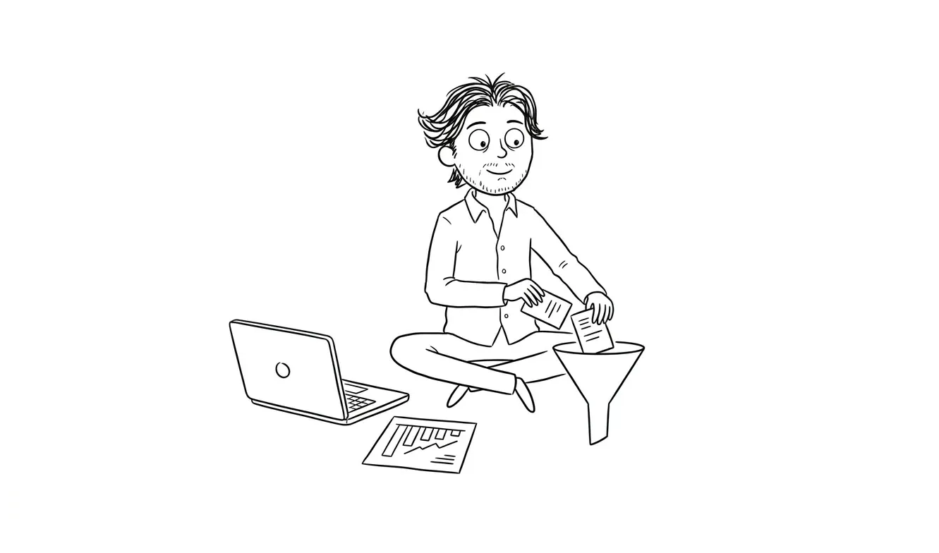
The middle path: design smart, not design more
The framing of “when to invest in design vs when to ship ugly” can imply it’s binary. It isn’t. There’s a version of design investment that’s efficient rather than comprehensive. Most founders benefit from this middle path far more than from either extreme.
Prioritize the high-stakes surfaces
Not everything in a product carries equal weight. The homepage, the signup flow, the first five minutes of onboarding, and the pricing page are doing more work than the settings panel or the profile page. If you’re going to invest in design, start where decisions get made.
Everything else can be functional and clean without being polished. Functional and clean is actually the right default for most of a product. Save polish for conversion-critical paths.
Separate structure from surface
Good information architecture is cheap and high-leverage. Figuring out the right hierarchy, the right labels, the right flow, that work is mostly thinking and sketching. It doesn’t require a full design system or pixel-perfect mockups.
A well-structured ugly interface beats a beautiful confusing one every single time. Structure first. Surface second.
Use a design system early, even a minimal one
If you’re building with React or Next.js, using a component library like shadcn/ui or Radix UI gives you consistent, accessible components without designing from scratch. You get 80% of the design quality at maybe 20% of the effort.
This is one of the biggest practical improvements founders can make to their build process. Stop designing every button from scratch. Start from a solid base and customize what matters.
Know what “done enough” looks like
There’s a version of design that’s done enough to ship without embarrassing you or losing trust. That’s the target at most early stages. Not perfect. Not rough. Done enough. Consistent spacing, readable type, clear calls to action, working states for errors and loading. That level of care takes less time than founders assume, especially if you’re starting from a solid component library.
How to decide at each stage
Here’s a rough decision framework based on where you are:
| Stage | Design priority | What to spend on |
|---|---|---|
| Pre-validation | Low | Nothing. Test the idea first. |
| Pre-launch (building v1) | Medium | Landing page. That’s it. |
| Just launched, no revenue | Medium-high | Onboarding flow, pricing page |
| First paying customers | High | Core product UX, retention flows |
| Growing, churning | Very high | Full UX audit, fix friction points |
| Scaling, competing | High | Brand, differentiating experience |
The shift from “low” to “high” happens when real users and real money are involved. Before that, the goal is learning, and design can wait.
What “ship ugly” actually costs you
Founders who default to “ship ugly always” as a mantra underestimate a few real costs.
The first is trust debt. Every rough edge a user encounters in your product adds to a mental tally. At some point that tally tips and they leave, even if the underlying product is genuinely valuable. Trust debt compounds.
The second is technical debt shaped like design debt. When you ship rough interfaces without thinking about the patterns, you end up with inconsistent components, duplicate logic, and UX contradictions that become genuinely expensive to fix later. Products that never get a coherent UI foundation often need a near-complete rebuild when growth demands a more serious product.
The third is the wrong users. Some early customers will be forgiving of rough edges. Others won’t. If you’re trying to land enterprise clients or sophisticated buyers, rough product design is a filter they’ll use against you. You may be inadvertently qualifying out the customers you most want.
The compounding problem with design debt
Design debt doesn’t just make your product look worse over time. It makes future design work harder and more expensive. Every workaround you add to a rough interface creates a constraint the next designer or developer has to work around. Patterns that were “temporary” become load-bearing walls.
This is a version of the same compounding problem that makes technical debt so costly. The later you address it, the more it’s woven into everything. If you know you’ll need to fix it eventually, fixing it at a natural checkpoint, say, before a fundraise or a big product push, is almost always cheaper than fixing it under pressure later.
A specific case for pre-launch founders
If you’re building something and haven’t launched yet, here’s what I’d actually recommend spending on design before you go live:
One good landing page. It doesn’t need to be elaborate, but it needs to be credible, clear about what the product does, and have a working way to capture interest or signups. This is the one place where design investment almost always pays back immediately, because it’s where all your early traffic lands.
Beyond that, hold off. Get your core flow working. Make sure it’s structurally sound. Check that the most important actions are obvious. Then launch and see what real users tell you.
That’s the version of “ship smart” I’d argue for. Not ship ugly. Not over-design. Ship a solid landing page and a functional product, then iterate on design based on what you learn.
If you’re curious what that actually costs and what’s included, I’ve got a breakdown in my article on how much a custom landing page costs, which might help calibrate your expectations.
Not sure what to prioritize? My Audit + Spec service takes one focused look at your product and tells you exactly what to fix first. $500, credited toward any follow-on work. Tell me what you’re working on.
When to invest in design before you think you’re ready
There’s one scenario worth calling out separately, because it catches founders off guard. Sometimes the right moment to invest in design is earlier than the metrics suggest.

If you’re about to raise a pre-seed or seed round, your product needs to look like something a serious team built. Investors are human. They respond to polish even when they say they don’t. A rough product with strong numbers can get funded. A rough product with okay numbers almost never does. A product that looks considered and intentional reads as a team that knows what they’re doing.
Similarly, if you’re about to get a major PR mention, a partnership announcement, or any kind of spike in attention, that’s not the time to have a landing page that looks like it was built in an afternoon. That traffic is often one-time. You don’t get a second chance to make that impression.
The pattern is: invest in design before high-stakes visibility events, not after. Waiting until after means you watched an opportunity convert at a fraction of what it could have.
This is one reason founders often come to me right before a launch or a fundraise push. The window is short and the stakes are real. That’s exactly the kind of work I do through the Idea to MVP service or a targeted landing page build, depending on where you are.
What I actually do at dee.agency
I work with founders who are past the “is this real” stage and into the “let’s build and ship” stage. That’s the window where design investment starts paying off, and where I can actually help.
If you need a landing page that converts, I do that as a flat-fee service. If you’re building a product from scratch, Idea to MVP covers the full design and build. If you have something live that isn’t performing, the audit is the right first step.
Everything I do is async and fast. No six-week discovery phases. No committee approvals. You get direct access to the person doing the work.
Frequently asked questions
When should a startup invest in design?
Invest in design when you have validated the problem and are building something for real users or paying customers. The critical inflection points are your landing page before launch, your onboarding flow when you first have signups, and your core product UX when churn becomes visible. Before validation, keep design investment minimal.
Is it okay to launch a product that looks rough?
Yes, if you’re launching to learn and your target users are tolerant of early-stage products, like fellow founders, developers, or beta testers. It’s a much riskier call when you’re launching to general consumers, charging money upfront, or competing in a crowded market where design is a differentiator.
How much does good design actually affect conversion?
Design clarity, meaning how quickly someone understands what your product does and what to do next, has a direct effect on conversion. A confusing value proposition or a buried call-to-action will hurt regardless of how polished the visuals are. Google’s research on page experience also confirms that load speed and usability signals affect organic ranking, not just user satisfaction.
What’s the minimum design investment before launching a SaaS product?
At minimum: a clear landing page, a working signup flow, and a first-run experience that gets users to their first “aha” moment without confusion. You don’t need a full design system or brand refresh. You need those three things to work well. Nielsen Norman Group research shows first impressions form in milliseconds, which is why the landing page is non-negotiable.
How do I know if my product has a design problem vs a product problem?
If users sign up but don’t come back, that’s often a design problem, specifically in onboarding or core feature discoverability. If users don’t sign up at all, it could be either. A UX audit can help separate the two by looking at where users drop off and why, rather than guessing.
What does “ship ugly” mean in practice?
It means prioritizing function over form during early validation phases. Ugly doesn’t mean broken or confusing. It means you haven’t polished the visual layer yet. Buttons work, flows make sense, data is correct, but you haven’t sweated the typography scale or spacing system. That’s fine until real users arrive in volume.
Ready to stop guessing?
If you’re not sure whether your product needs design work or just needs to ship, I can help you figure that out fast. The Audit + Spec is a $500 focused review that tells you exactly where the friction is and what to do about it. Or if you’re starting from scratch, let’s talk about your MVP.
Tell me about your project and I’ll give you a straight answer.

Got a project worth shipping? Send the brief.
Quote and kickoff date back in a day, usually faster. If it's not a good fit I'll say so.